Communication design is all about content: delivering a message, not just decoration. “Communication” implies functionality and flexibility; it’s solving problems through analytical thinking, well-researched concepts and intelligent structures — with elegance. To tell a story well is to take the inherent personality of a project and translate into a visual language: form follows content.
But communication design is also the reaction to a socio-cultural context:
it can’t be separated from its underlying values, assumptions and ideologies—
all design is political. So we must try to minimise the negative impact of our work on people and planet. I interpret communication design as a critical and active form of social production.
My name is Hannes Mitterberger and I’m a communication designer.
Let’s have a conversation about your next project
Communication design is all about content: delivering a message, not just decoration. “Communication” implies functionality and flexibility; it’s solving problems through analytical thinking, well-researched concepts and intelligent structures — with elegance. To tell a story well is to take the inherent personality of a project and translate into a visual language.
But communication design is also the reaction to a socio-cultural context:
it can’t be separated from its underlying values, assumptions and ideologies—all design is political. So we must try to minimise the negative impact of our work on people and planet. I interpret communication design as a critical and active form of social production.
My name is Hannes Mitterberger and I’m a communication designer.
Let’s have a conversation about your next project
Communication design is all about content: delivering a message, not just decoration. “Communication” implies functionality and flexibility; it’s solving problems through analytical thinking, well-researched concepts and intelligent structures — with elegance. To tell a story well is to take the inherent personality of a project and translate into a visual language.
But communication design is also the reaction to a socio-cultural context: it can’t be separated from its underlying values, assumptions and ideologies—all design is political.
So we must try to minimise the negative impact of our work on people and planet. I interpret communication design as a critical and active form of social production.
My name is Hannes Mitterberger and
I’m a communication designer.
Let’s have a conversation about your next project
Hannes Mitterberger
Communication Design
— About
— Contact
— News (external)
— Visit my Blog aka Monthly Poster Project (coming soon)
Hannes Mitterberger
Communication Design
— About
— Send mail
— News (external)
— Visit my Blog aka Monthly Poster Project (coming soon)
SELECTED PROJECTS (7)
SELECTED PROJECTS (5)
SELECTED PROJECTS (5)
1.
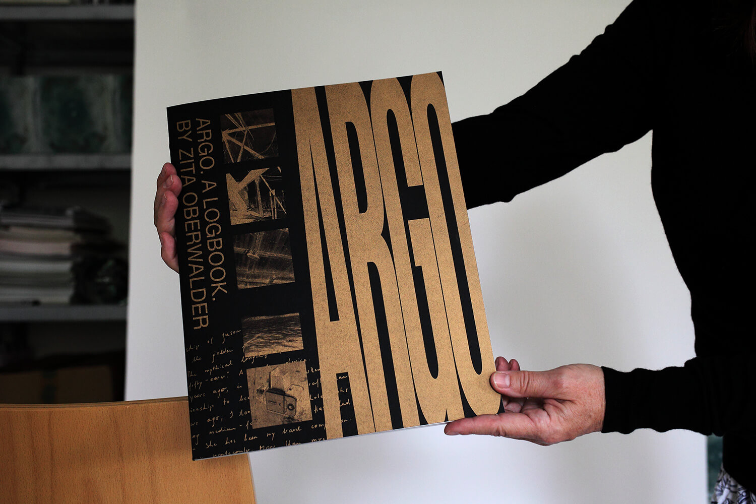
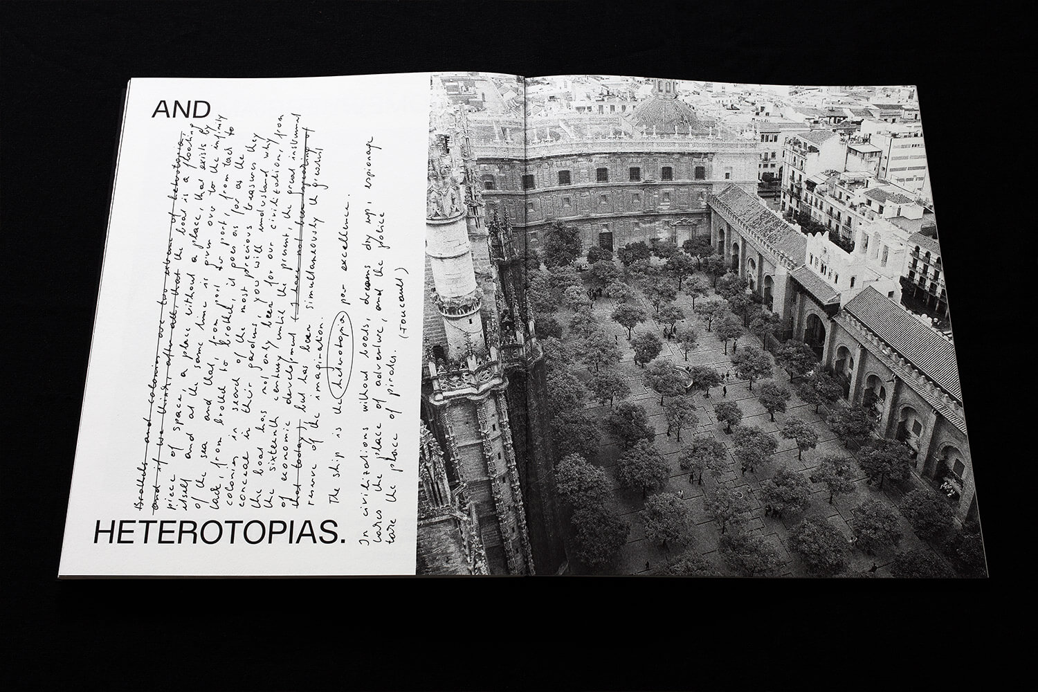
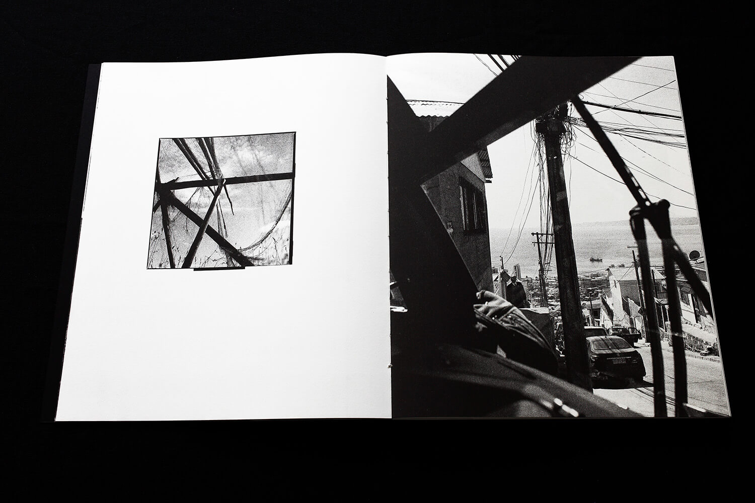
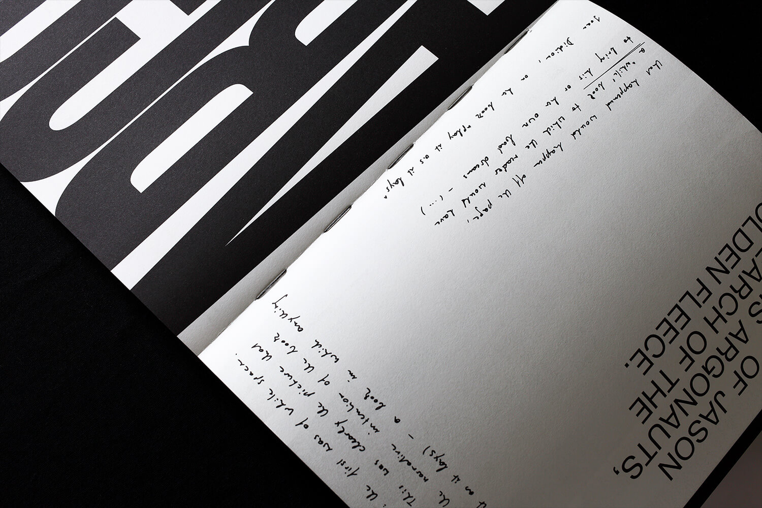
A logbook documenting a visual journey through 50 years of analog b/w-photography, poetic in image and text, Riso-printed in black and gold.
1.
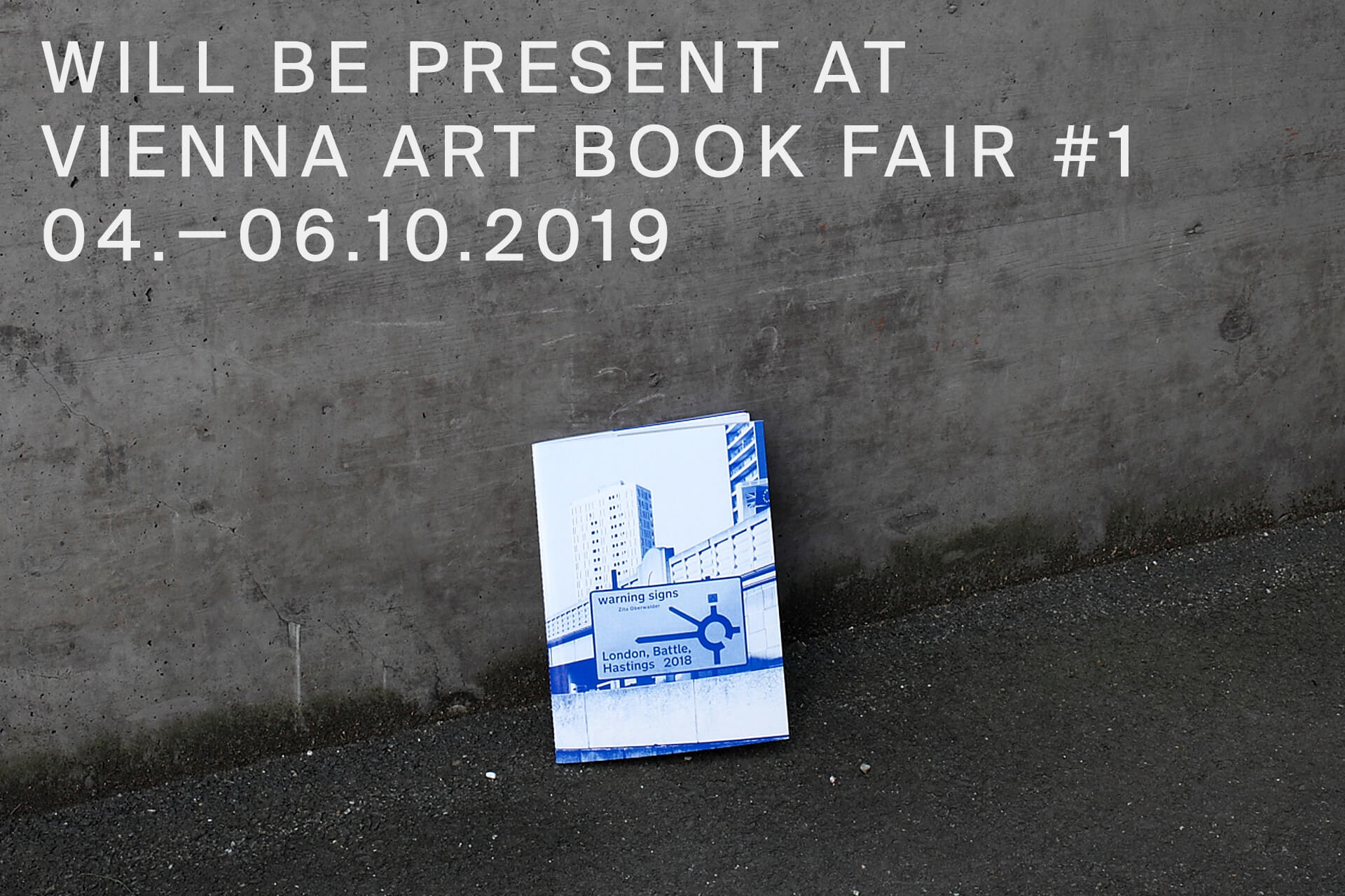
“Don't settle for black and white” with this conceptual photo-essay in two parts, poetically invoking the everyday dystopia of Brexit-London.
Get a copy here.
1.
Conceptual photo-essay in two parts. Get a copy here.
1.
Some of my most successful posters.
Graphic Design
Editorial Design
Concept Design
(Ghost-)Writing
FOR:
Zita Oberwalder
IN:
2023
WITH:
Zita Oberwalder,
Lukas Ullsperger
winner of the awards:
–"Die schönsten Bücher Österreichs 2023"
–"Deutscher Photobuchpreis 24|25"
FOR: Zita Oberwalder IN: 2019 WITH: Zita Oberwalder, Kate Howlett-Jones
FOR: Zita Oberwalder IN: 2019 WITH: Zita Oberwalder, Kate Howlett-Jones
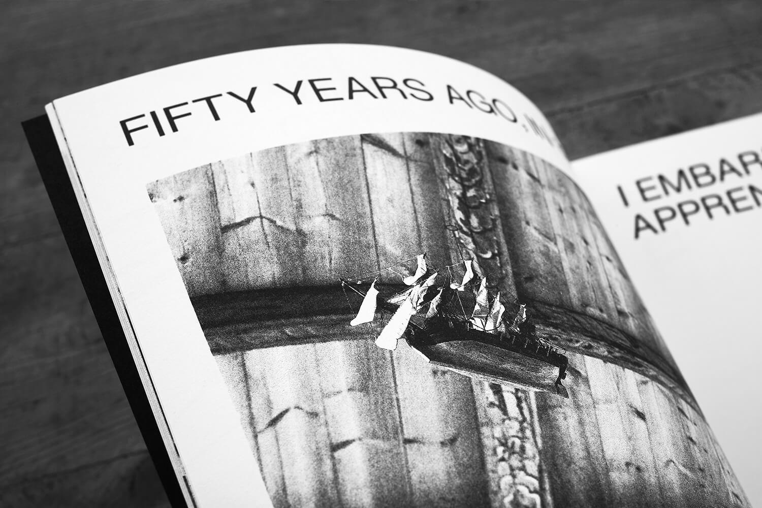
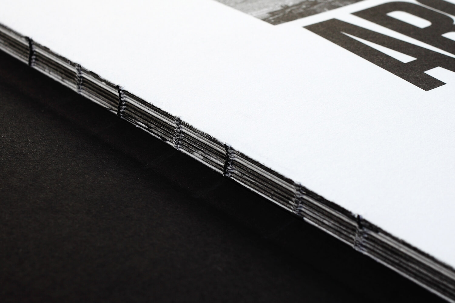
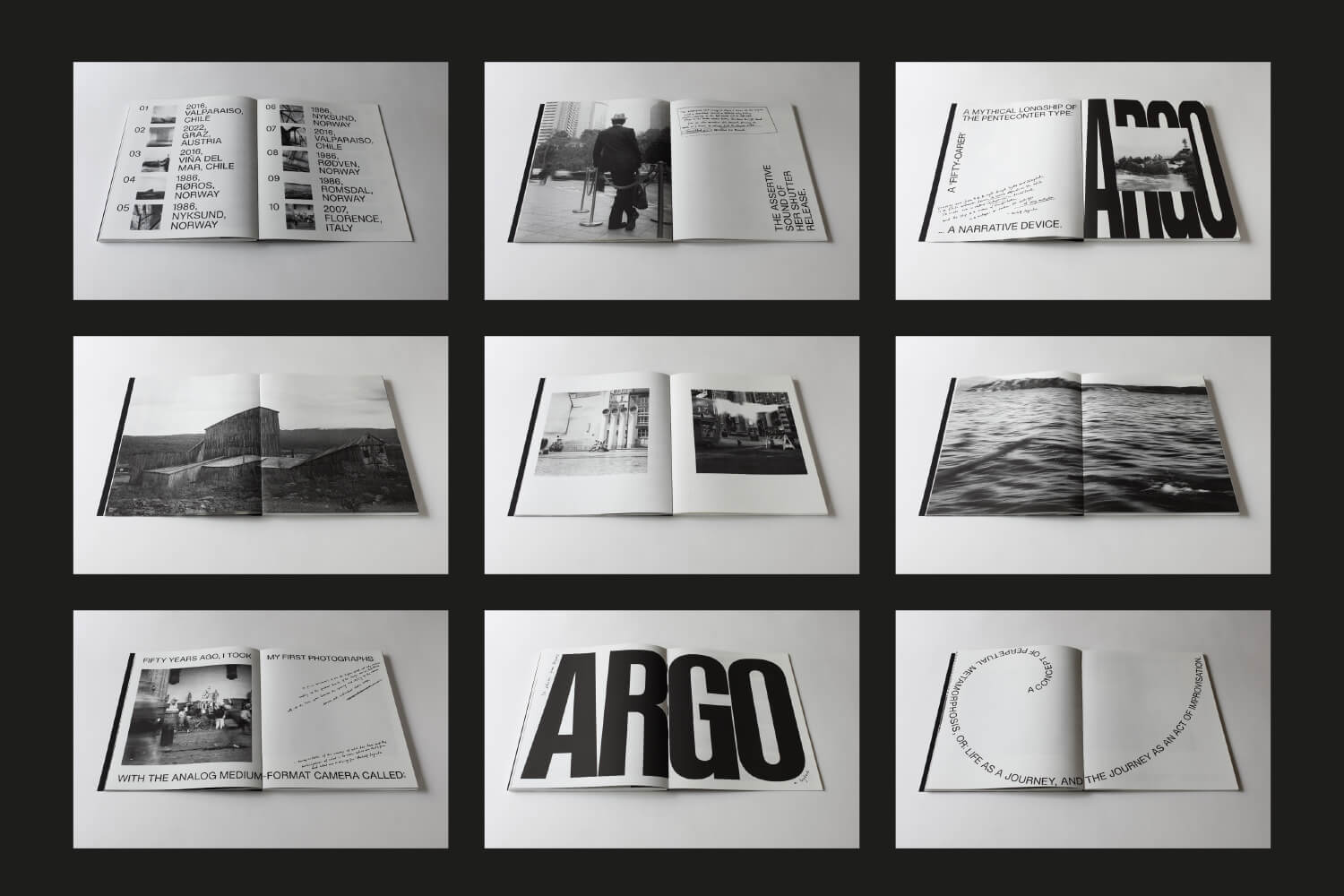
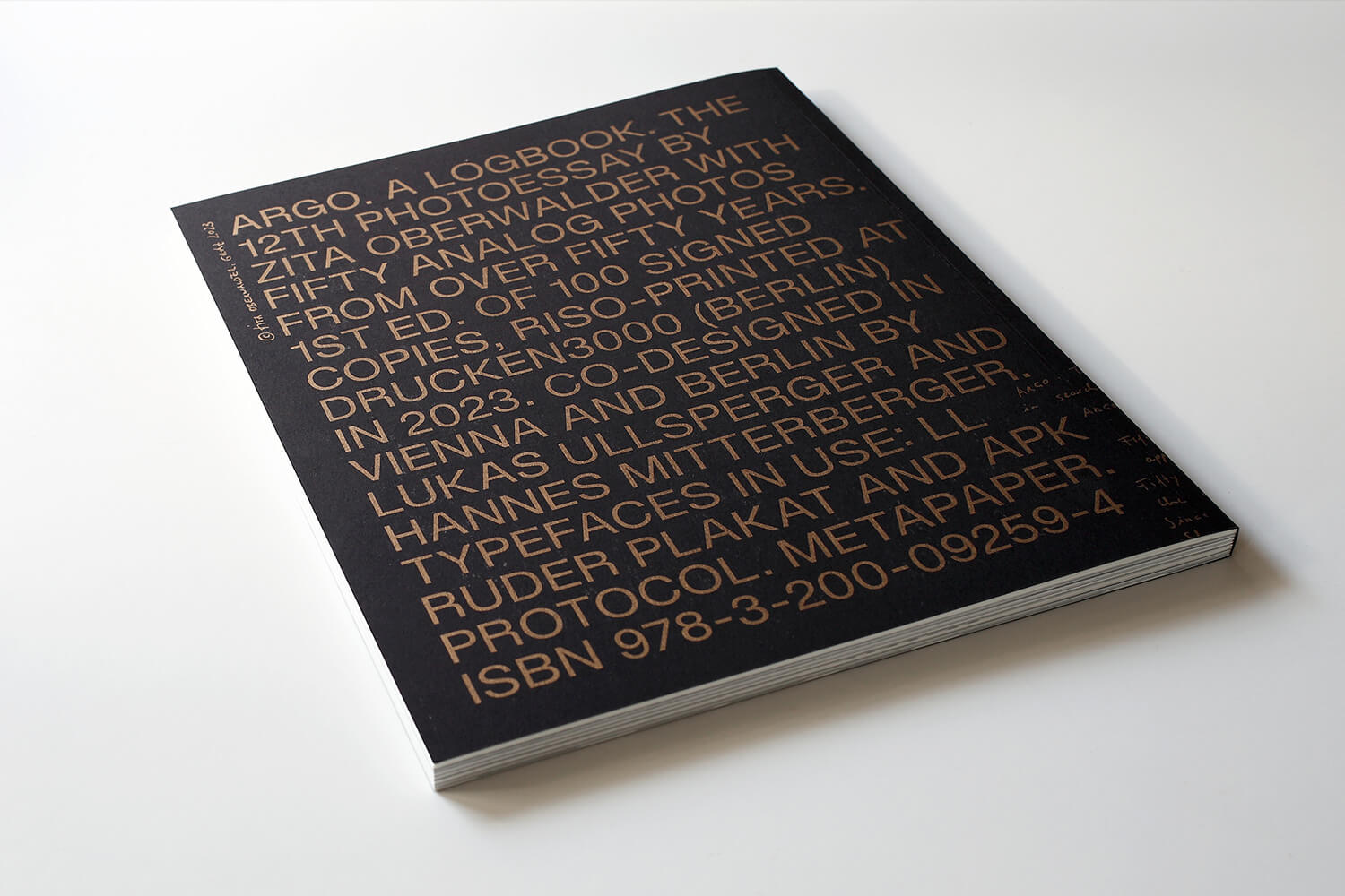
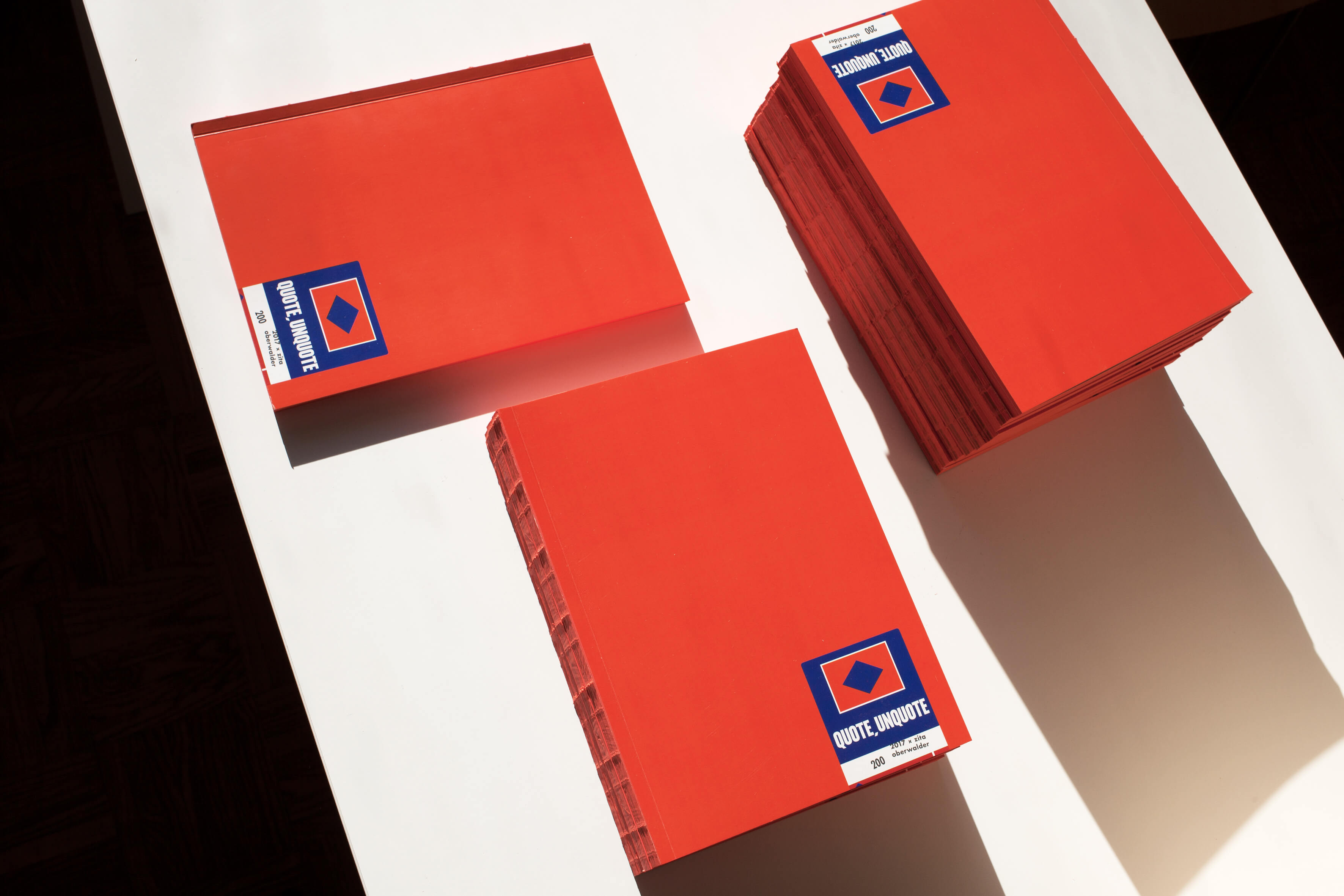
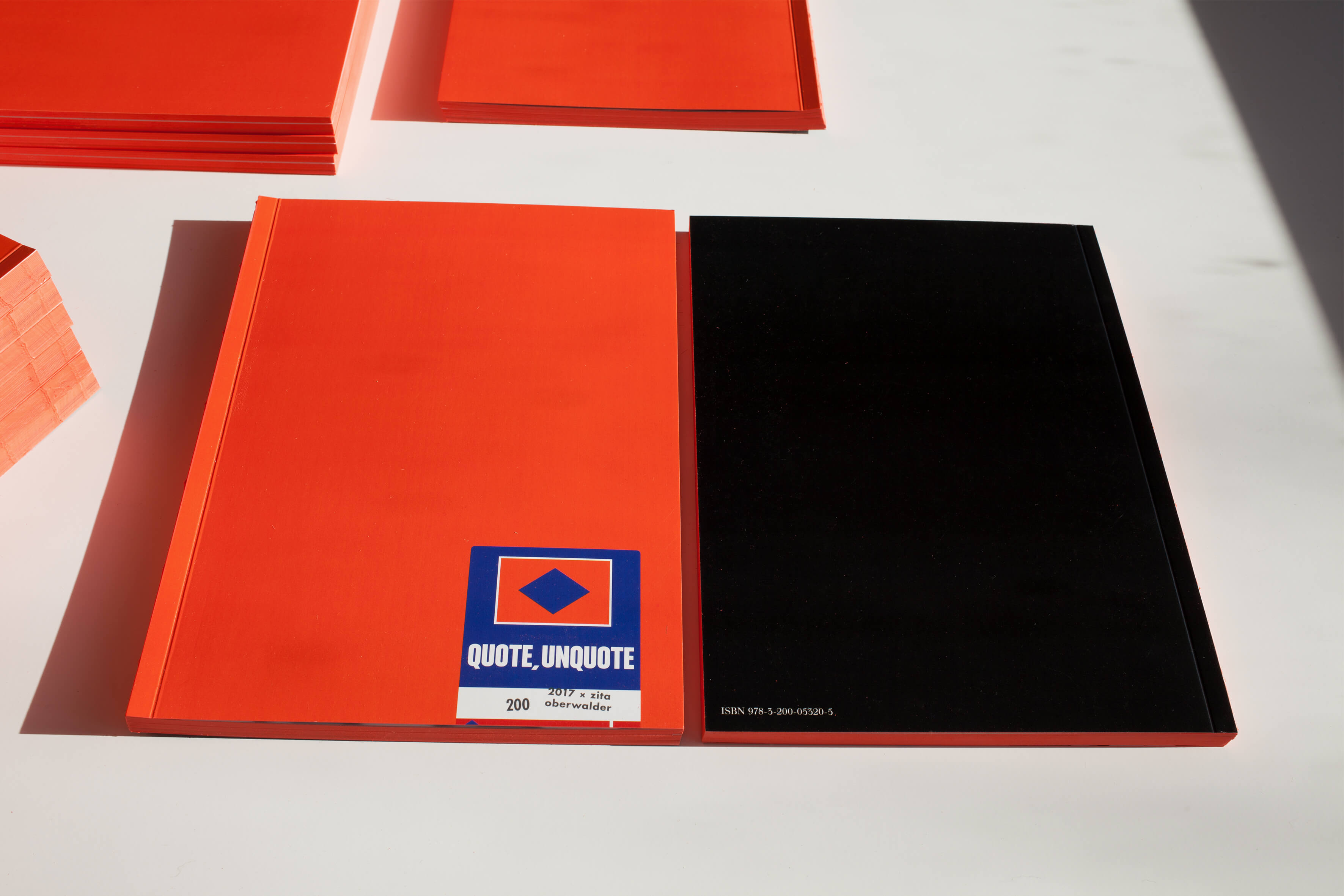
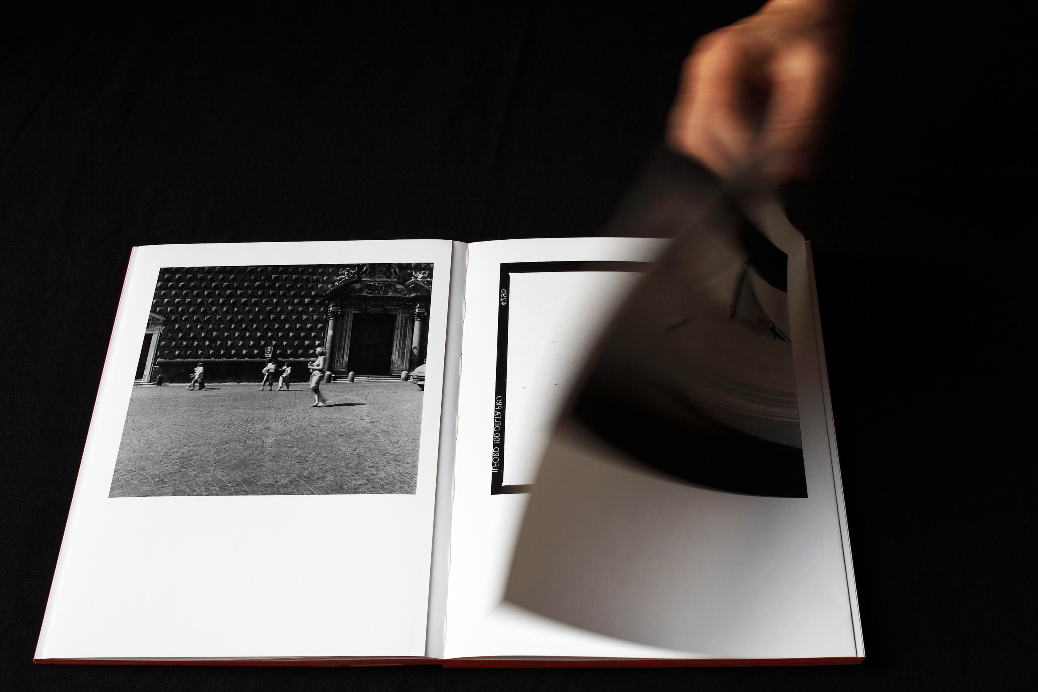
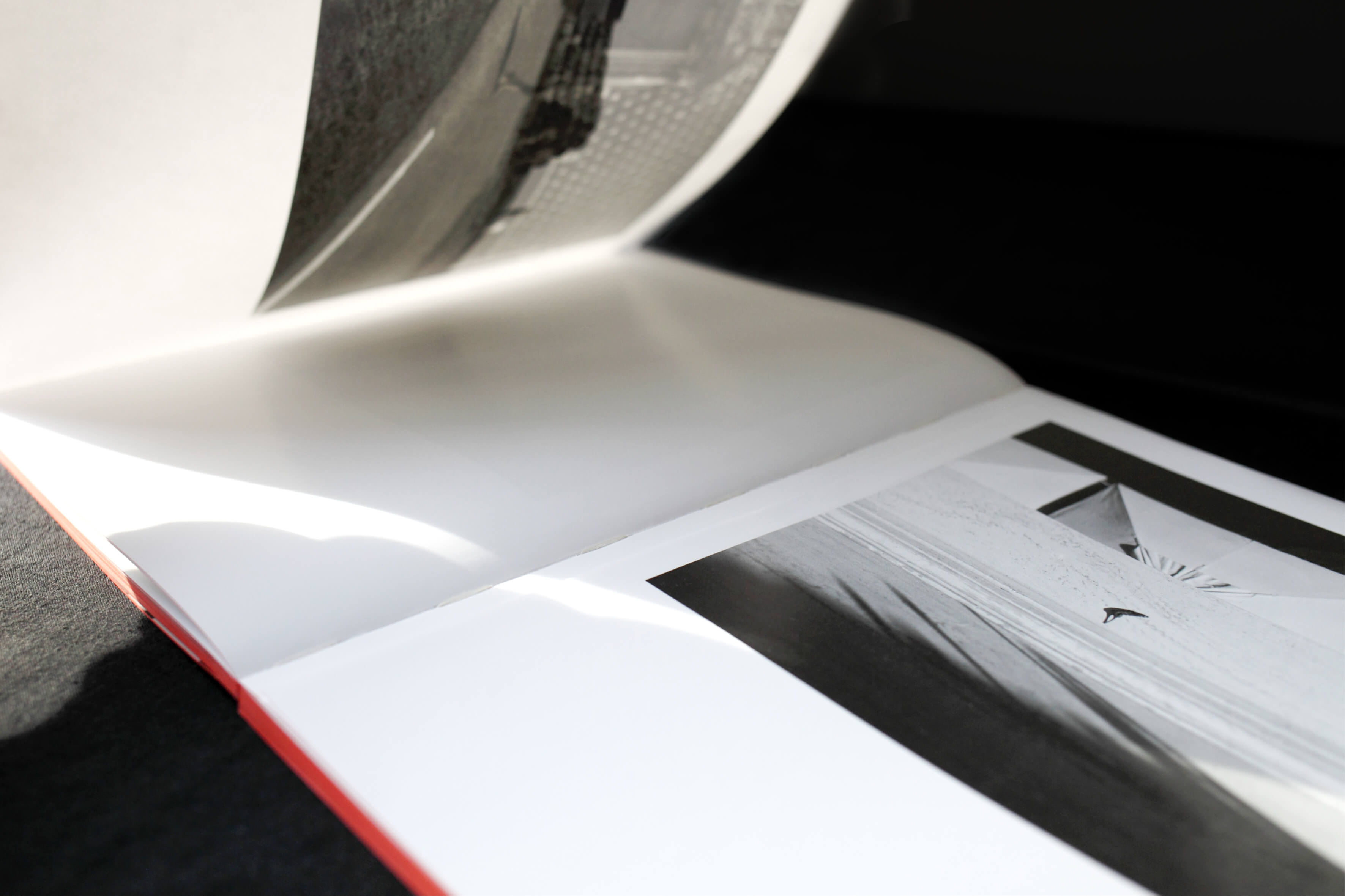
The double award winning ARGO. A LOGBOOK. uses the mythological longship as a metaphor for Zita Oberwalder’s 50-year journey in analog photography. Through her Hasselblad 500C/M, she pursues the golden fleece—symbolizing (artistic) purpose—within spaces, non-places, and heterotopias. Designed around the golden ratio with the APK Protocol typeface in 50pt, the book blends precision with a personal touch, enhanced by handwritten notes. Co-designed in Vienna, Berlin, and Graz, and printed via Risography at Drucken3000 (Berlin) in black and gold.
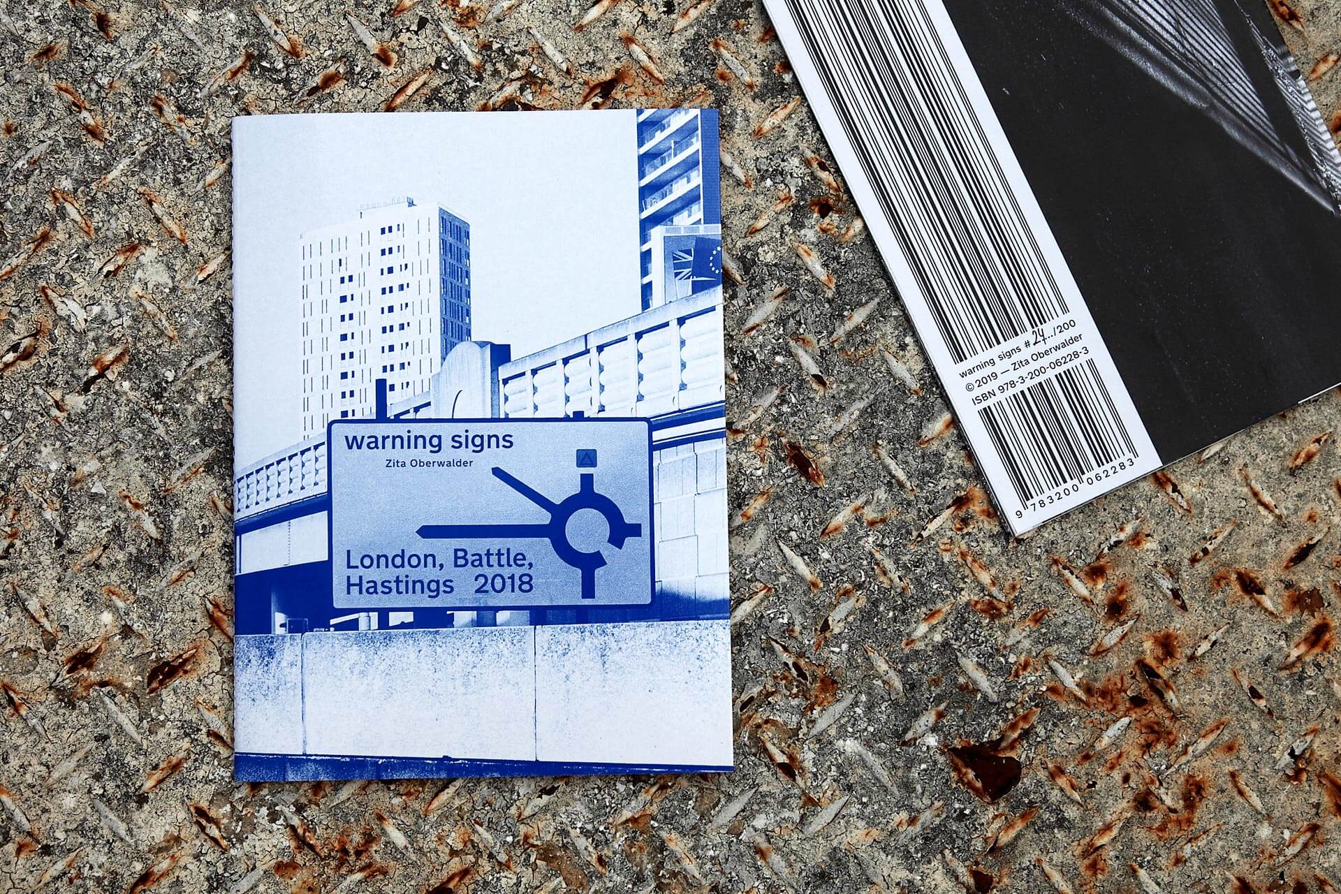
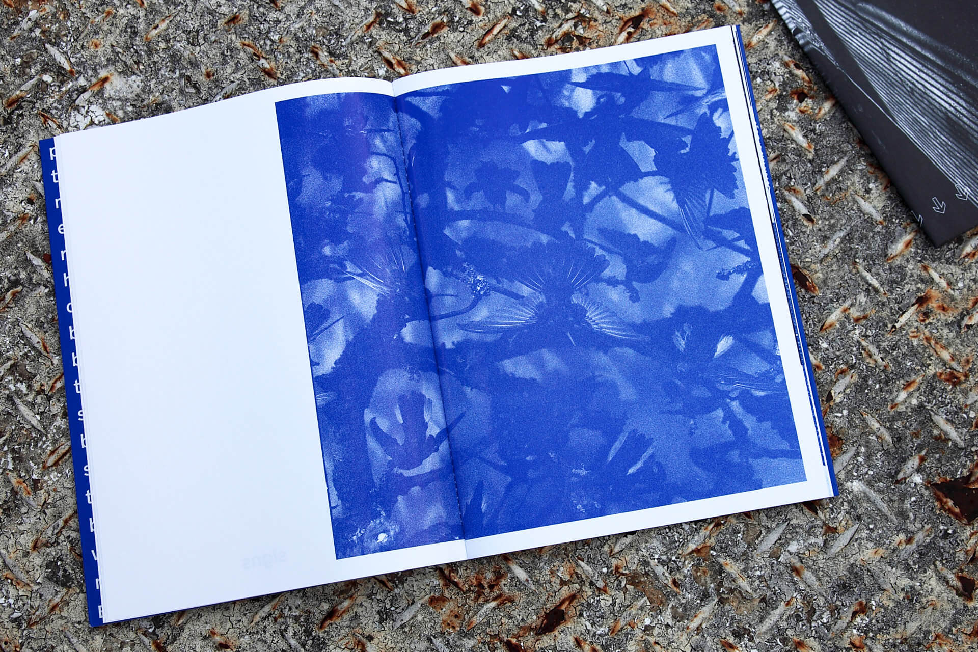
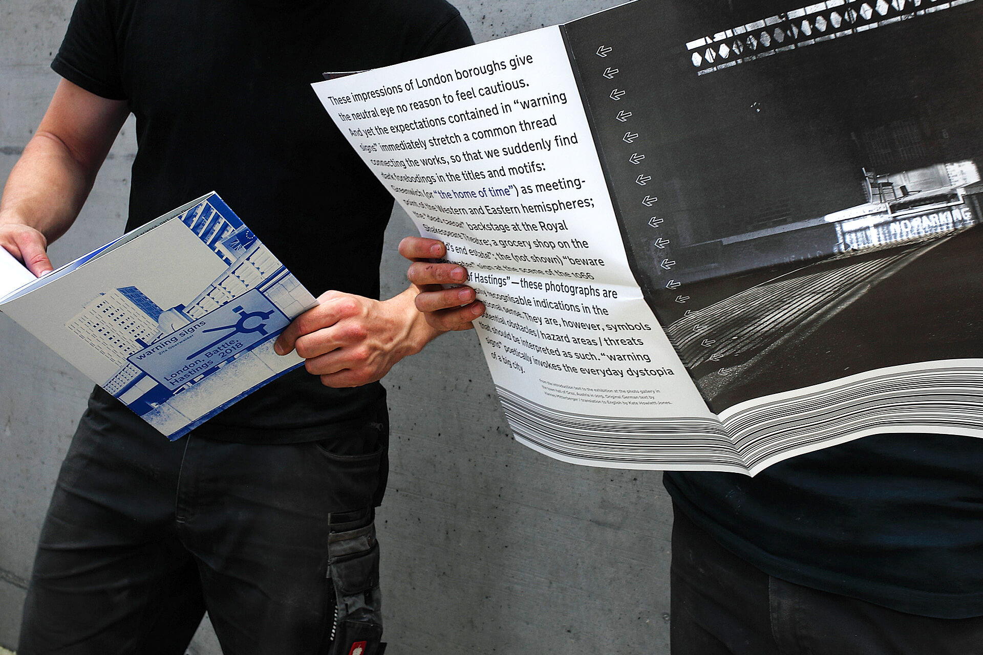
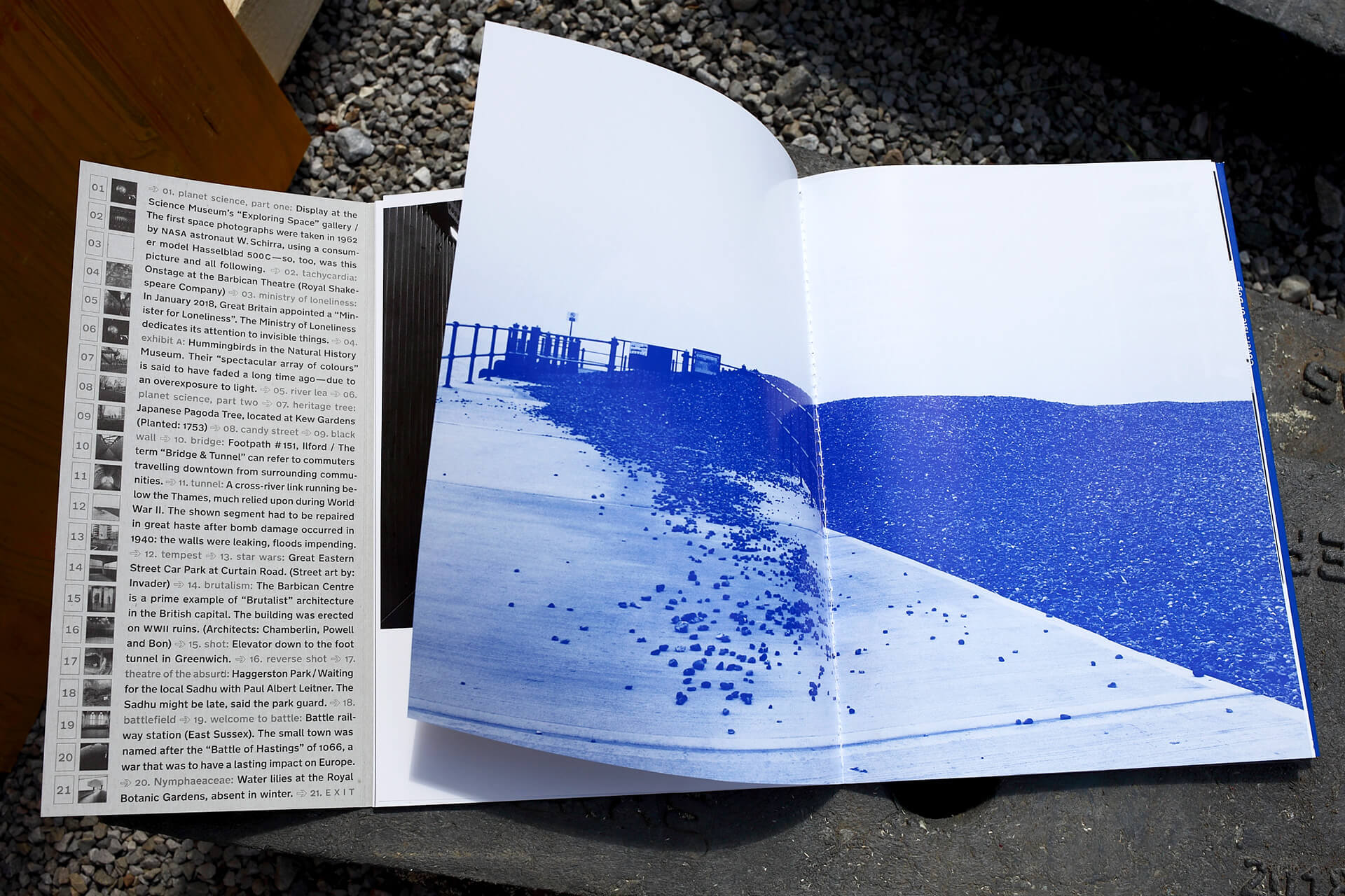
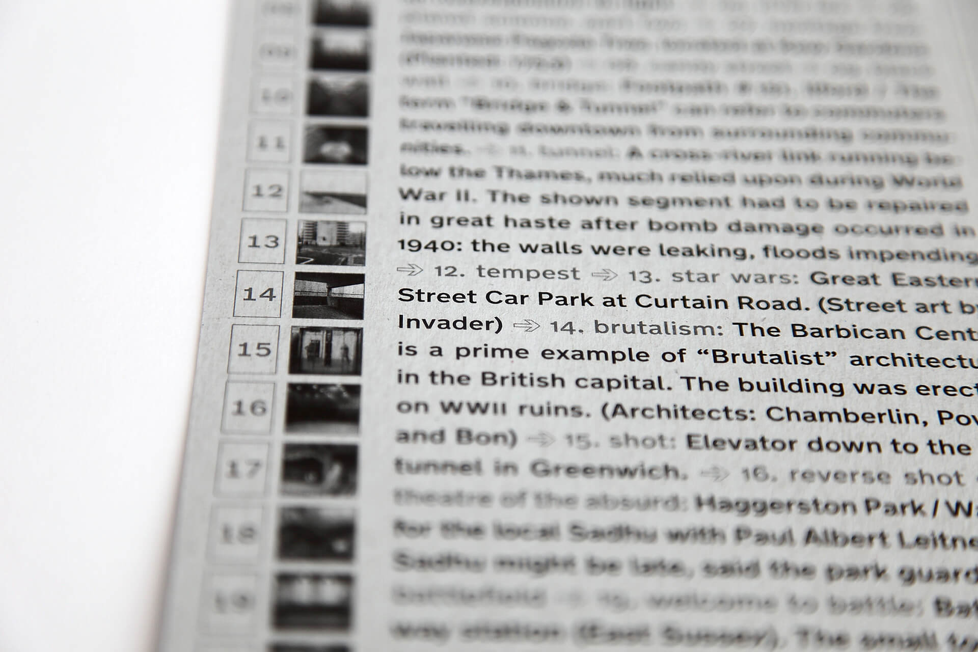
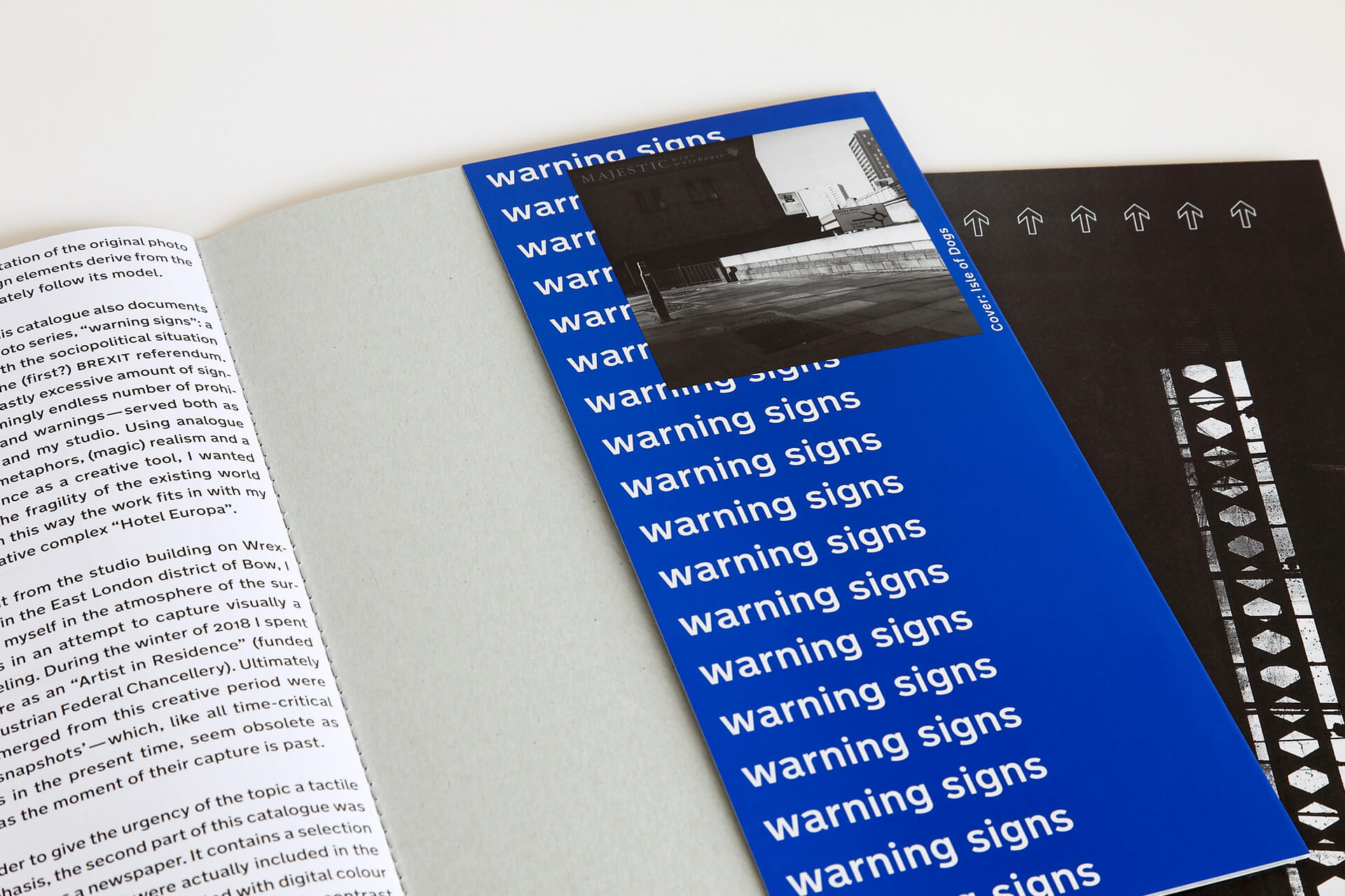
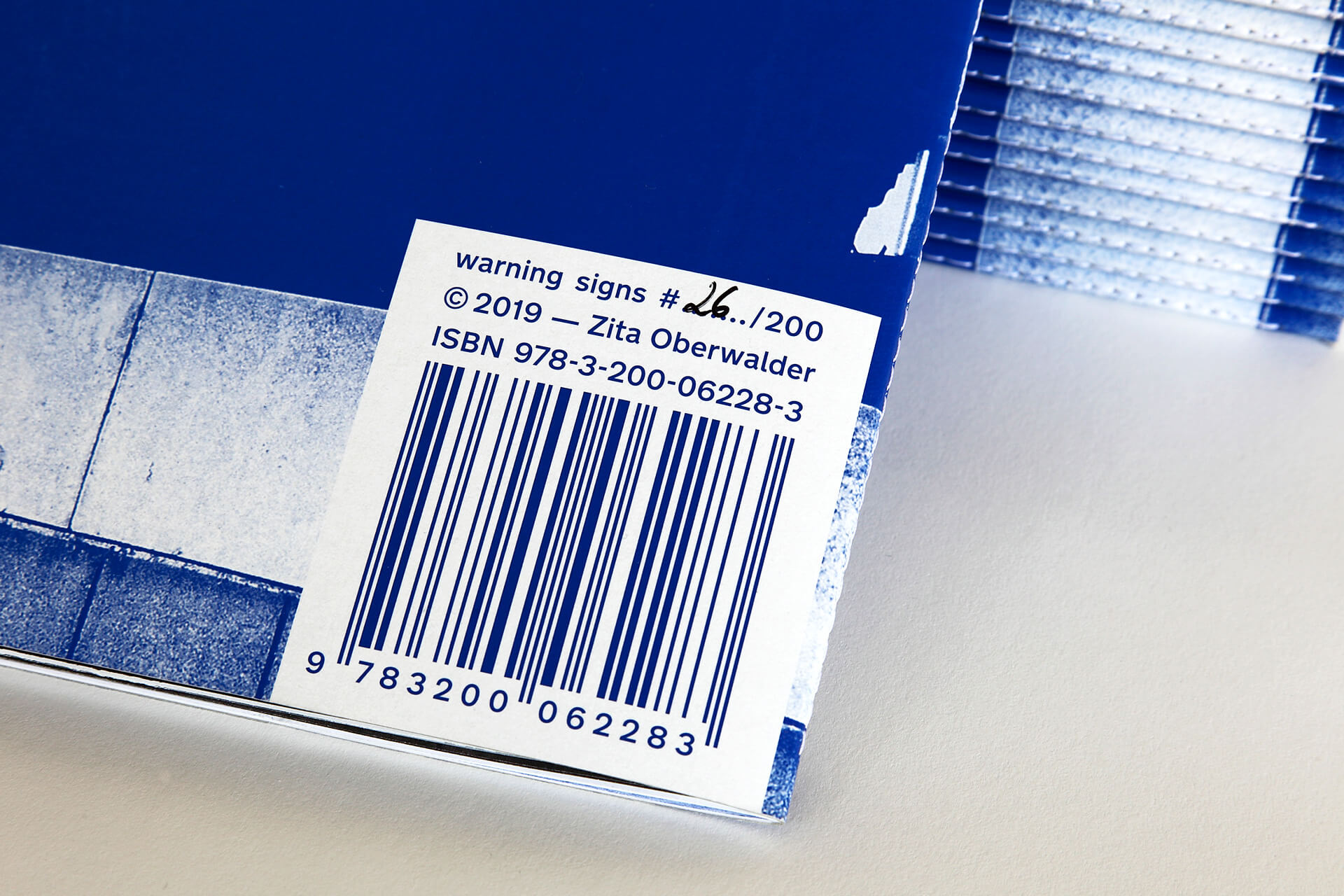
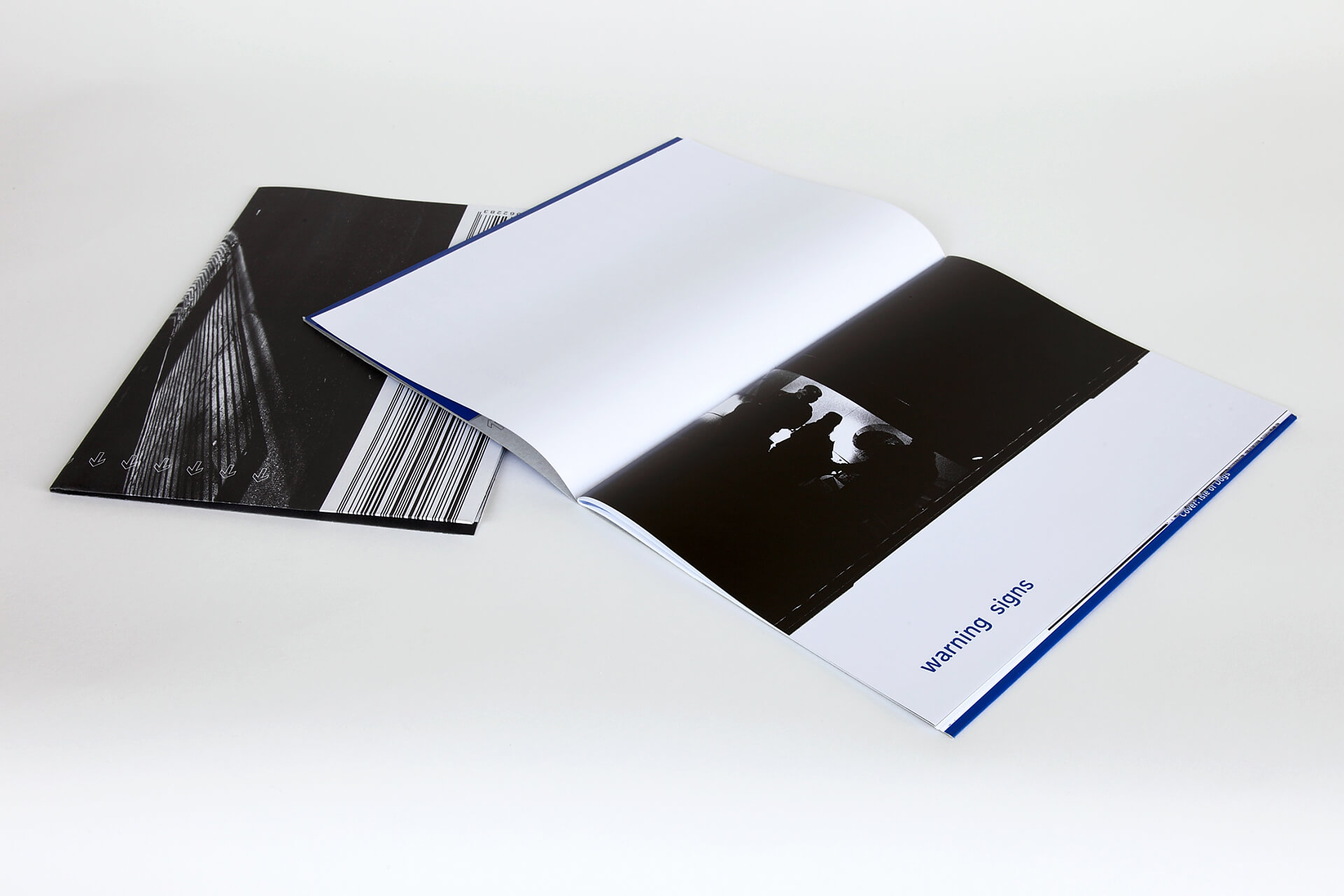
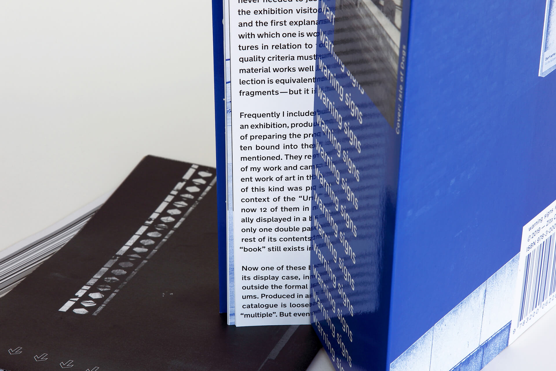
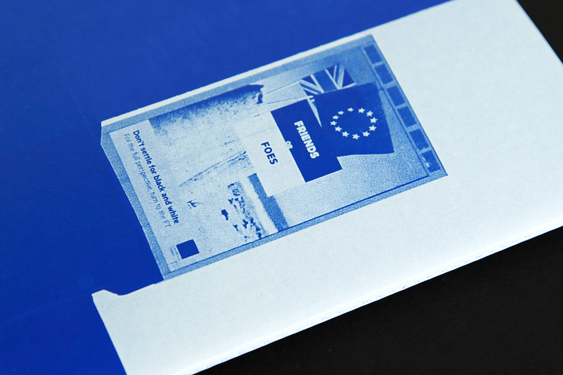
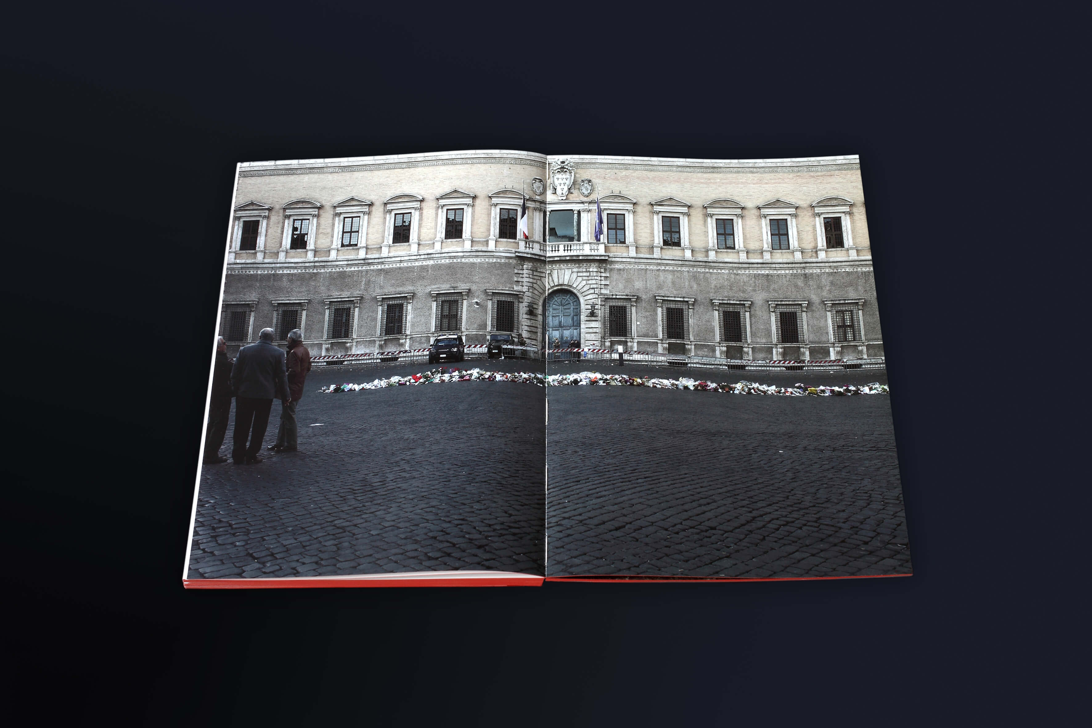
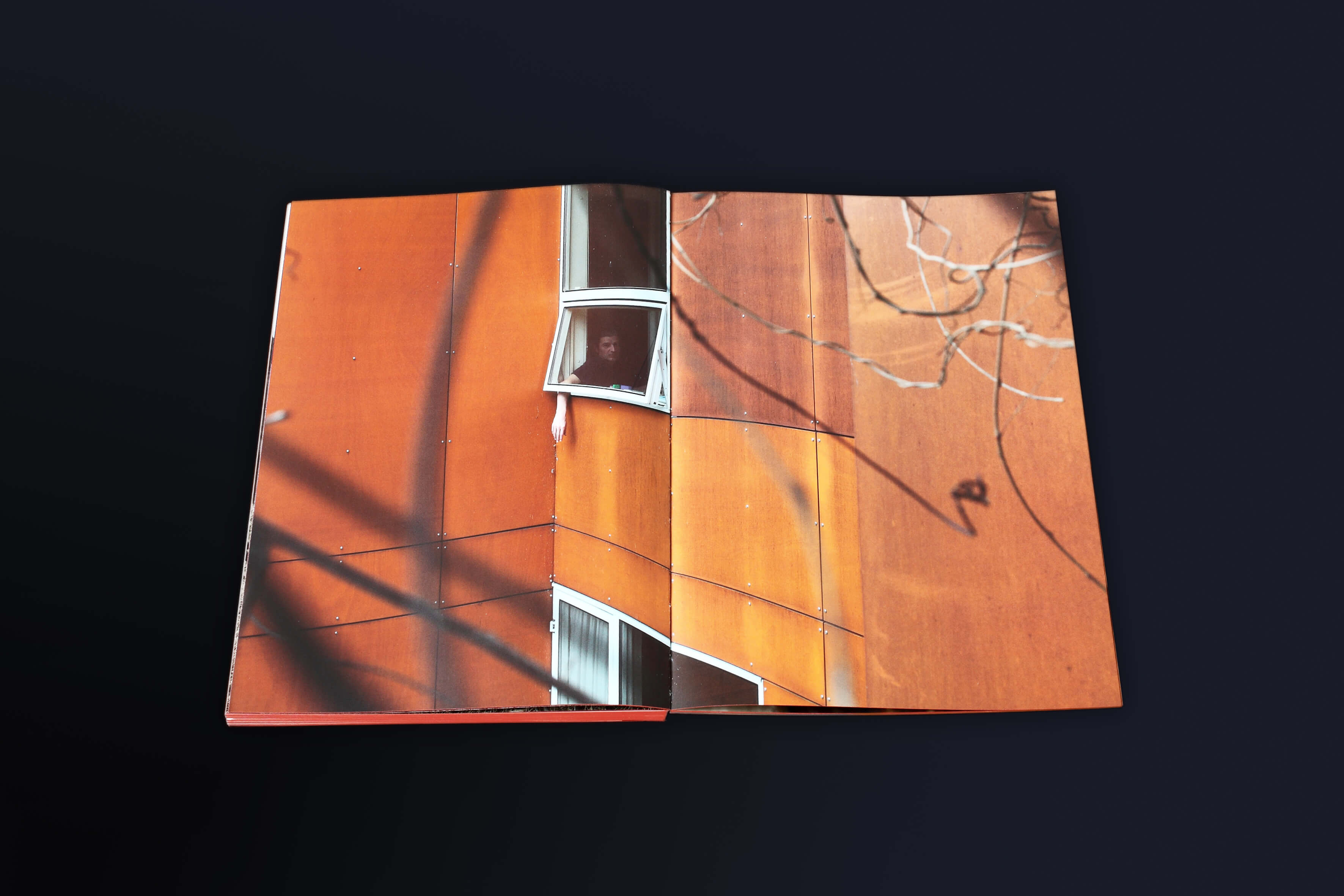
A photo catalog with accompanying “newspaper” documenting the latest series by fine art photographer Zita Oberwalder. It’s a visual dialogue with the socio-political situation of London after the Brexit referendum. The leading design elements arise from the content: Pantone Reflex Blue appears both in the flags of the UK and the EU. The typeface “New Transport” by London-based foundry A2-Type is an update on the classic british roadsign type from the 60’s. The work also features some of my writing, translated into Englisch by Howlett-Jones.
A photo catalog with accompanying “newspaper” documenting the latest series by fine art photographer Zita Oberwalder. It’s a visual dialogue with the socio-political situation of London after the Brexit referendum. The leading design elements arise from the content: Pantone Reflex Blue appears both in the flags of the UK and the EU. The typeface “New Transport” by London-based foundry A2-Type is an update on the classic british roadsign type from the 60’s. The work also features some of my writing, translated into Englisch by Howlett-Jones.
2.
Poster design still serves as a strong tool to send messages on current and socially relevant topics. Here are some of my most successful results.
1.
“Don't settle for black and white” with this conceptual photo-essay in two parts, poetically invoking the everyday dystopia of Brexit-London.
Get a copy here.
1.
Conceptual photo-essay in two parts. Get a copy here.
1.
Some of my most successful posters.
Graphic Design
Social Design
Editorial Design, Graphic Design, Concept, Writing
Graphic Design, Social Design


FOR:
Misc. competitions;
self-initiated projects
IN:
2018—2019
WITH:
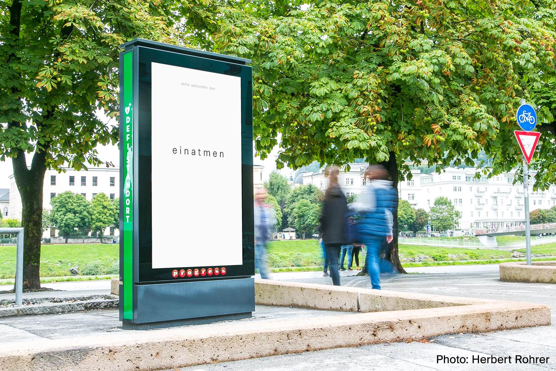
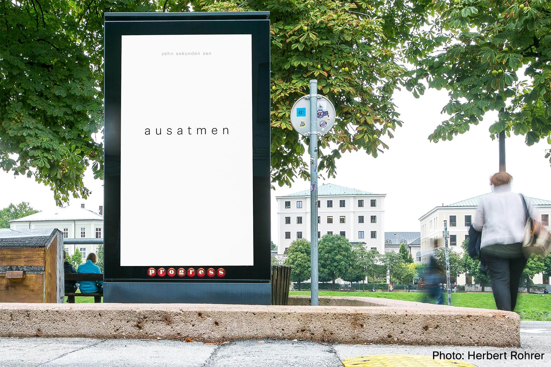
Herbert Rohrer
(zen sekunden zen)
Lukas Ullsperger
(Valeria)
FOR: Zita Oberwalder IN: 2019 WITH: Zita Oberwalder, Kate Howlett-Jones
FOR: Misc. competitions; self-initiated projects IN: 2018—2019 WITH: Herbert Rohrer (zen sekunden zen); Lukas Ullsperger (Valeria)
1. zen sekunden zen (ten seconds zen) – Winning design for a competition held by the City of Salzburg.
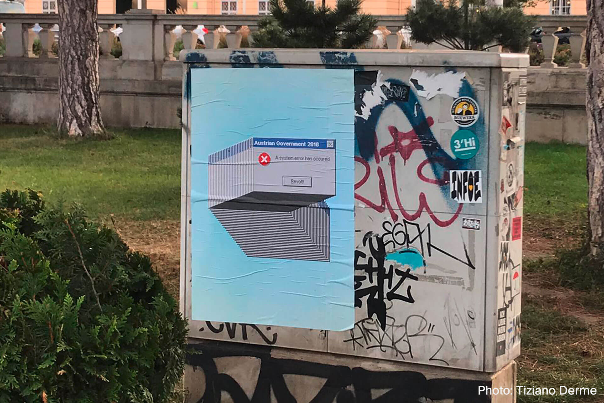
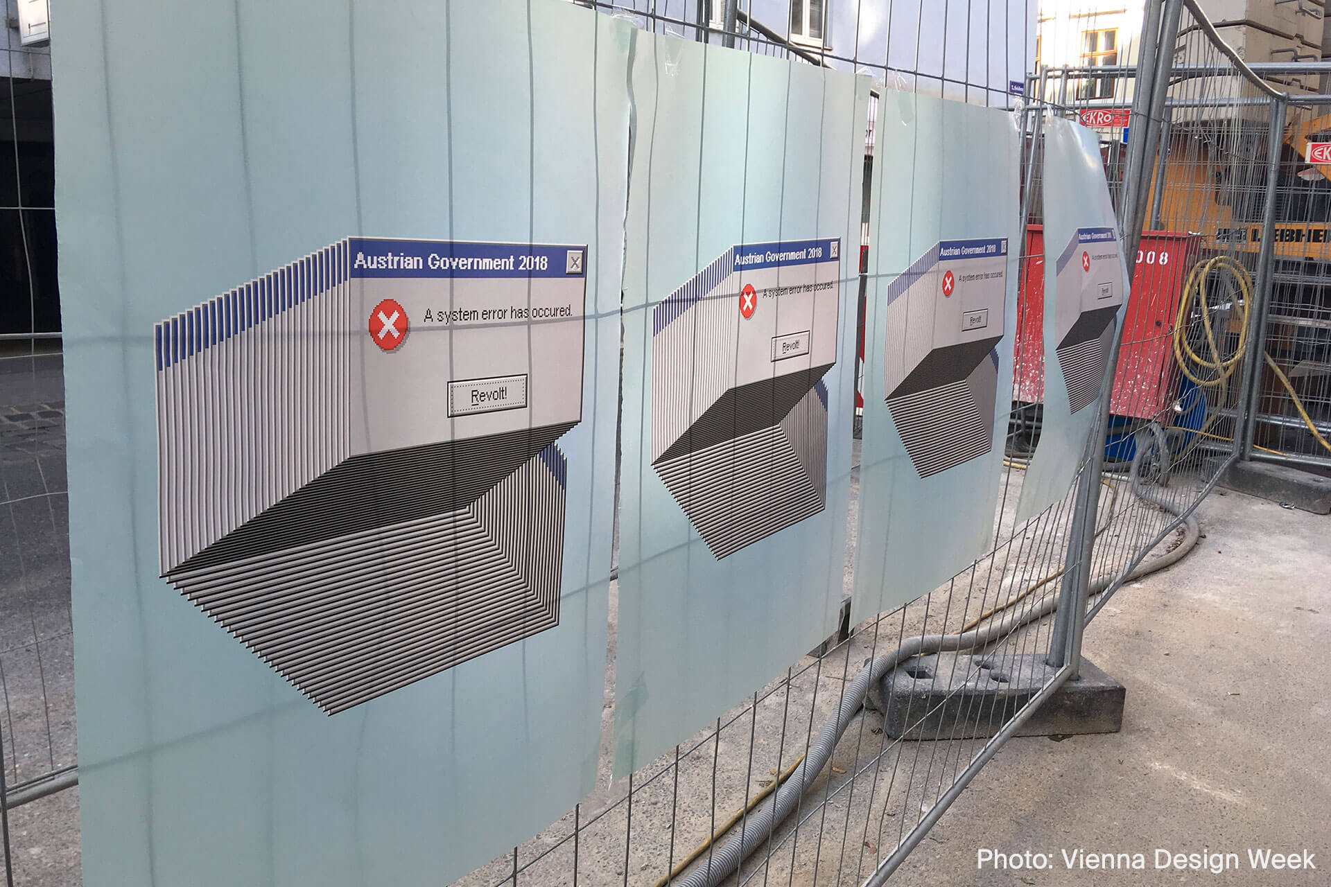
2. System Error – Winning design for a competition held within the framework of Vienna Design Week '18.
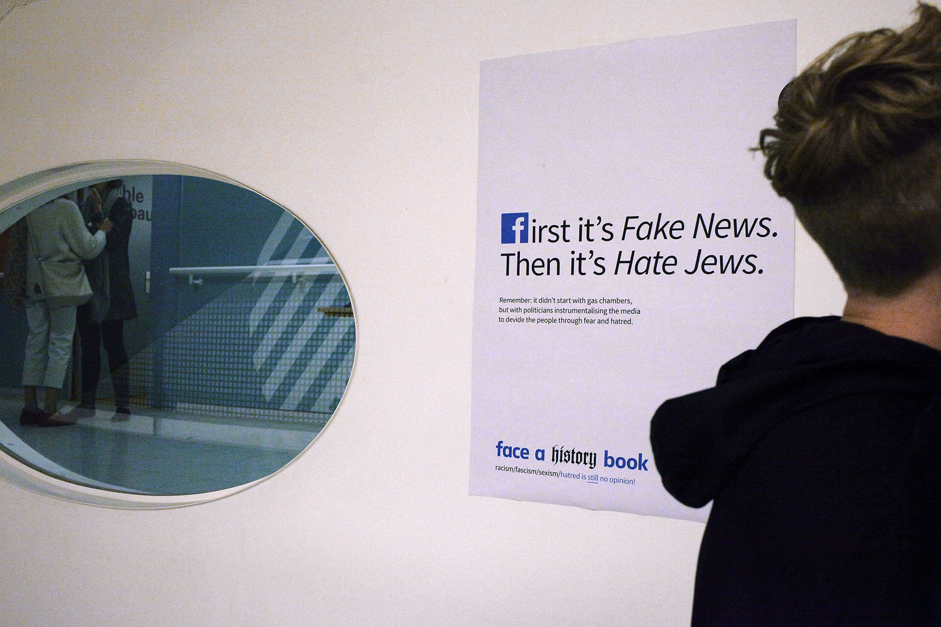
3. Face a History Book – Poster included in the “studio protest” exhibition at Vienna Design Week '18.
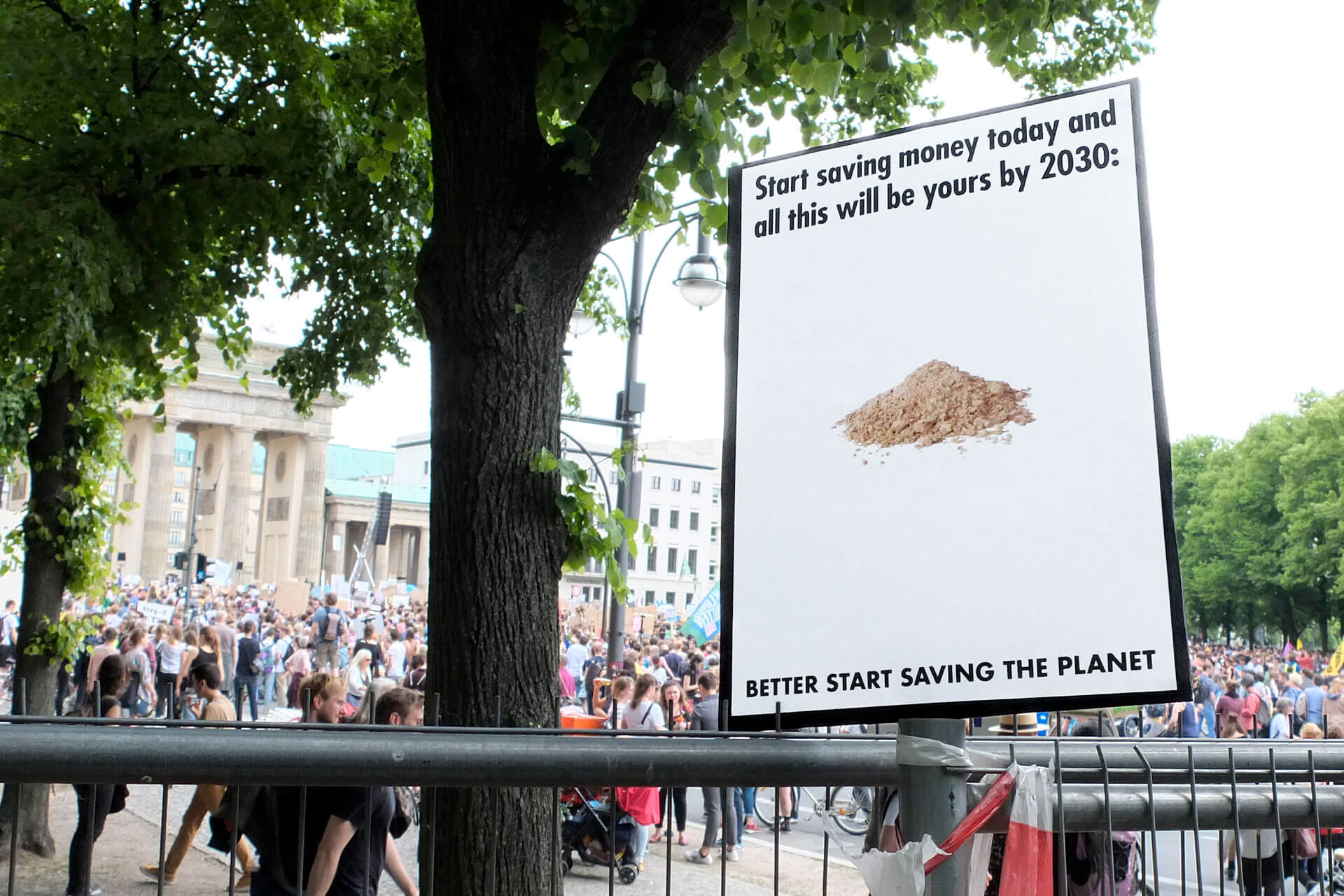
4. Investment Advice – Poster included in the “studio protest” exhibition at Vienna Design Week '18.
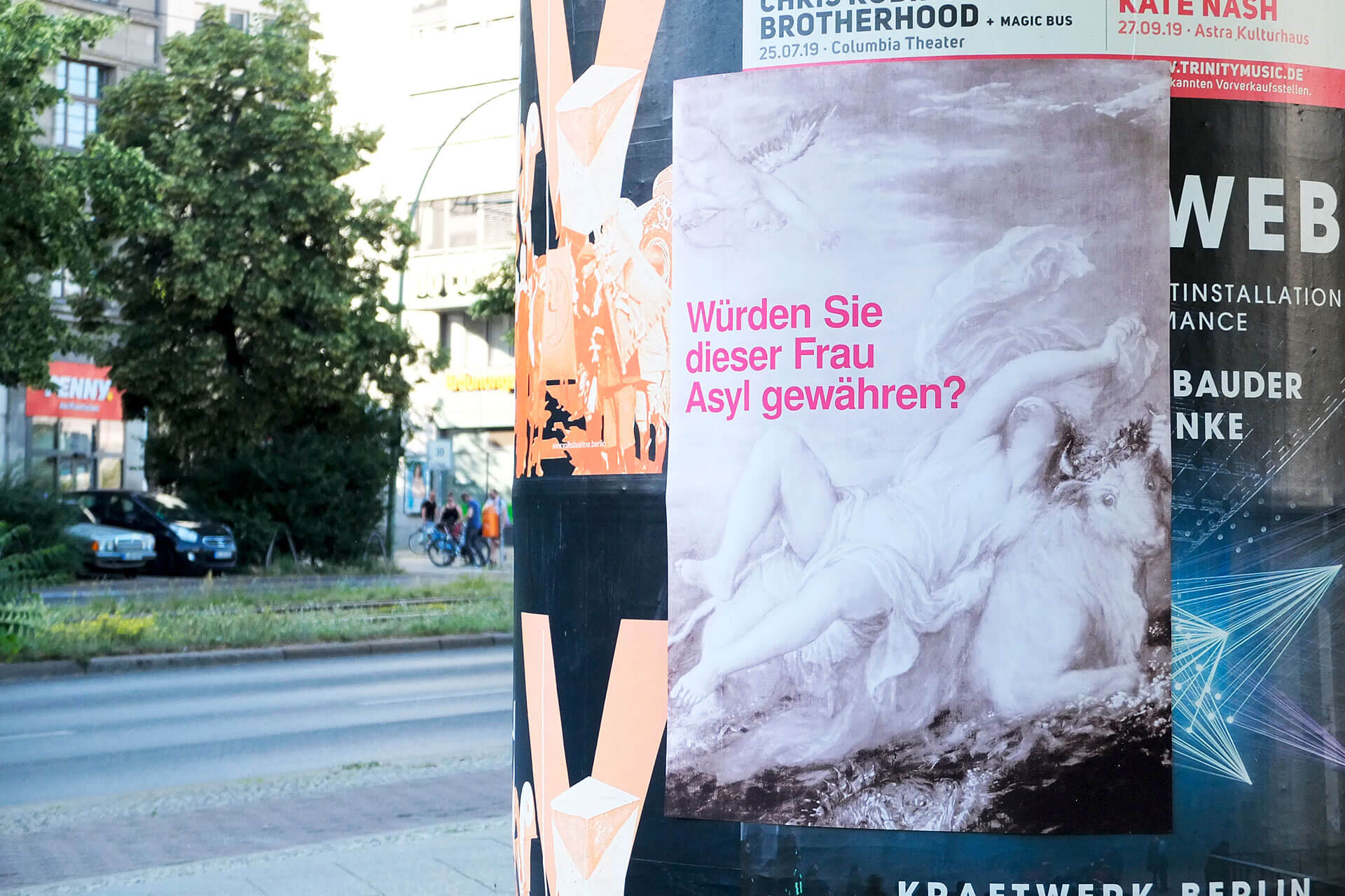
5. Europa! – Shortlist for 2018's MUT ZUR WUT poster competition, a homage to Klaus Staek.
6. Vote Love 2019 – Self-initiated online+print campaign to promote voter participation at the EU election.
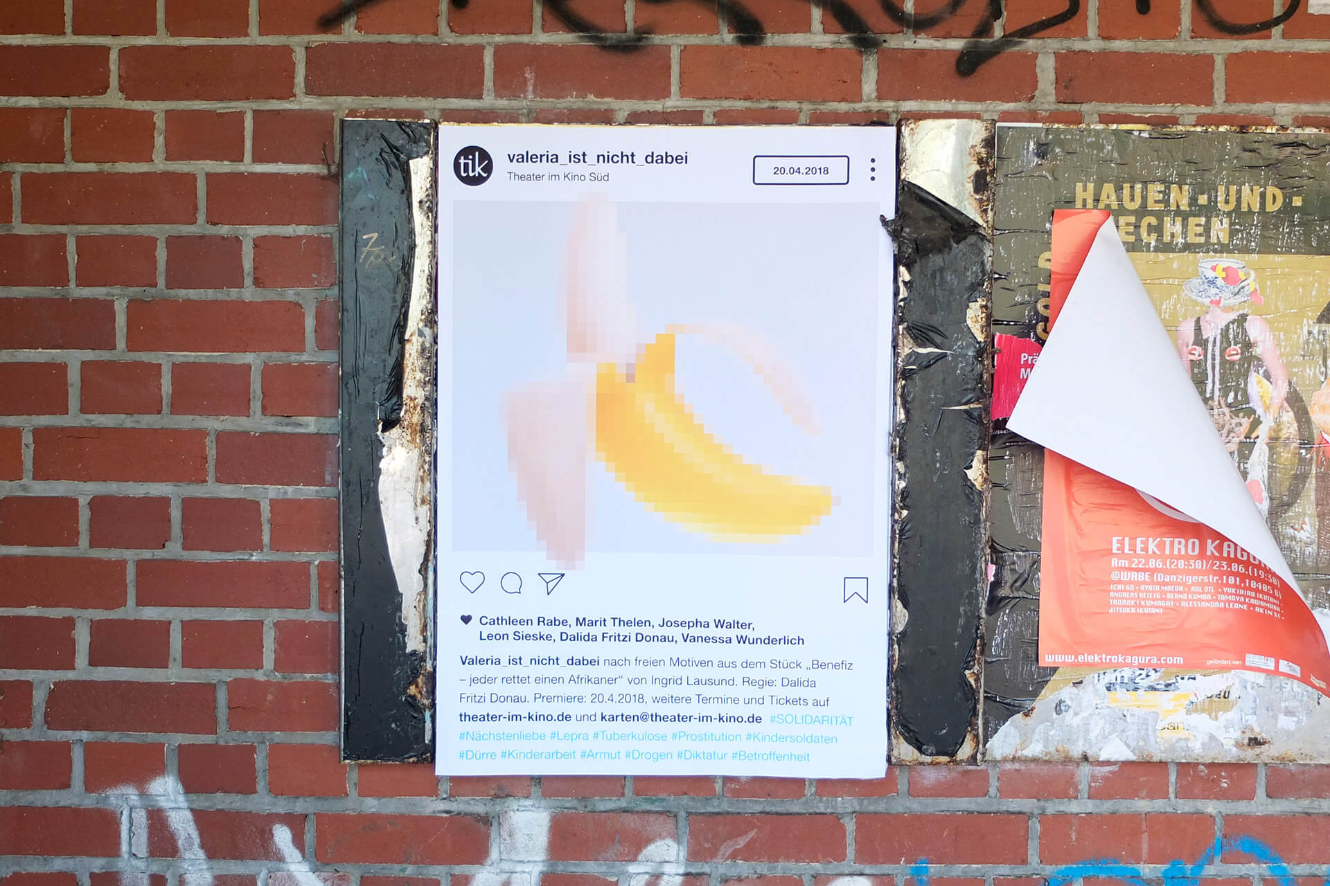
7. Valeria_ist_nicht_dabei – Poster announcing a theater play by young indepentend actors/writers in Berlin.
1. zen sekunden zen (ten seconds zen) – Winning design for a competition held by the City of Salzburg. // 2. System Error – Winning design for a competition held within the framework of Vienna Design Week '18. // 3. Face a History Book – Poster included in the “studio protest” exhibition at Vienna Design Week '18. // 4. Investment Advice – Poster included in the “studio protest” exhibition at Vienna Design Week '18. // 5. Europa! – Shortlist for 2018's MUT ZUR WUT poster competition, a homage to Klaus Staek. // 6. Vote Love 2019 – Self-initiated online+print campaign to promote voter participation at the EU election. //
7. Valeria_ist_nicht_dabei – Poster announcing a theater play by young indepentend actors/writers in Berlin.
3.
“Don’t settle for black and white” with this conceptual photo-essay in two parts, poetically invoking the everyday dystopia of Brexit-London. Get a copy here.
1.
“Don't settle for black and white” with this conceptual photo-essay in two parts, poetically invoking the everyday dystopia of Brexit-London.
Get a copy here.
1.
Conceptual photo-essay in two parts. Get a copy here.
2.
Conceptual photo-essay in two parts. Get a copy here.
Editorial Design
Graphic Design
Concept
Writing
Editorial Design, Graphic Design, Concept, Writing
Editorial Design, Graphic Design, Concept, Writing

FOR:
Zita Oberwalder
IN:
2019
WITH:
Zita Oberwalder,
Kate Howlett-Jones
winner of the Austrian state award 2019:
"Die schönsten Bücher Österreichs"
FOR: Zita Oberwalder IN: 2019 WITH: Zita Oberwalder, Kate Howlett-Jones
FOR: Zita Oberwalder IN: 2019 WITH: Zita Oberwalder, Kate Howlett-Jones
Award winning photo catalog with accompanying “newspaper” documenting the latest series by fine art photographer Zita Oberwalder. It’s a visual dialogue with the socio-political situation of London after the Brexit referendum. The leading design elements arise from the content: Pantone Reflex Blue appears both in the flags of the UK and the EU. The typeface “New Transport” by London-based foundry A2-Type is an update on the classic british roadsign type from the 60’s. The work also features some of my writing, translated into Englisch by Howlett-Jones.
A photo catalog with accompanying “newspaper” documenting the latest series by fine art photographer Zita Oberwalder. It’s a visual dialogue with the socio-political situation of London after the Brexit referendum. The leading design elements arise from the content: Pantone Reflex Blue appears both in the flags of the UK and the EU. The typeface “New Transport” by London-based foundry A2-Type is an update on the classic british roadsign type from the 60’s. The work also features some of my writing, translated into Englisch by Howlett-Jones.
A photo catalog with accompanying “newspaper” documenting the latest series by fine art photographer Zita Oberwalder. It’s a visual dialogue with the socio-political situation of London after the Brexit referendum. The leading design elements arise from the content: Pantone Reflex Blue appears both in the flags of the UK and the EU. The typeface “New Transport” by London-based foundry A2-Type is an update on the classic british roadsign type from the 60’s. The work also features some of my writing, translated into Englisch by Howlett-Jones.
4.
“Beta” versions + co-design + flexibility = a corporate design refresh for a cultural/art institution in Berlin that didn’t want to have a “corporate” design.
2.
corporate design refresh for a cultural/art institution in Berlin.
3.
corporate design refresh for a cultural/art institution in Berlin.
Visual Identity
Concept
Editorial Design
Graphic Design
Web Design
Visual Identity, Concept, Editorial Design, Graphic Design, Web Design
Visual Identity, Concept, Editorial Design, Graphic Design, Web Design

FOR:
ZK/U — Zentrum für Kunst und Urbanistik Berlin
IN:
2017–early 2019
WITH:
ZK/U Team + Interns;
ZK/U Residents
FOR: ZK/U — Zentrum für Kunst und Urbanistik Berlin IN: 2017–early 2019 WITH: ZK/U Team + Interns; ZK/U Residents
FOR: ZK/U — Zentrum für Kunst und Urbanistik Berlin IN: 2017–early 2019 WITH: ZK/U Team + Interns; ZK/U Residents
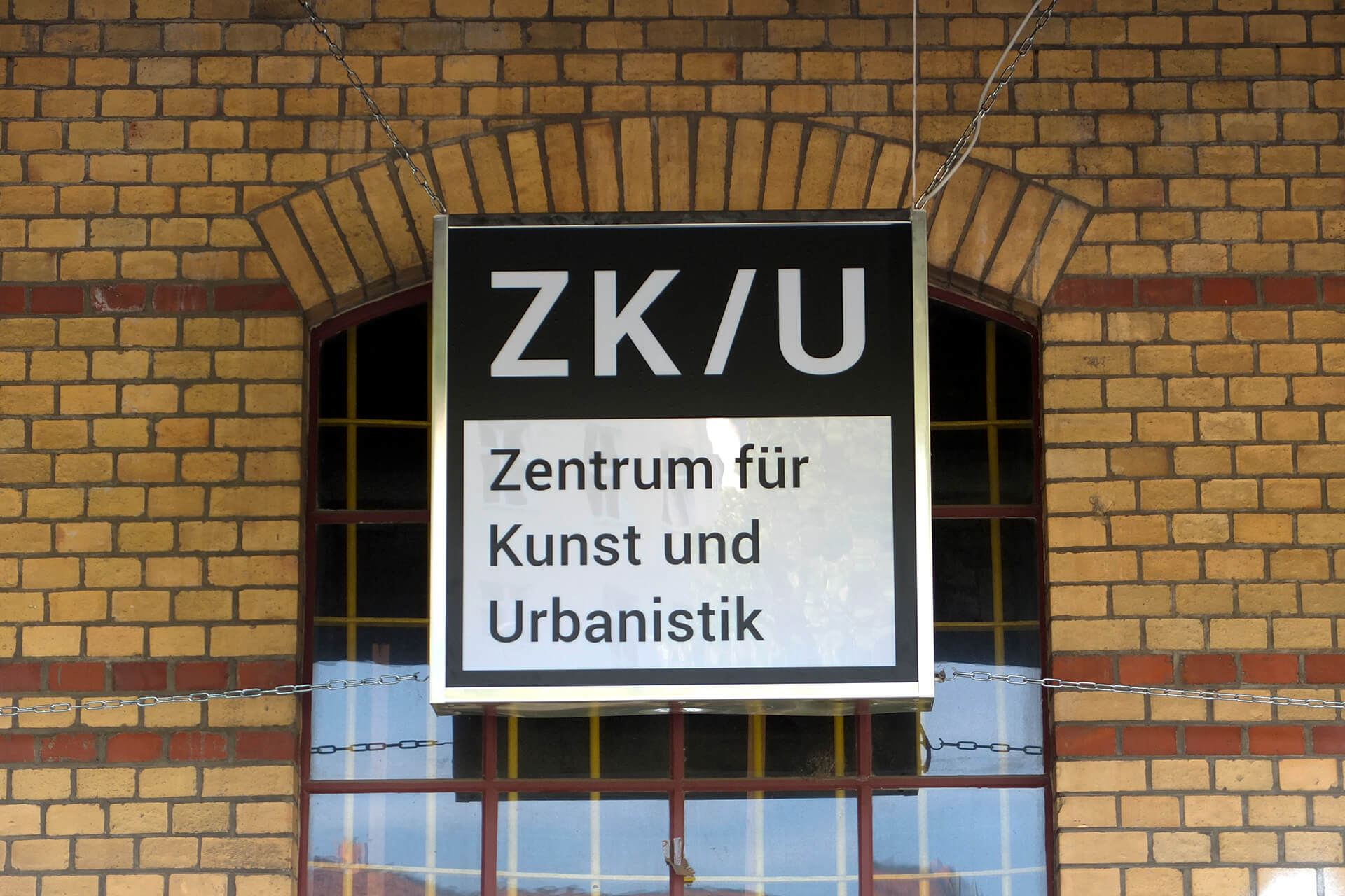
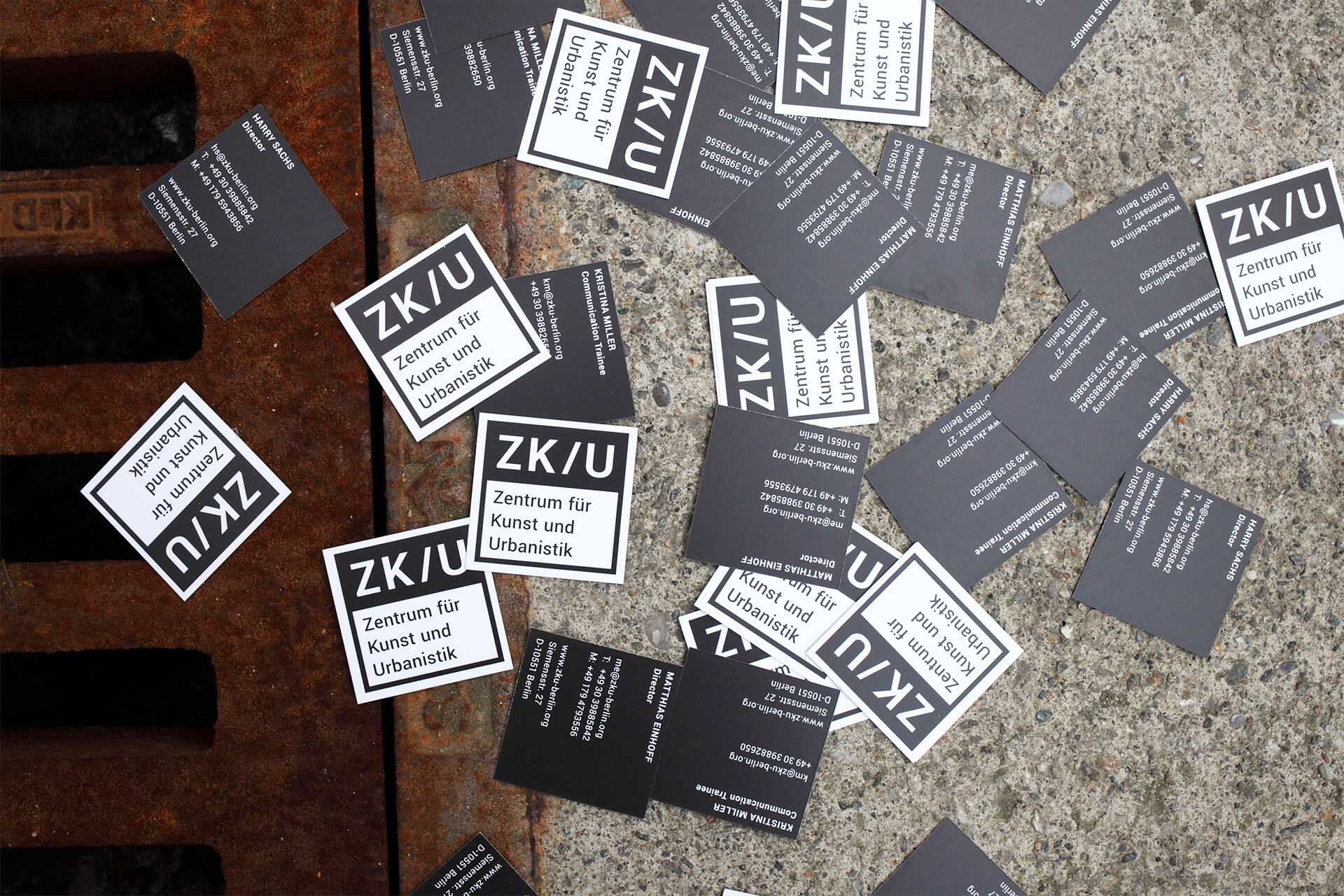
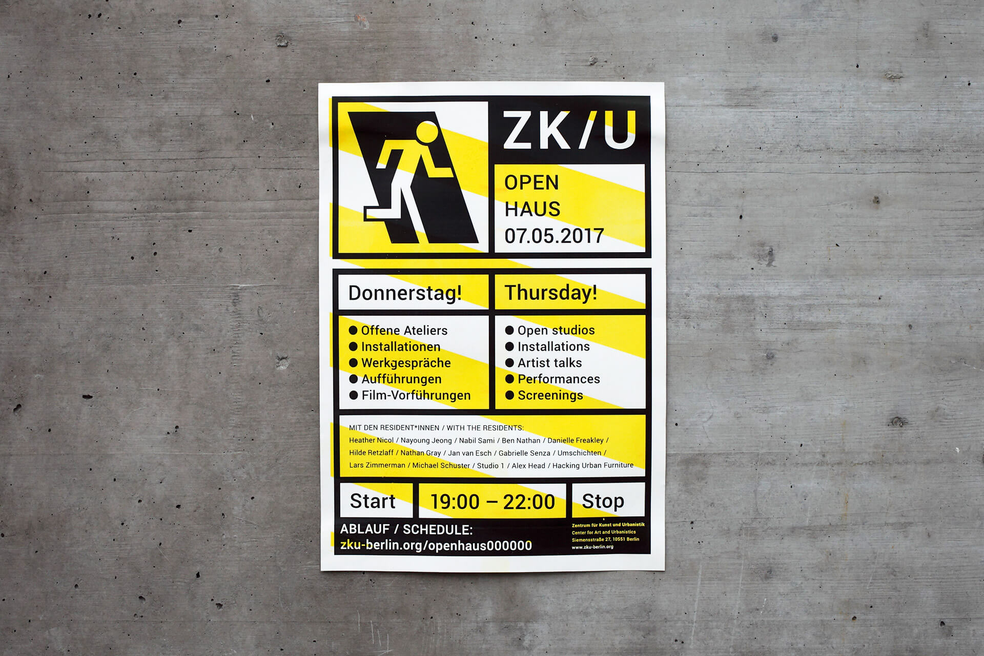
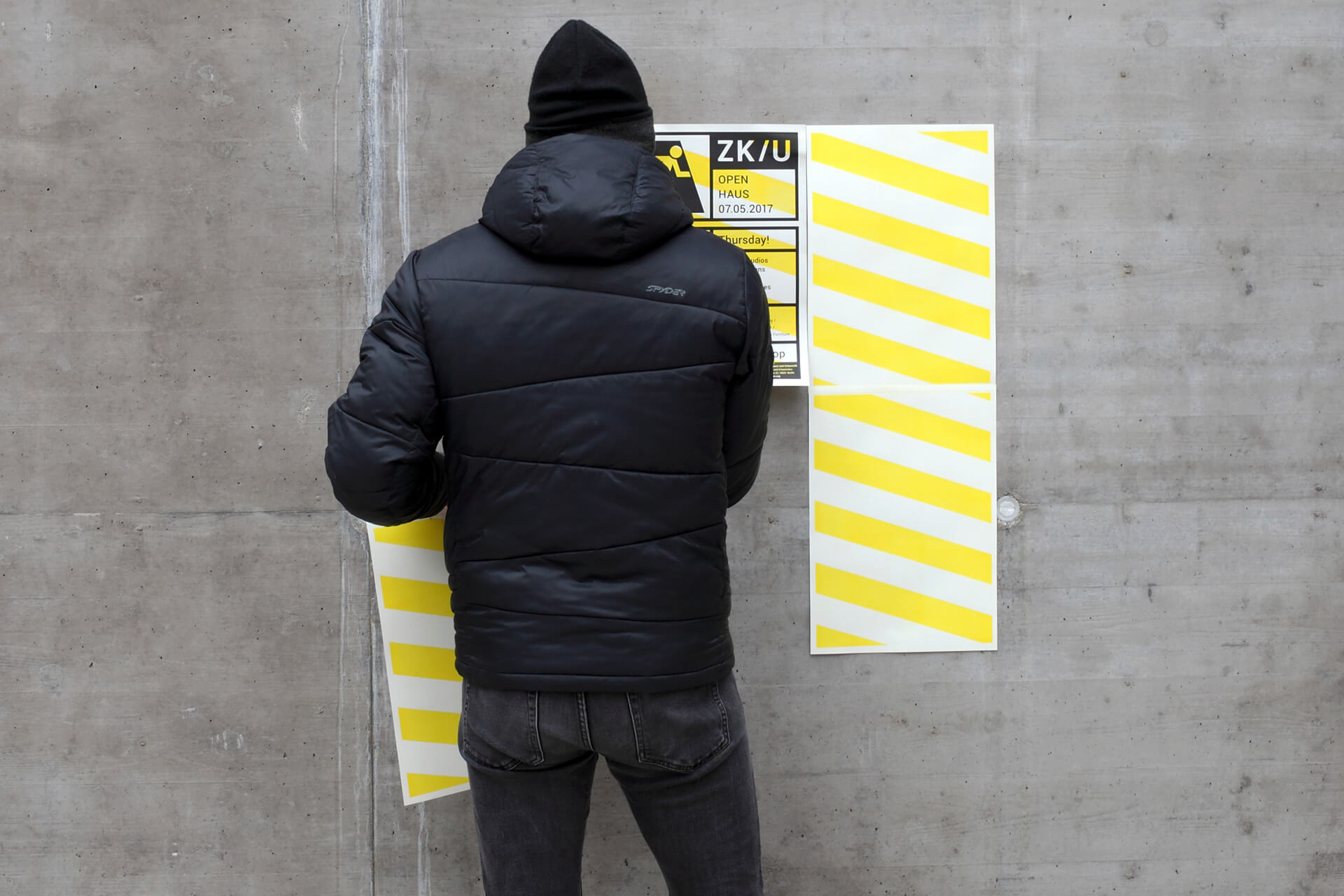
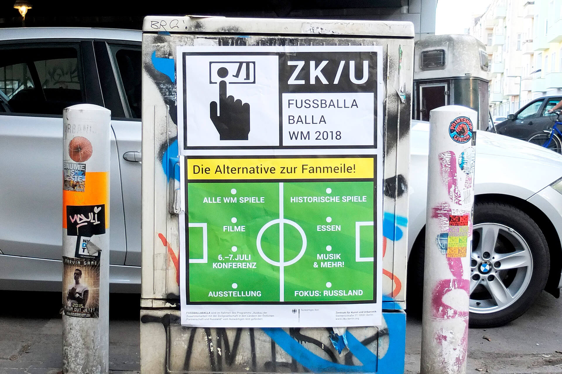
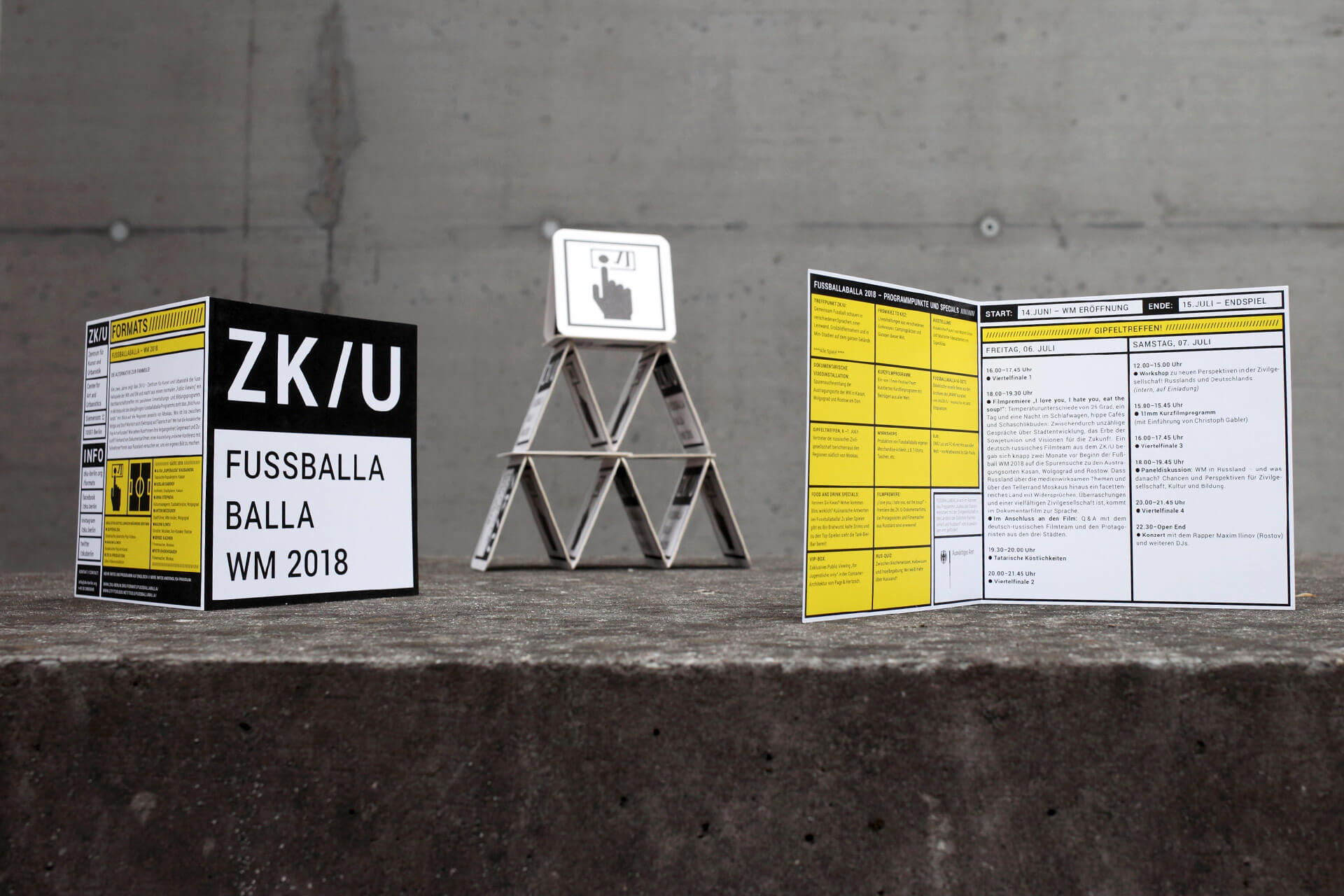
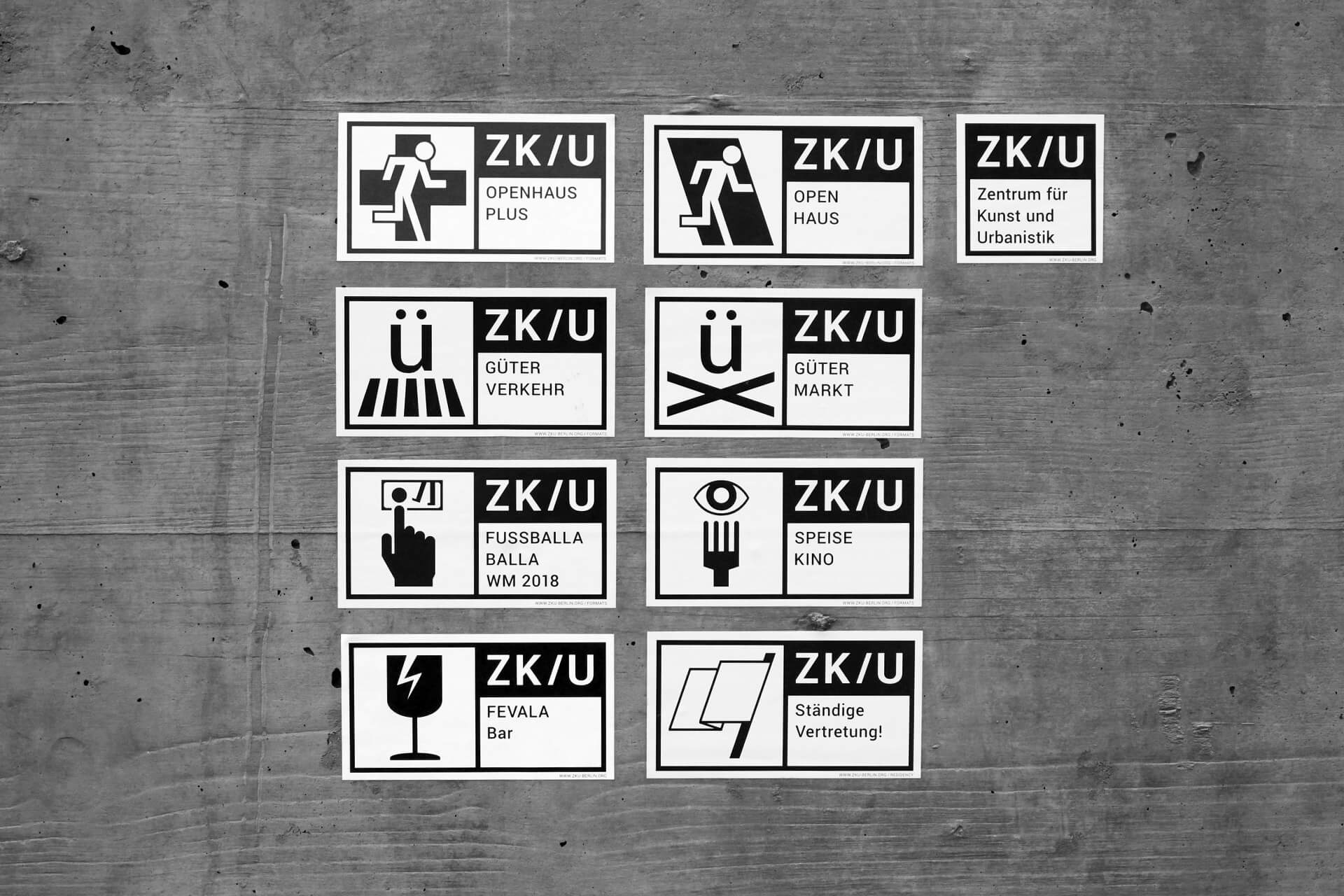
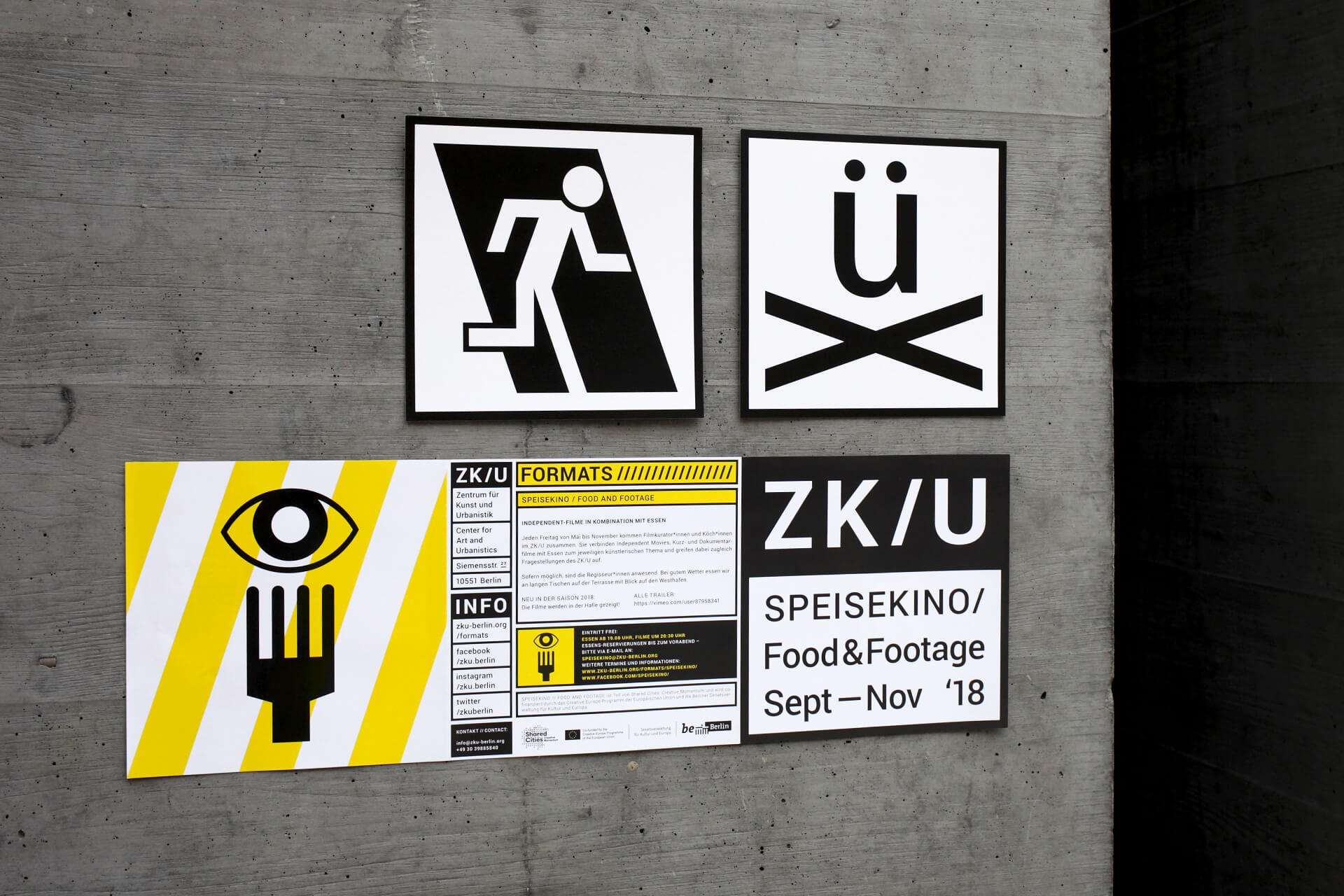
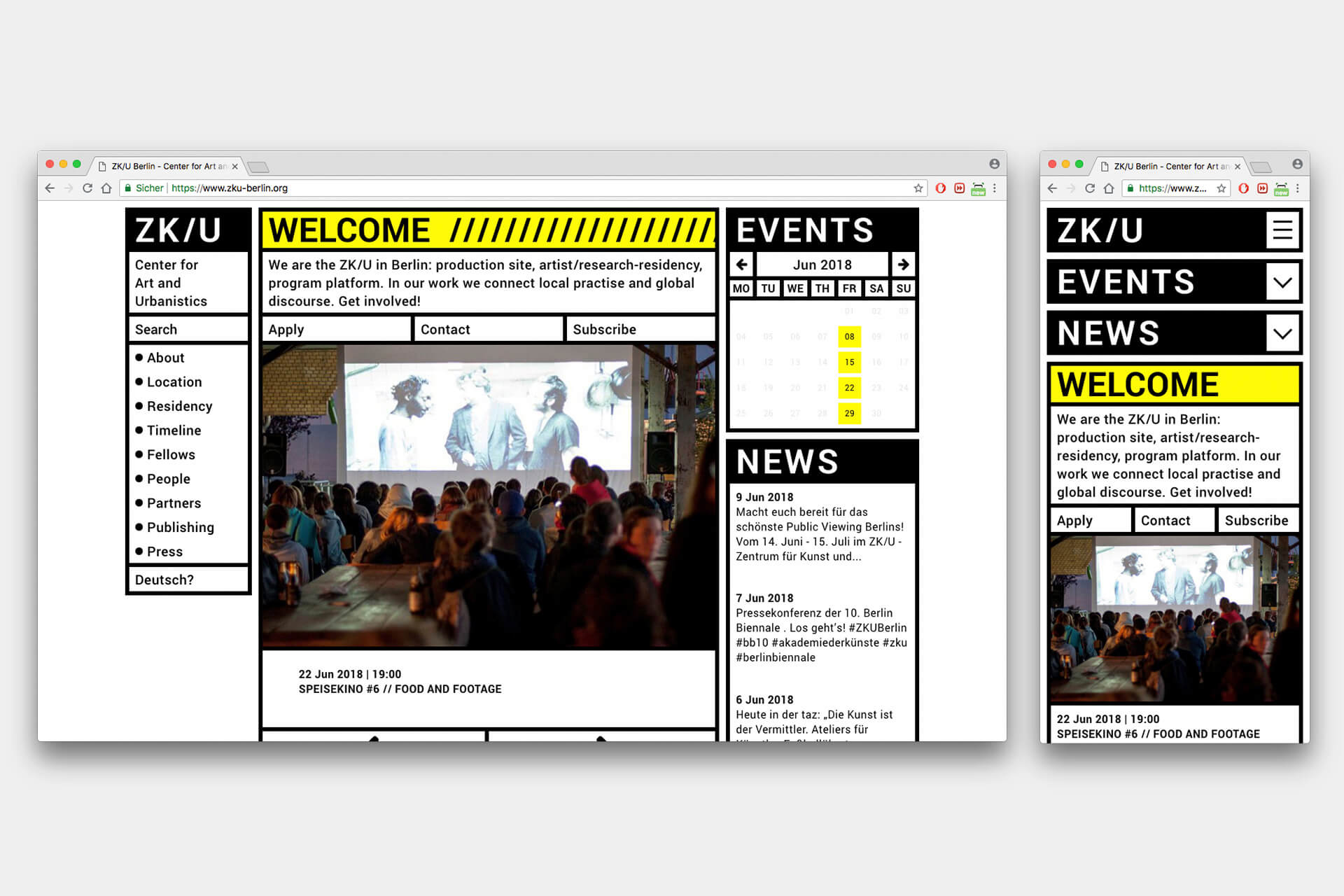
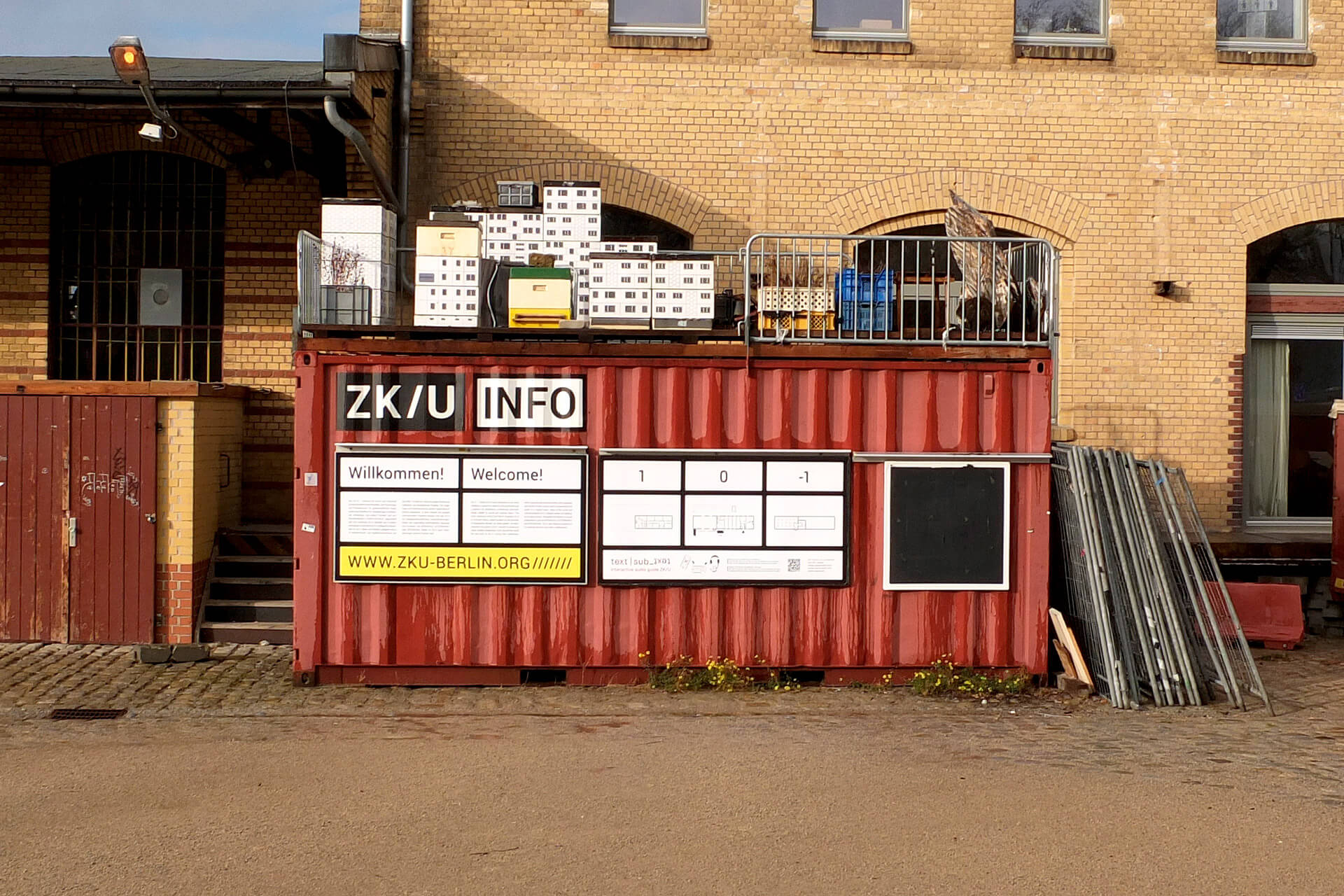
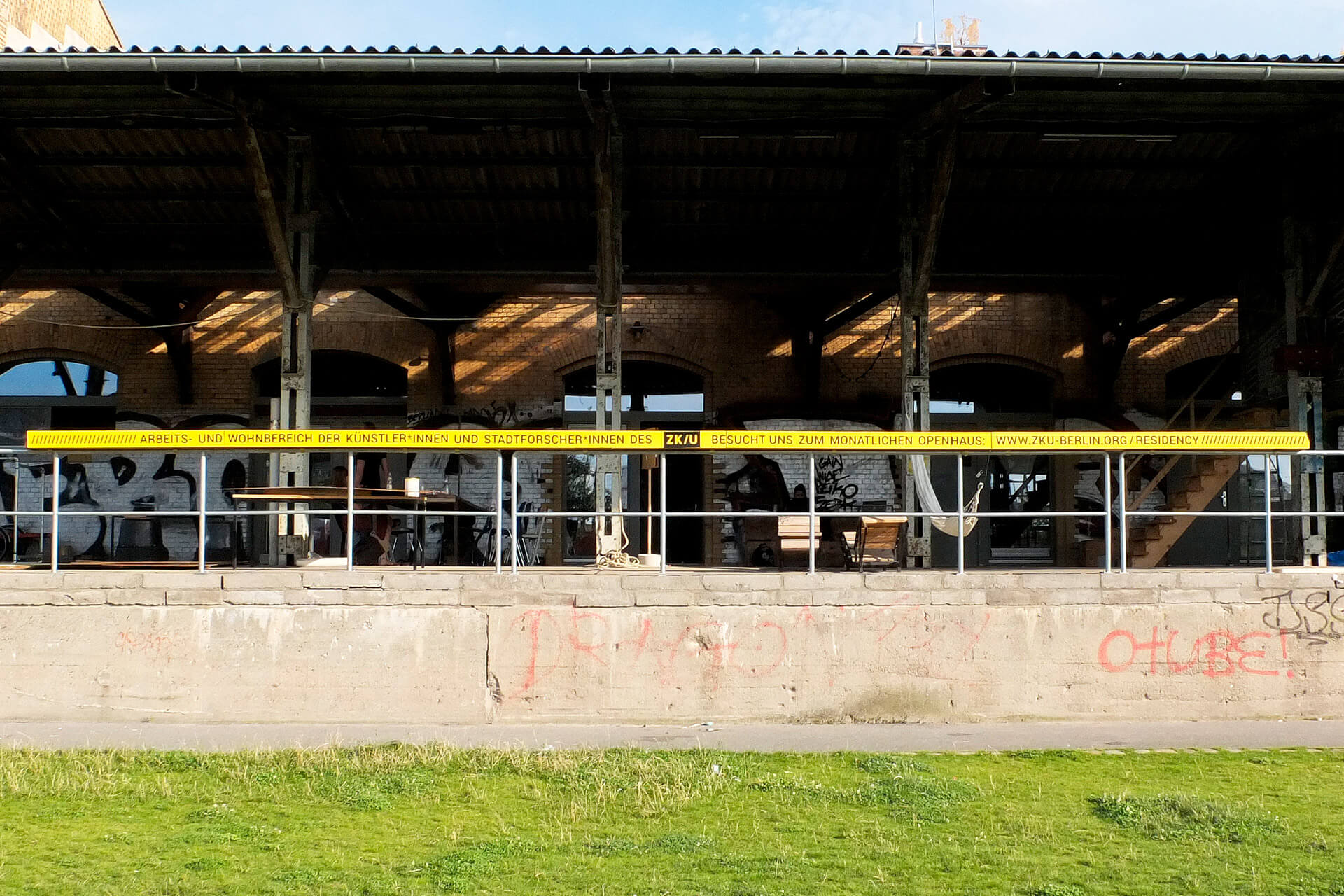
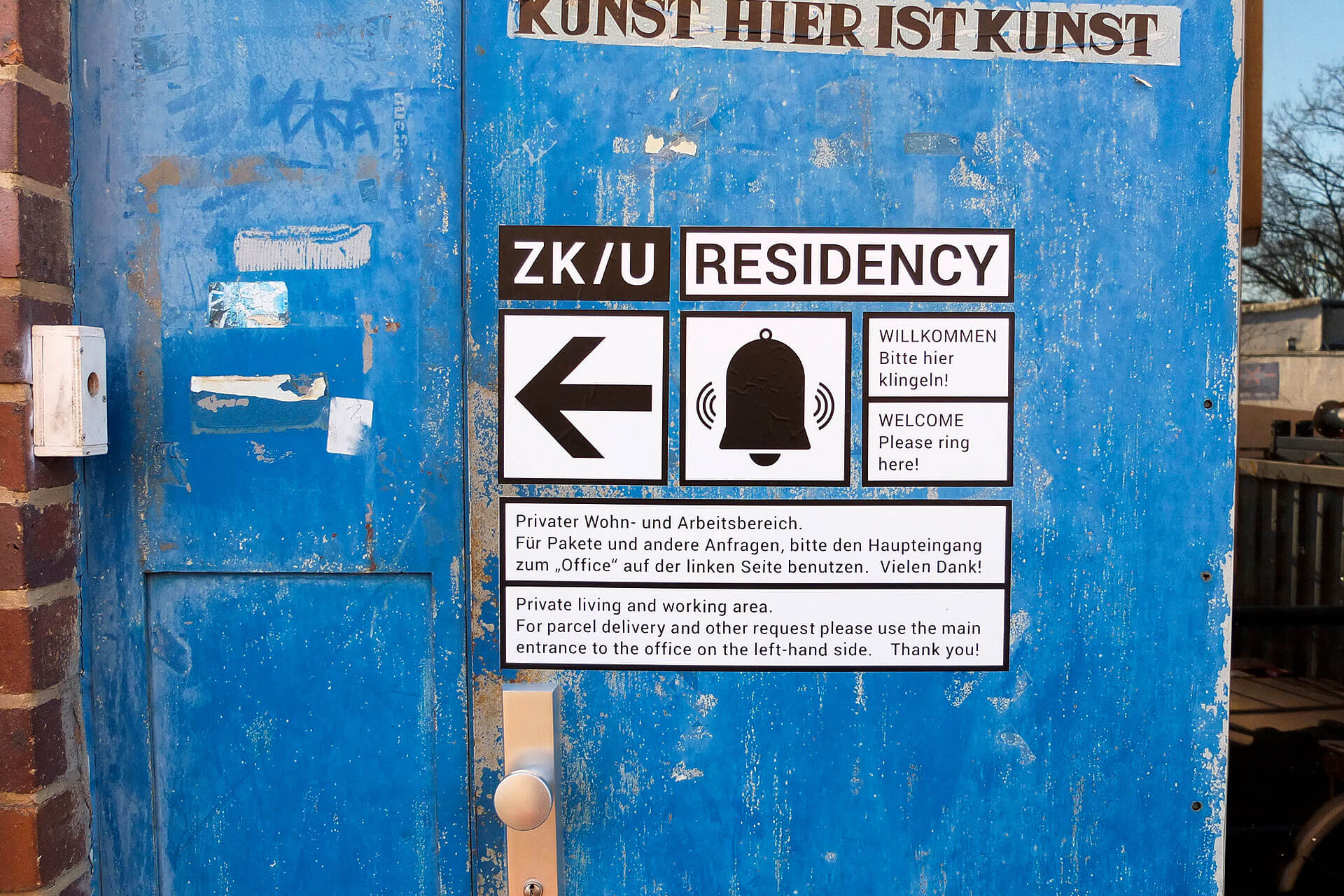
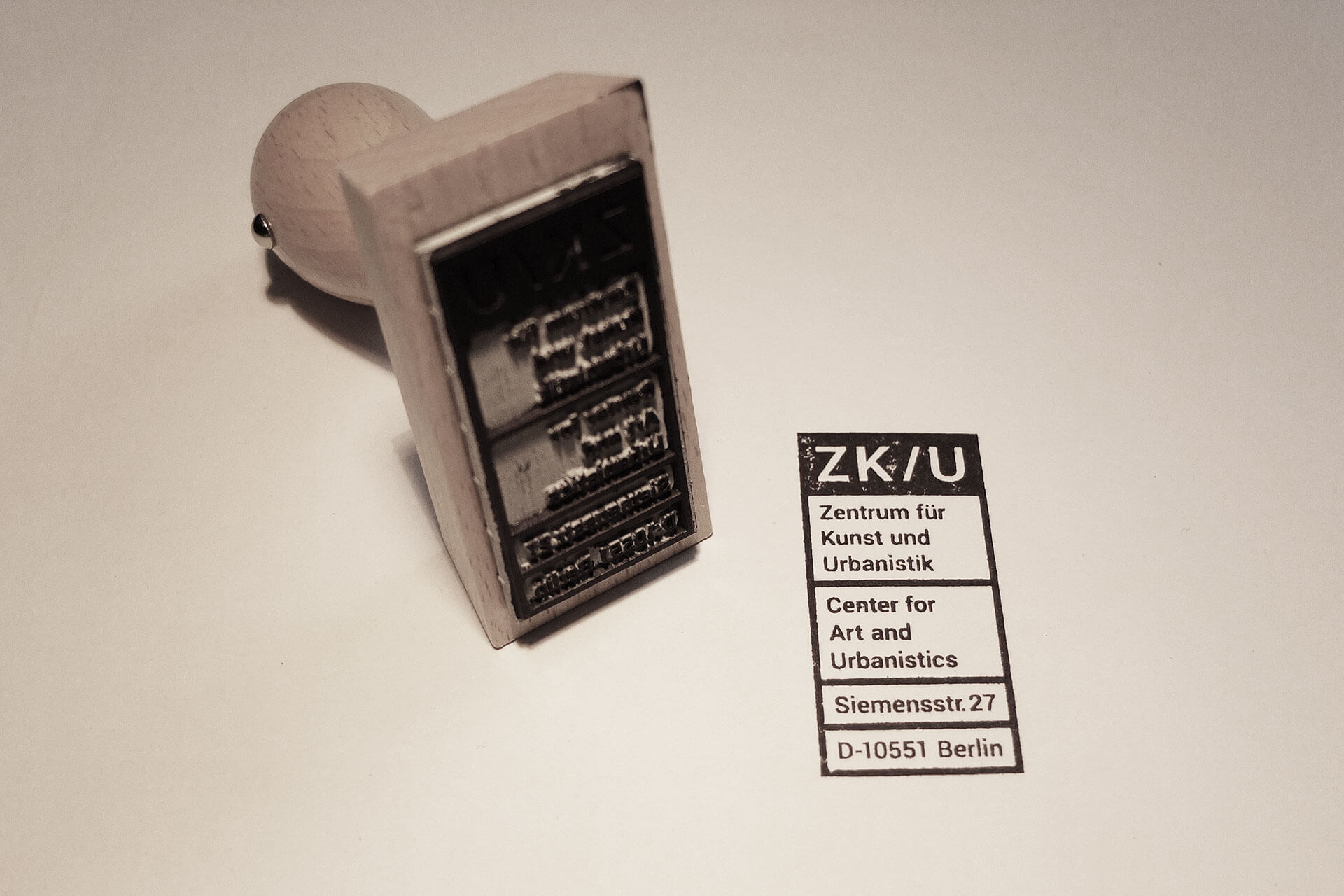
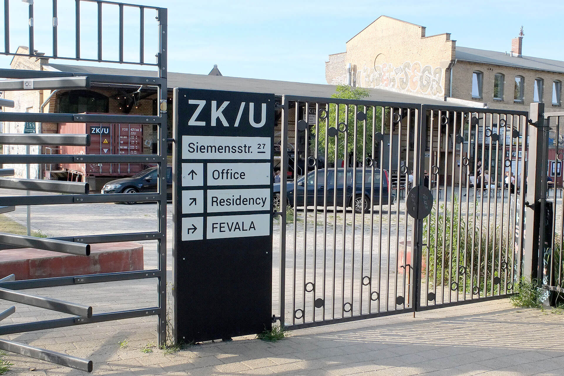
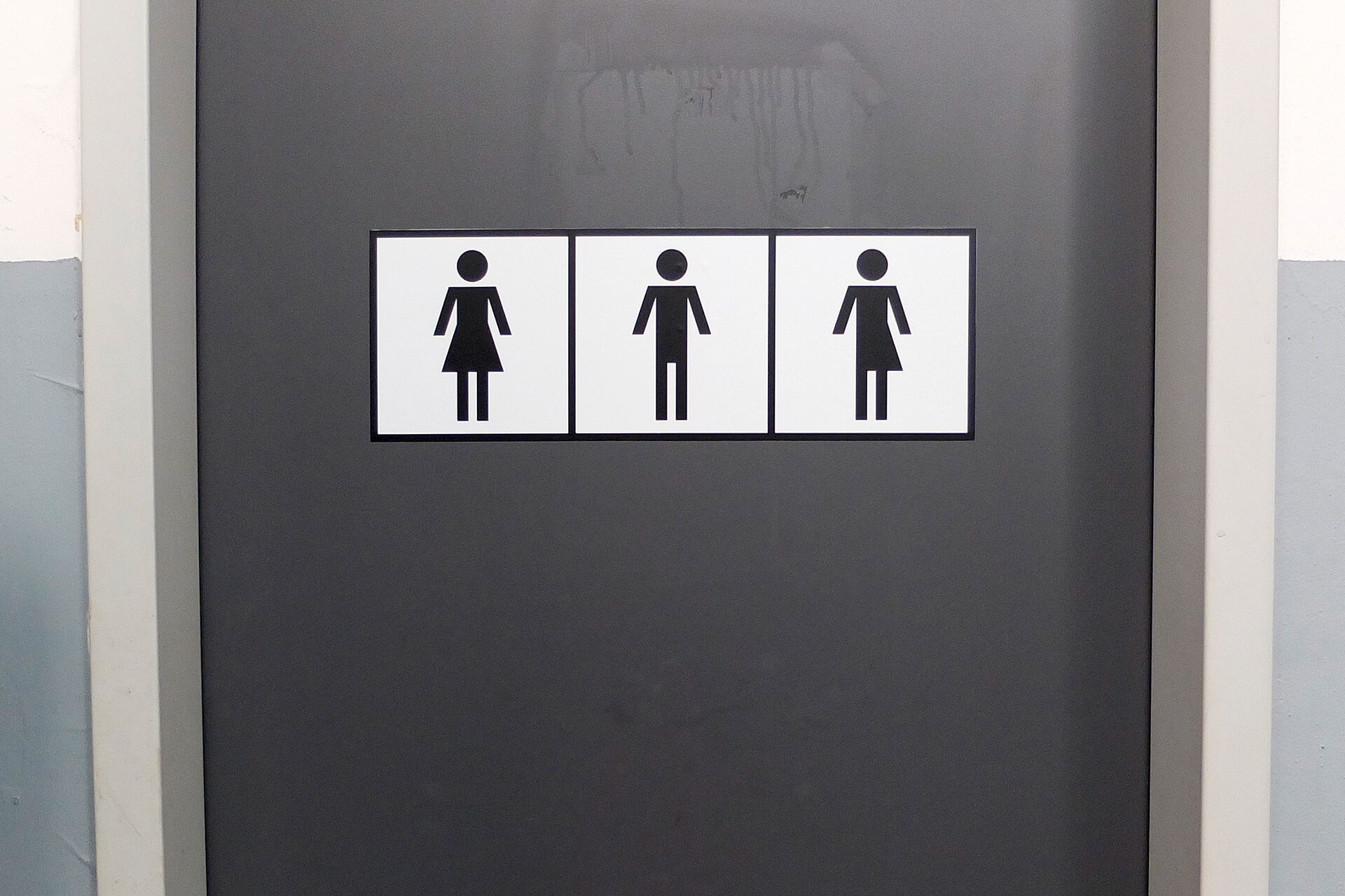
Corporate design refresh including logos, business cards, letter heads, posters, flyer, postcards, stamps, stickers, websites and signage on-site. As a cultural instution, ZK/U often conveys the distinct DIY-charm of artistic communities, with a fair amount of bottum-up anti-establishment thinking. So its visual identity had to be flexible and open-source, while remaining logical, bold and distinct. The style was inspired by shipping containers, industry standards and warning signs. After all, the “Center for Art and Urbanistics” is located in a former railway depot in Berlin-Moabit, often reminiscent of industrial/urban construction sites.
Corporate design refresh including logos, business cards, letter heads, posters, flyer, postcards, stamps, stickers, websites and signage on-site. As a cultural instution, ZK/U often conveys the distinct DIY-charm of artistic communities, with a fair amount of bottum-up anti-establishment thinking. So its visual identity had to be flexible and open-source, while remaining logical, bold and distinct. The style was inspired by shipping containers, industry standards and warning signs. After all, the “Center for Art and Urbanistics” is located in a former railway depot in Berlin-Moabit, often reminiscent of industrial/urban construction sites.
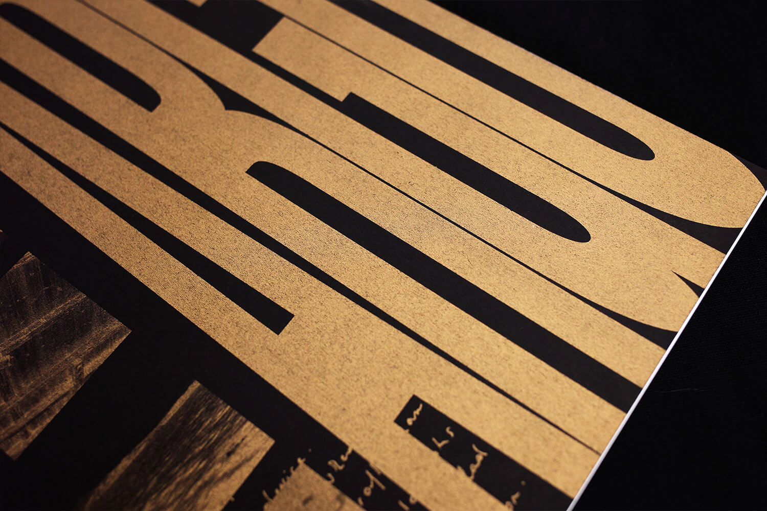
5.
Editorial design is archival work: this concept-driven photo catalogue relies heavily on visual quotes and literary cross references.
3.
Concept-driven photo book heavy on (visual) quotes.
4.
Concept-driven photo book heavy on (visual) quotes.
Editorial Design
Graphic Design
Concept
Research
Writing
Editorial Design
Graphic Design
Concept
Research
Writing
Editorial Design, Graphic Design, Concept, Research, Writing
Editorial Design, Graphic Design, Concept, Research, Writing

FOR:
Zita Oberwalder
IN:
2017
WITH:
Zita Oberwalder
FOR: Zita Oberwalder IN: 2017 WITH: Zita Oberwalder
FOR: Zita Oberwalder IN: 2017 WITH: Zita Oberwalder
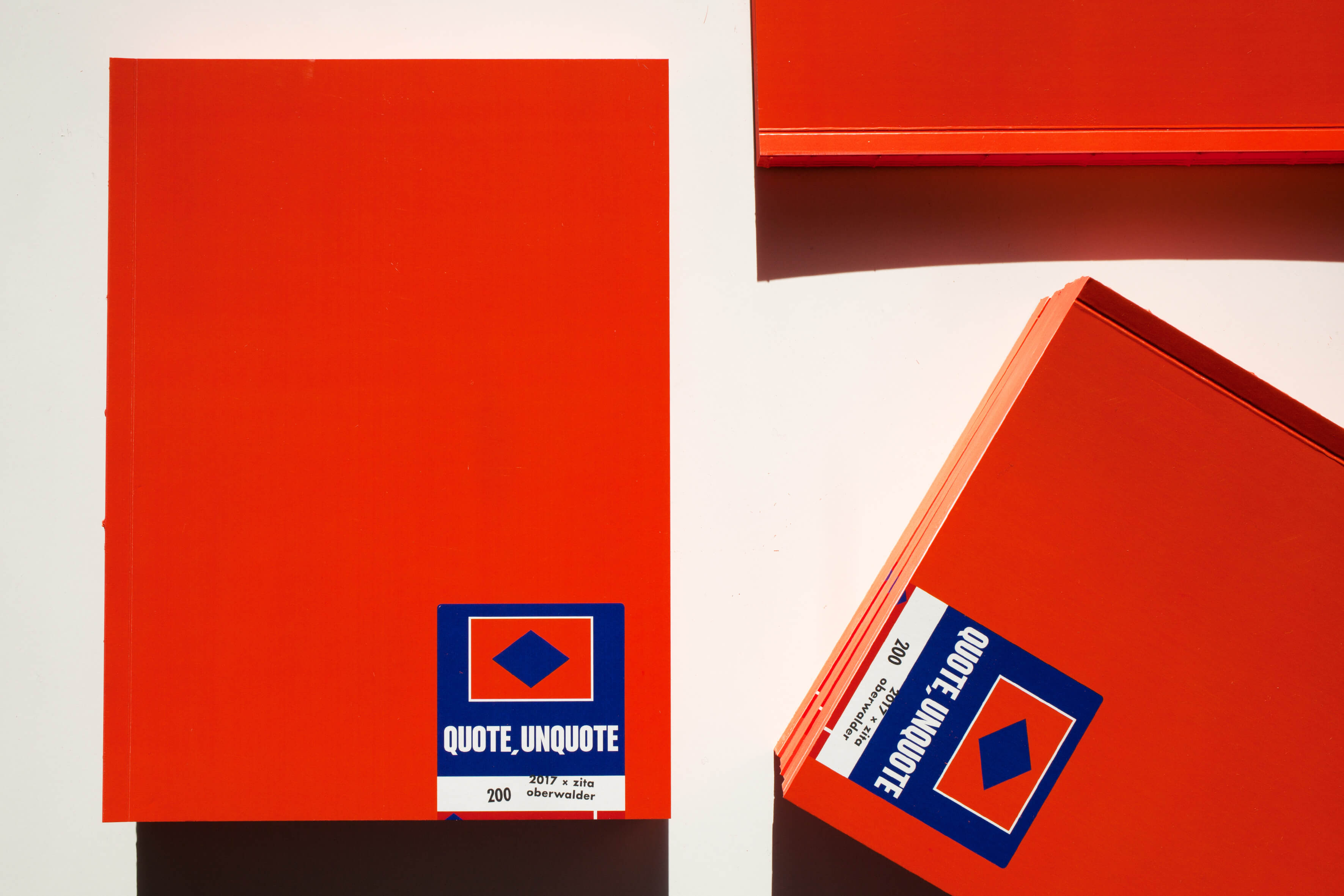
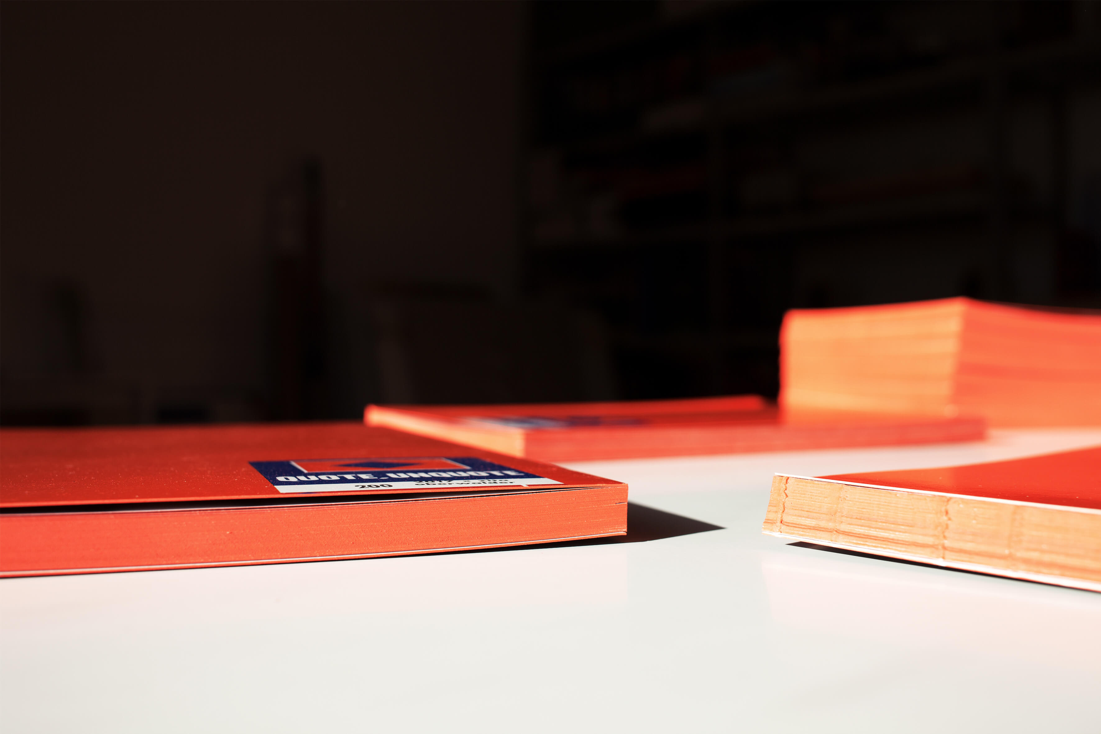
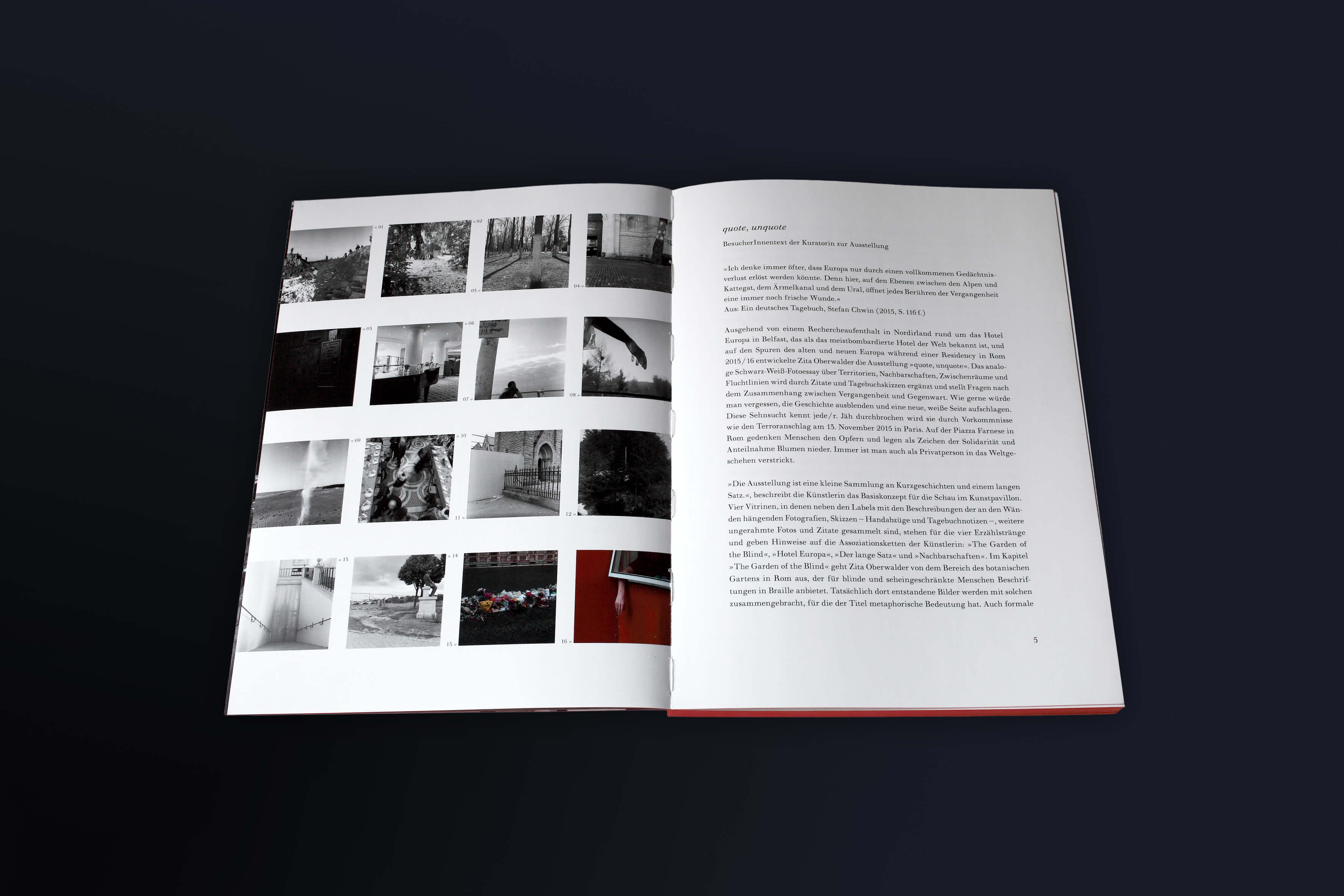
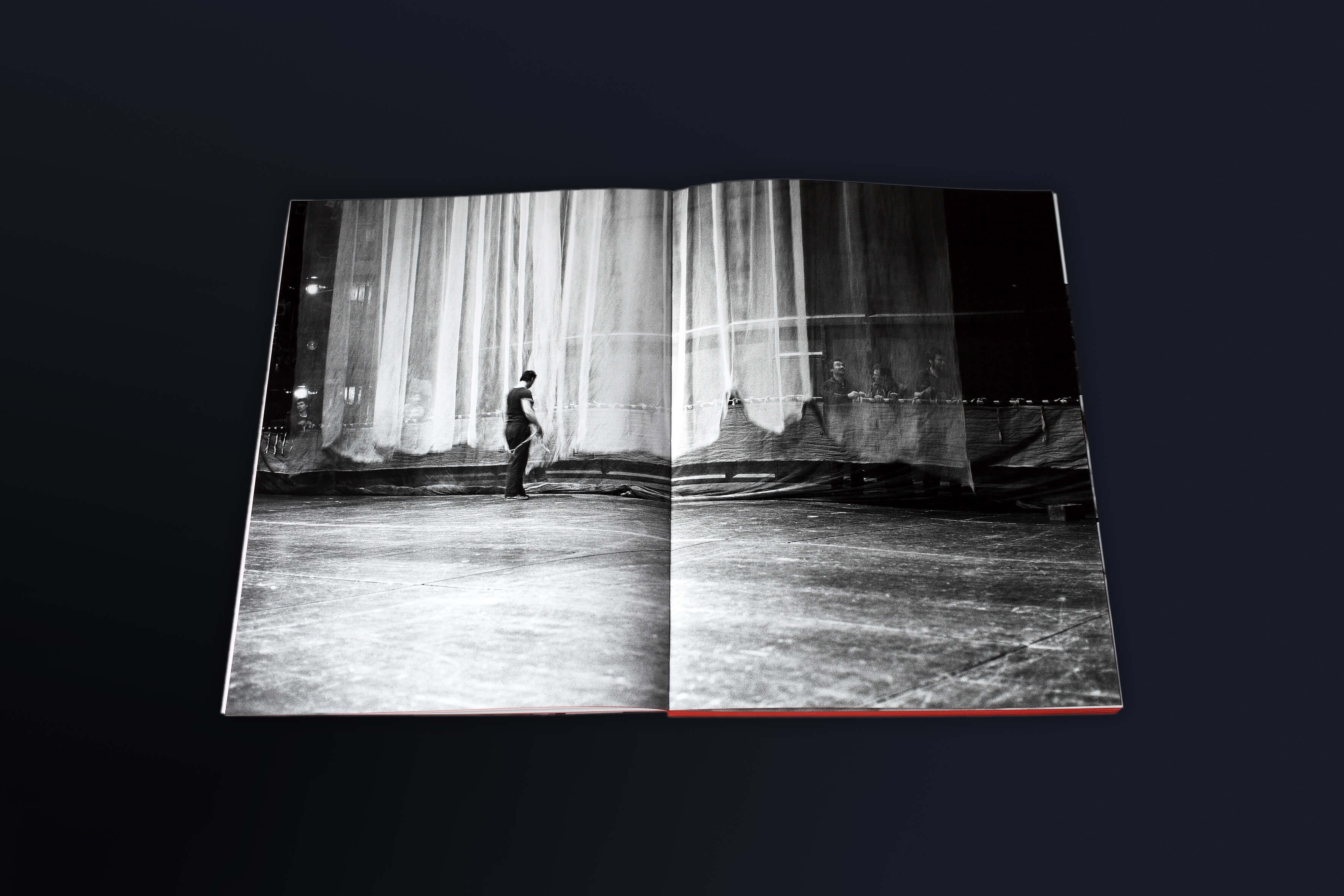
The catalogue’s cover design was inspired by classic “Ilford” photo paper boxes. Its interior picks up on the editorial design of a book by Erich Fried from 1980 on Ingeborg Bachman’s poem “Bohemia lies by the Sea”. I also wrote a ten page long analysis (in German language) based on several interviews with the artist and a relevant literature research on the topic of “non-places”—a recurring theme in her work.
The catalogue’s cover design was inspired by classic “Ilford” photo paper boxes. Its interior picks up on the editorial design of a book by Erich Fried from 1980 on Ingeborg Bachman's poem “Bohemia lies by the Sea”. I also wrote a ten page long analysis (in German language) based on several interviews with the artist and a relevant literature research on the topic of “non-places” – a recurring theme in her work.
6.
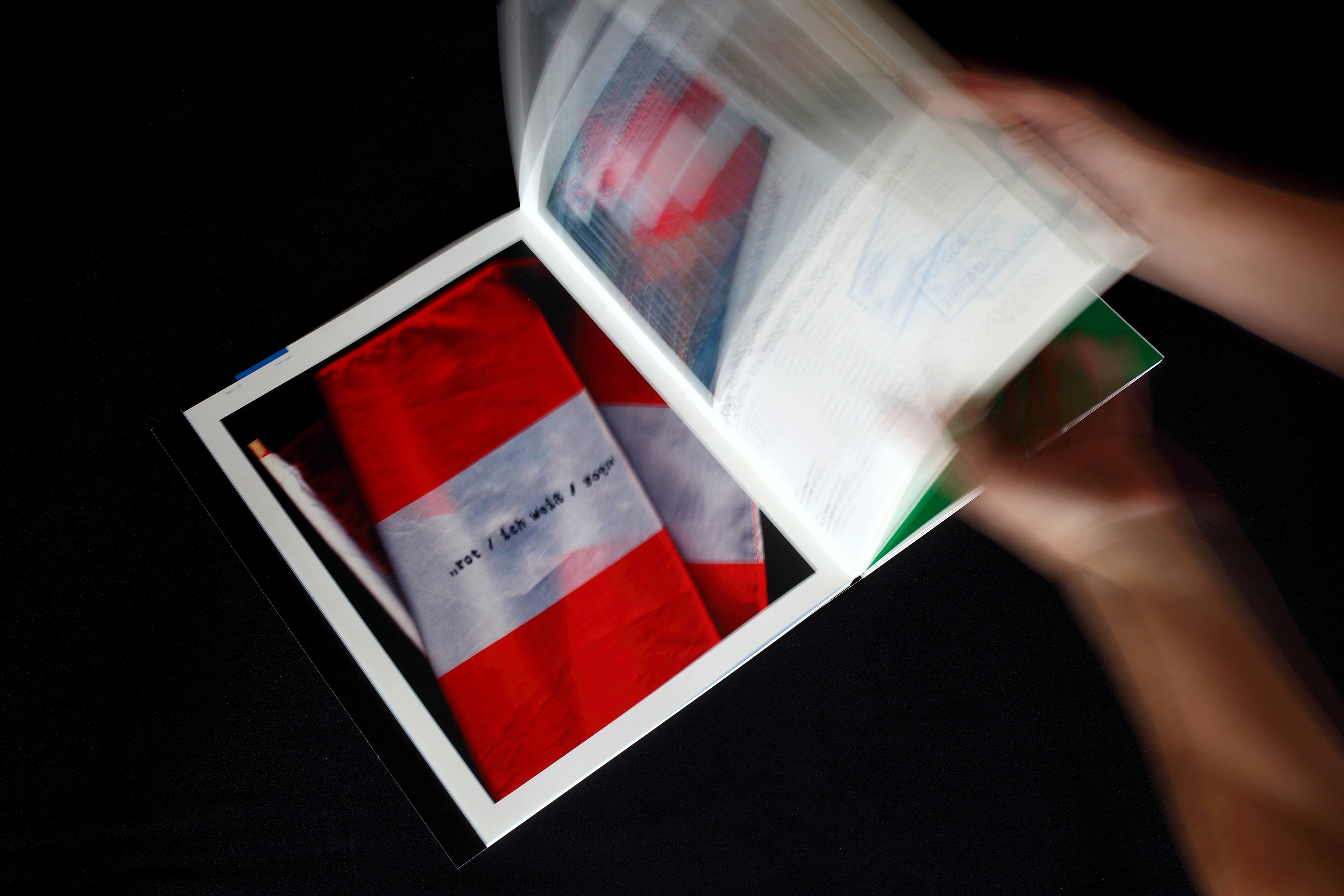
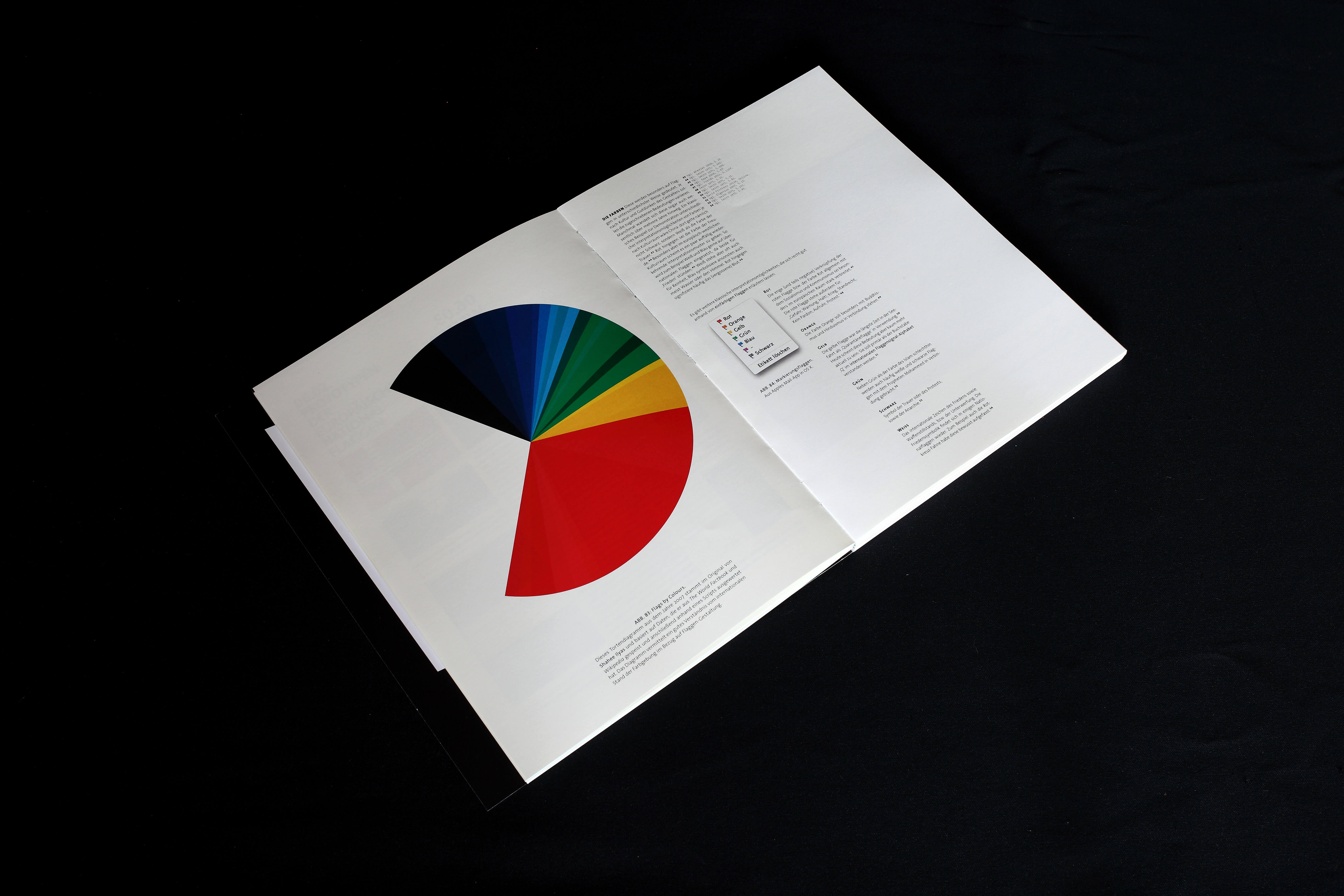
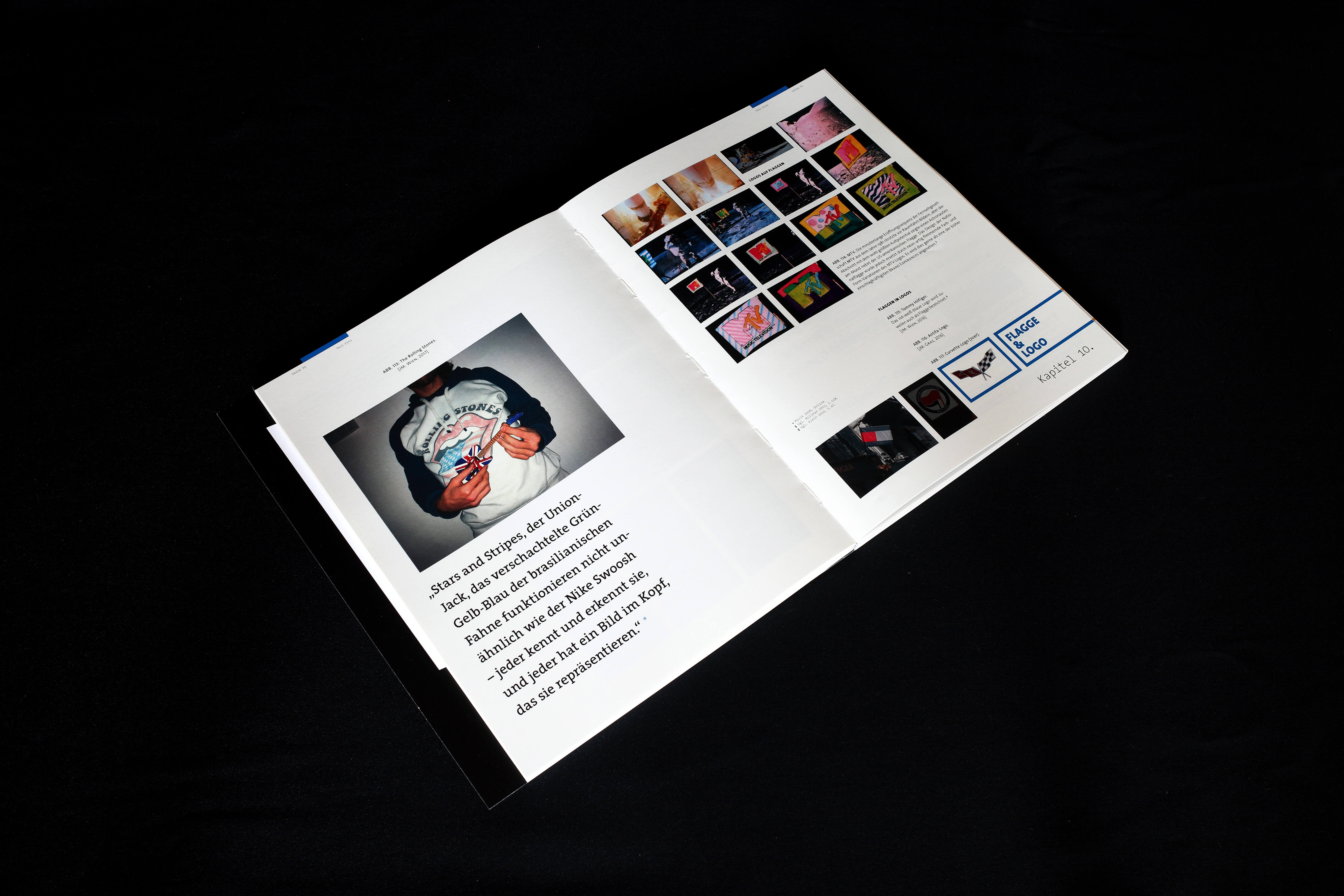
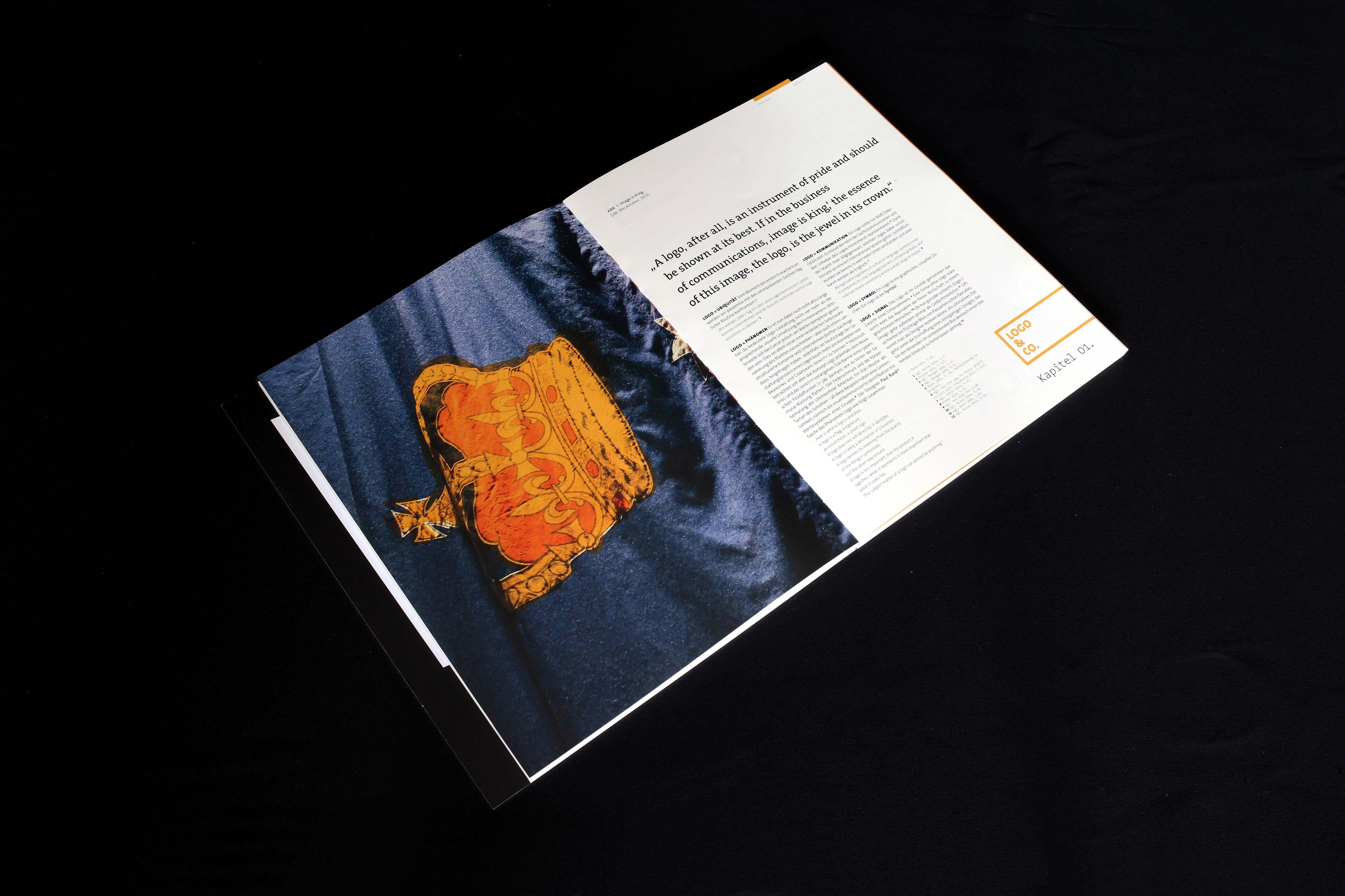
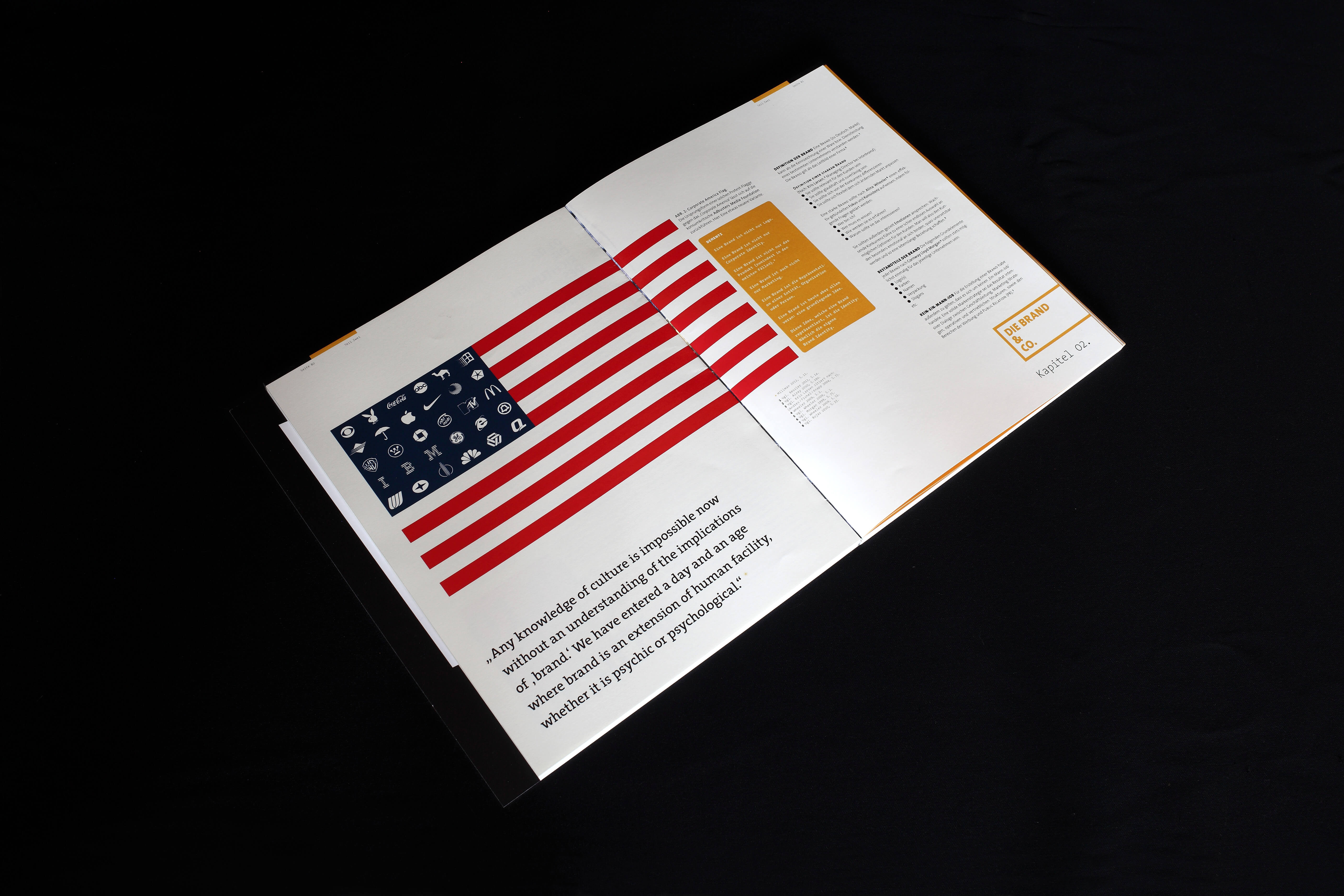
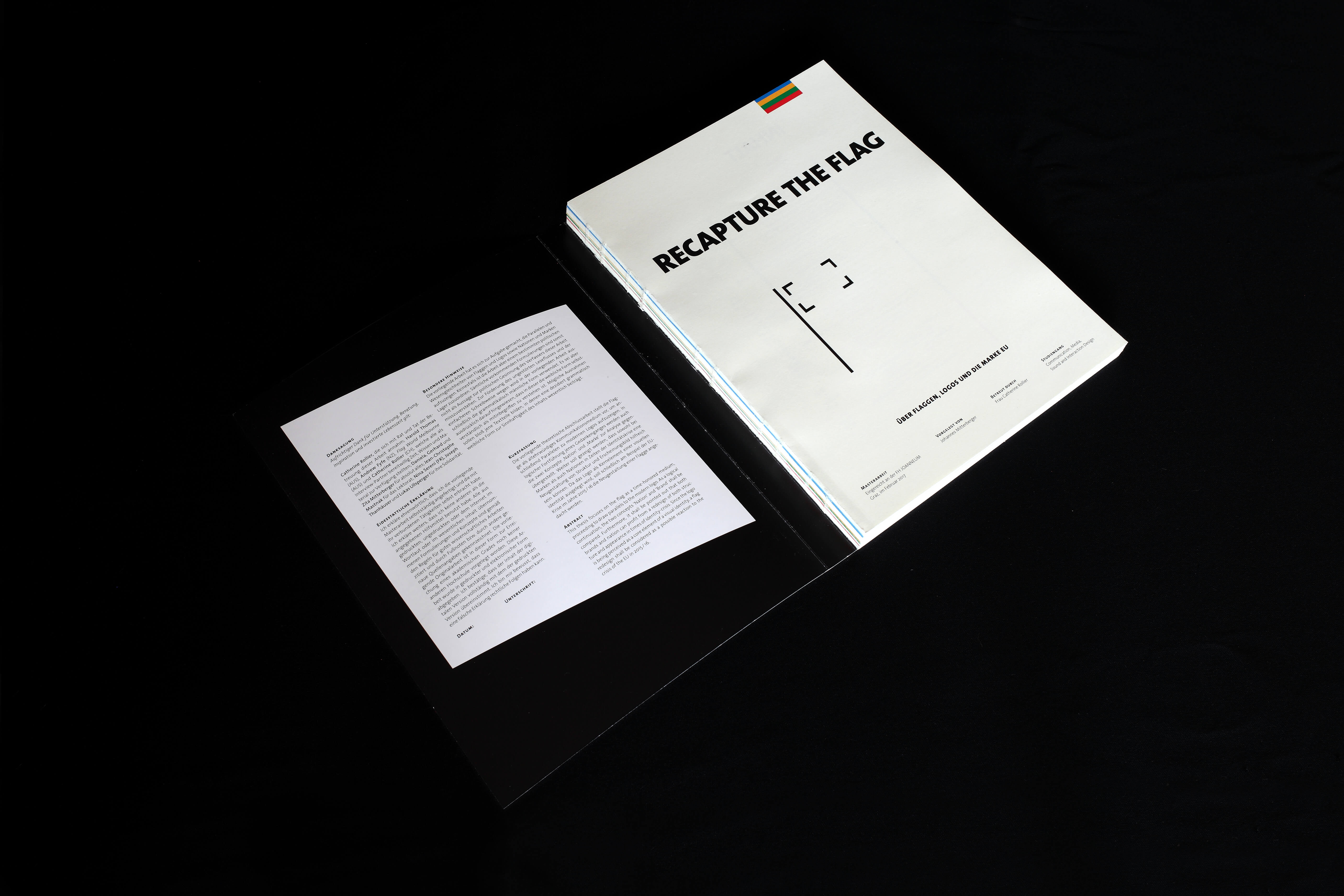
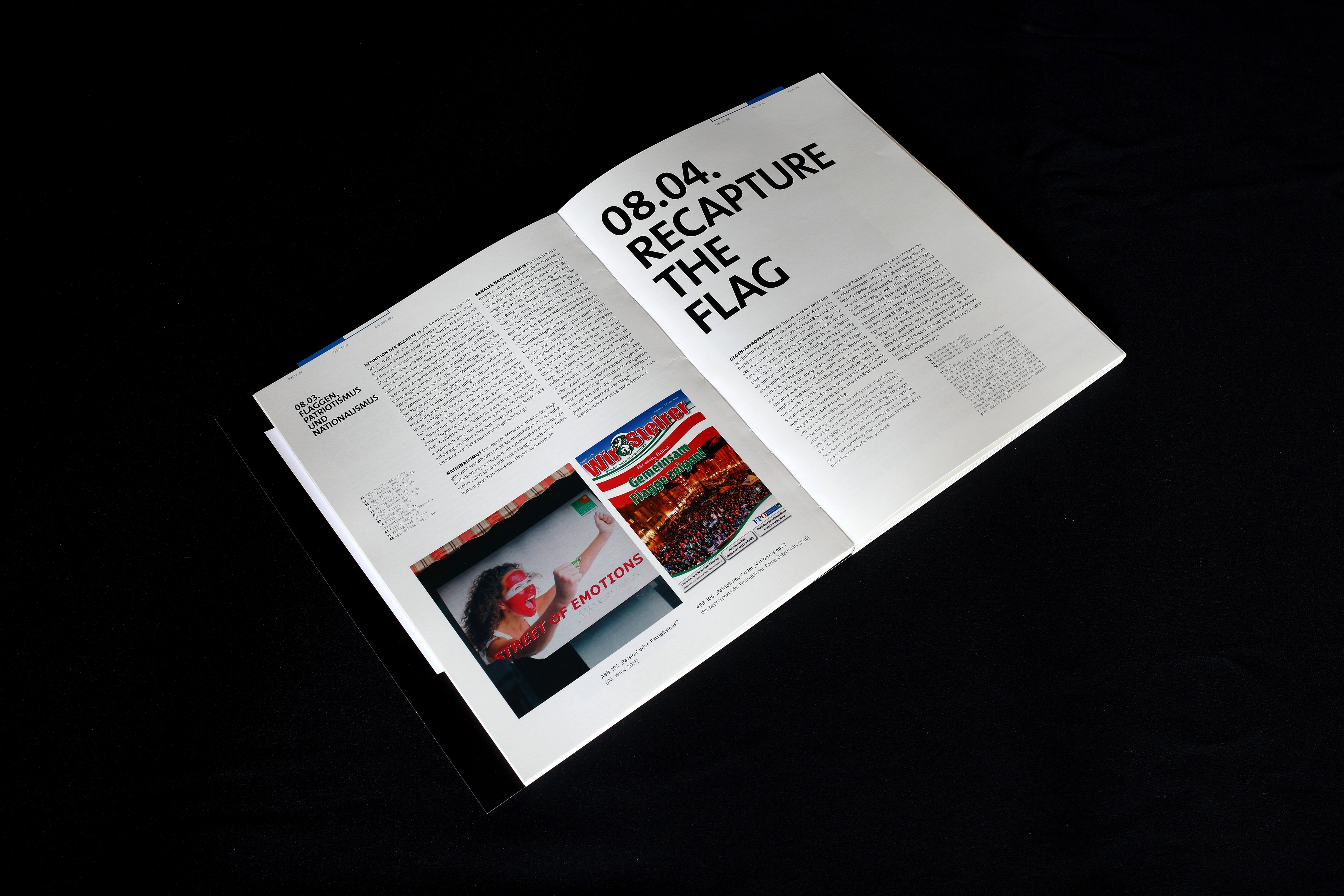
Master thesis—or “scientific design magazine”—on why you actually care about flags, even if you don’t. Spoiler: A flag is a logo is an empty vessel for emotions.
4.
Master thesis—or “scientific design magazine”—on why you actually care about flags, even if you don’t. Spoiler: A flag is a logo is an empty vessel.
4.
Master thesis on flag design
5.
Master thesis on flag design
Editorial Design
Graphic Design
Research
Illustration
Journalism
Writing
Editorial Design, Graphic Design, Research, Illustration, Writing
Editorial Design, Graphic Design, Research, Illustration, Writing

FOR:
FH Joanneum
IN:
2015—2016
WITH:
Catherine Rollier
FOR: FH Joanneum IN: 2015—2016 WITH: Catherine Rollier
FOR: FH Joanneum IN: 2015—2016 WITH: Catherine Rollier
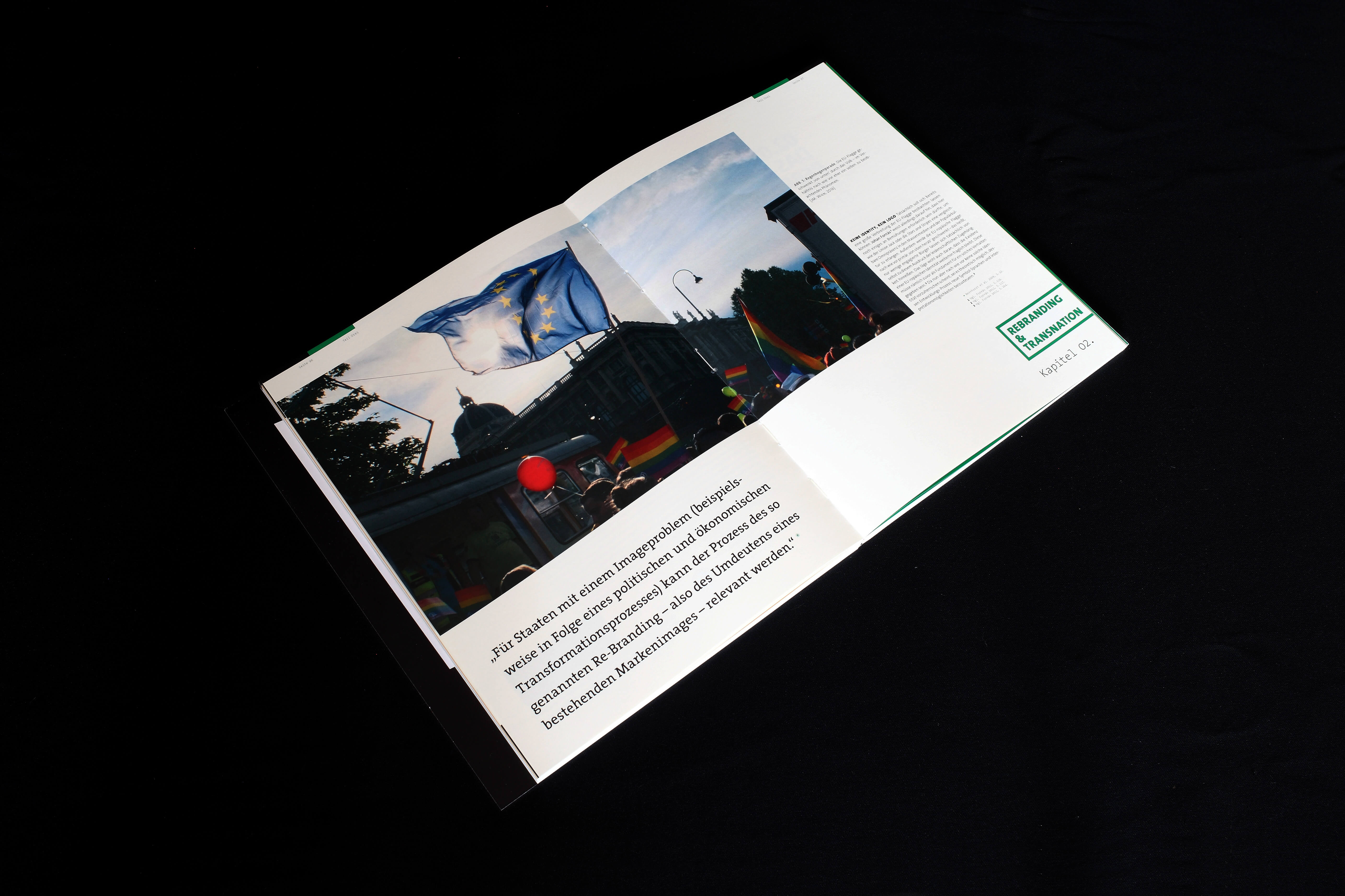
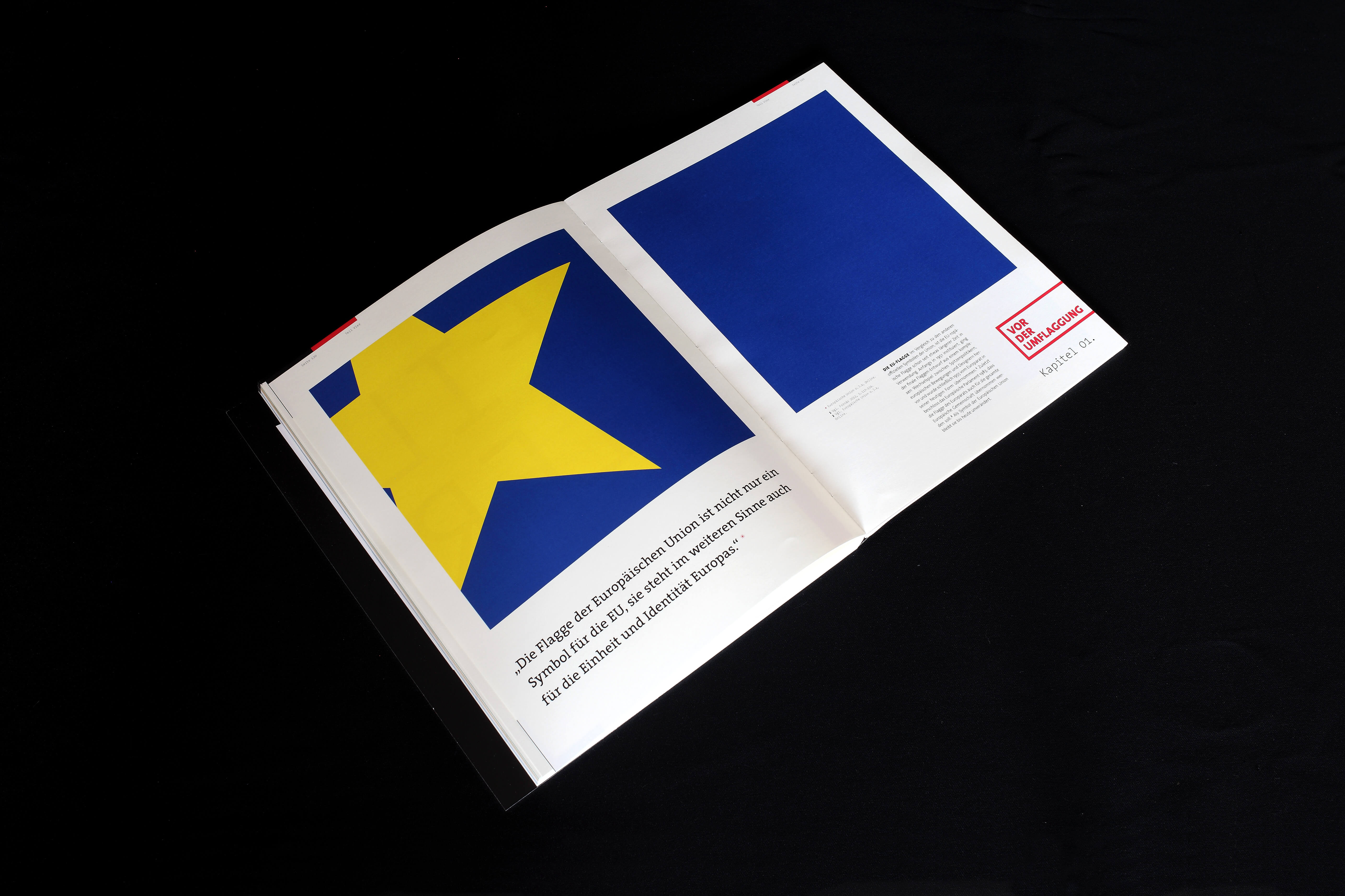
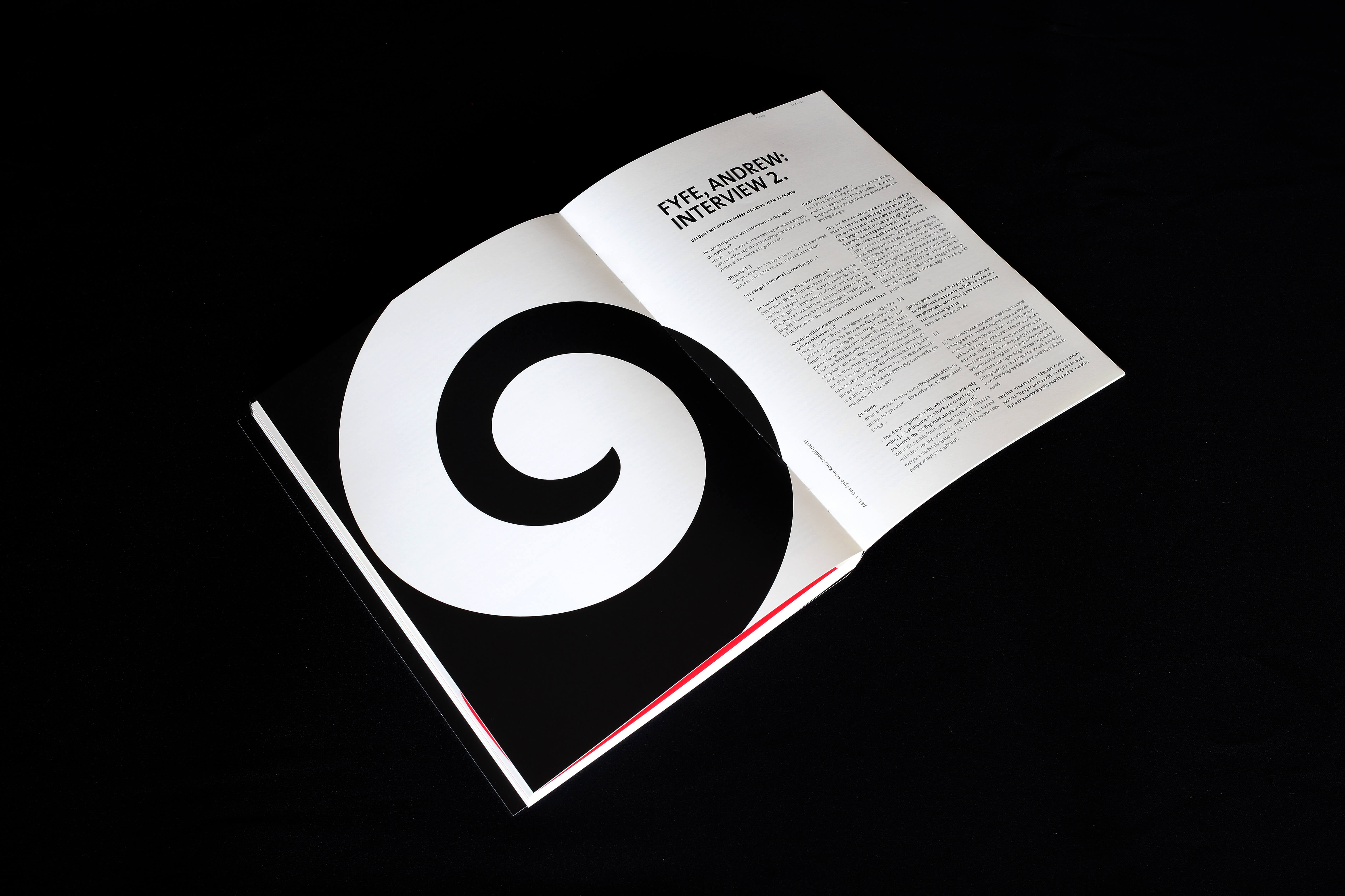
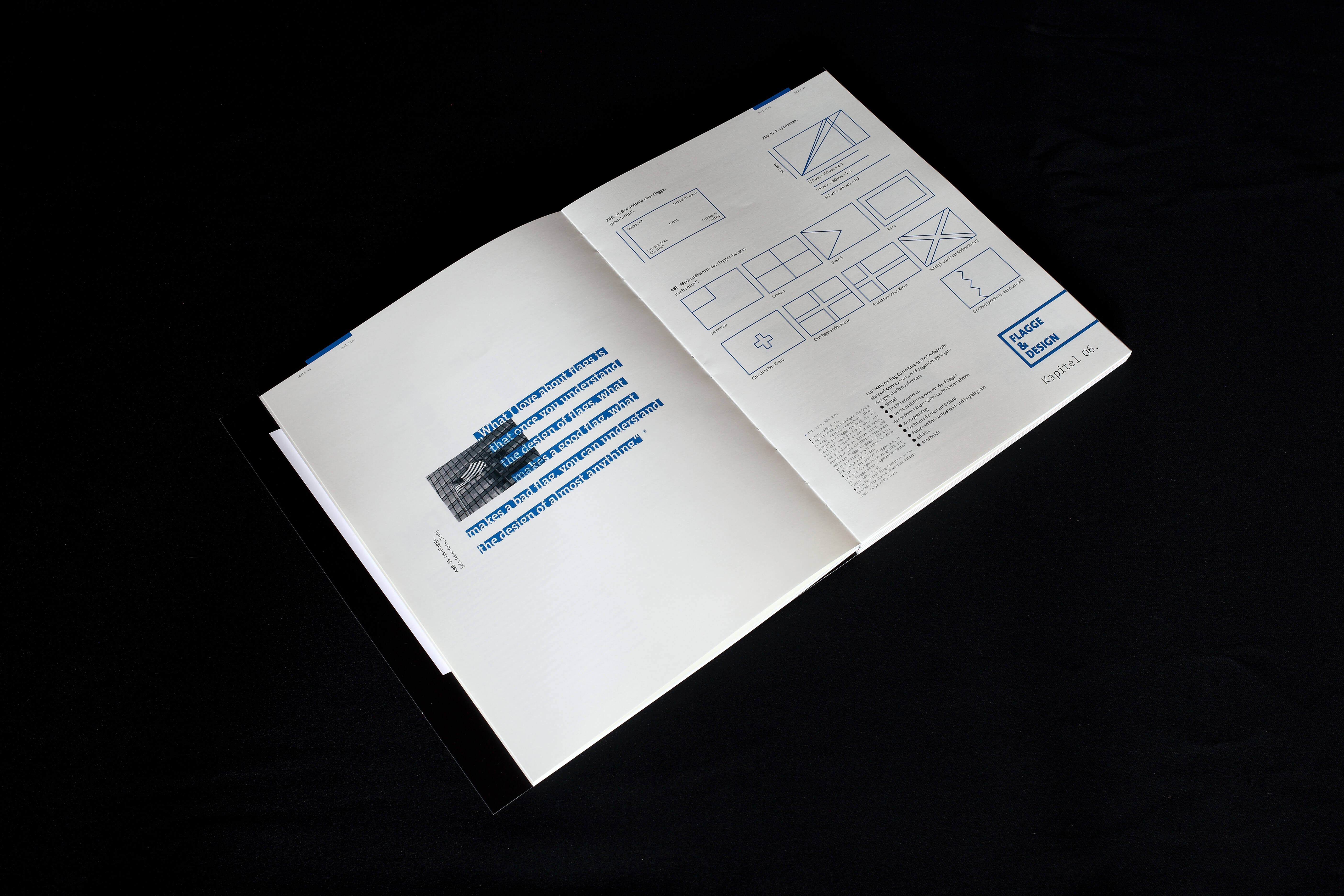
Master thesis on flags, logos, branding, nations, and politics — with a special emphasis on EUrope and (then) current events. A visual narrative about geopolitical issues as a synergy of form, content and zeitgeist: exploring new relations between journalism and design on 216 pages worth of empirical (design) studies, extensive literature research and custom artwork, including photos, illustrations, graphics, experimental typefaces, etc. Featuring interviews with Catherine Rollier, Andrew Fyfe and Harold Thomas.
Master thesis on flags, logos, branding, nations, and politics — with a special emphasis on EUrope and (then) current events. A visual narrative about geopolitical issues as a synergy of form, content and zeitgeist: exploring new relations between journalism and design on 216 pages worth of empirical (design) studies, extensive literature research and custom artwork, including photos, illustrations, graphics, experimental typefaces, etc. Featuring interviews with Catherine Rollier, Andrew Fyfe and Harold Thomas.
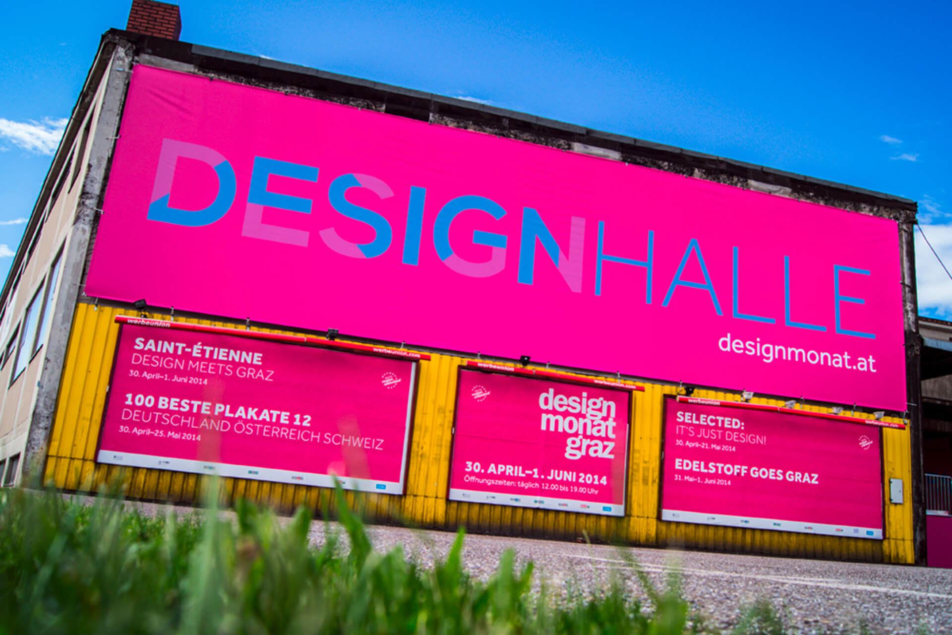
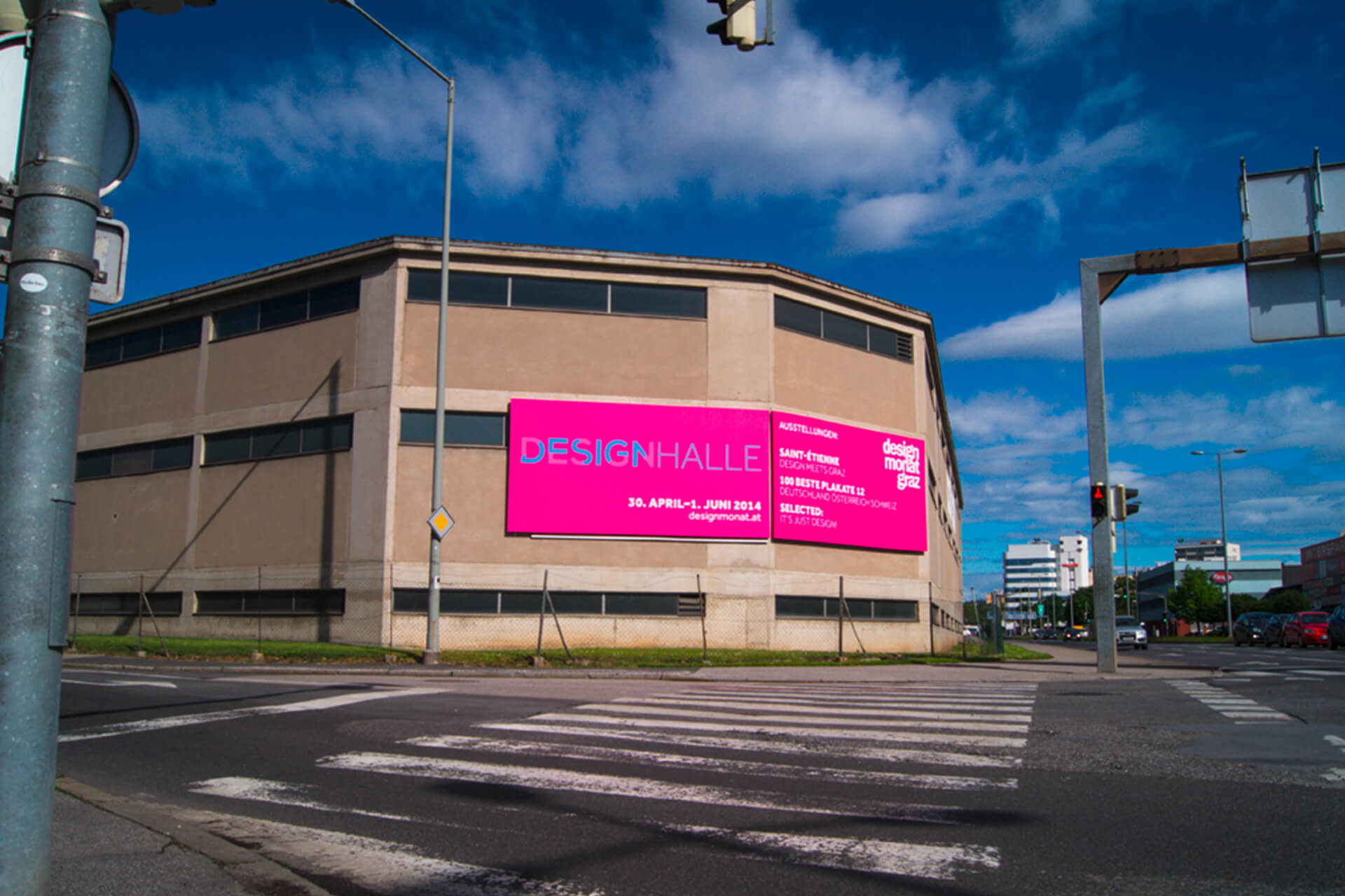
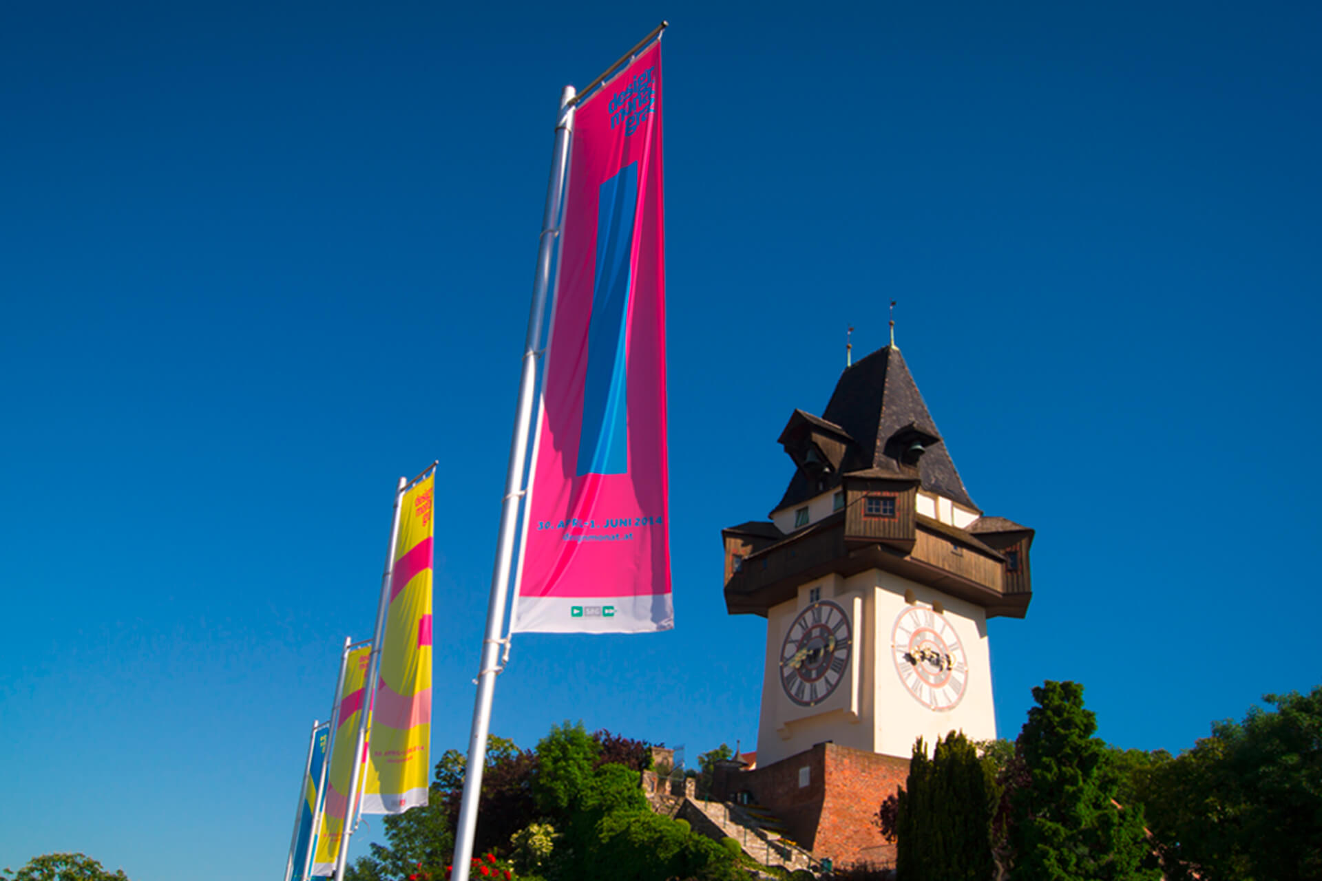
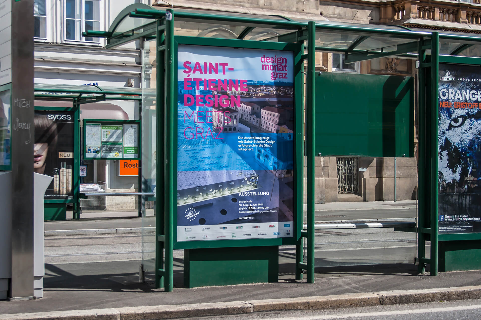
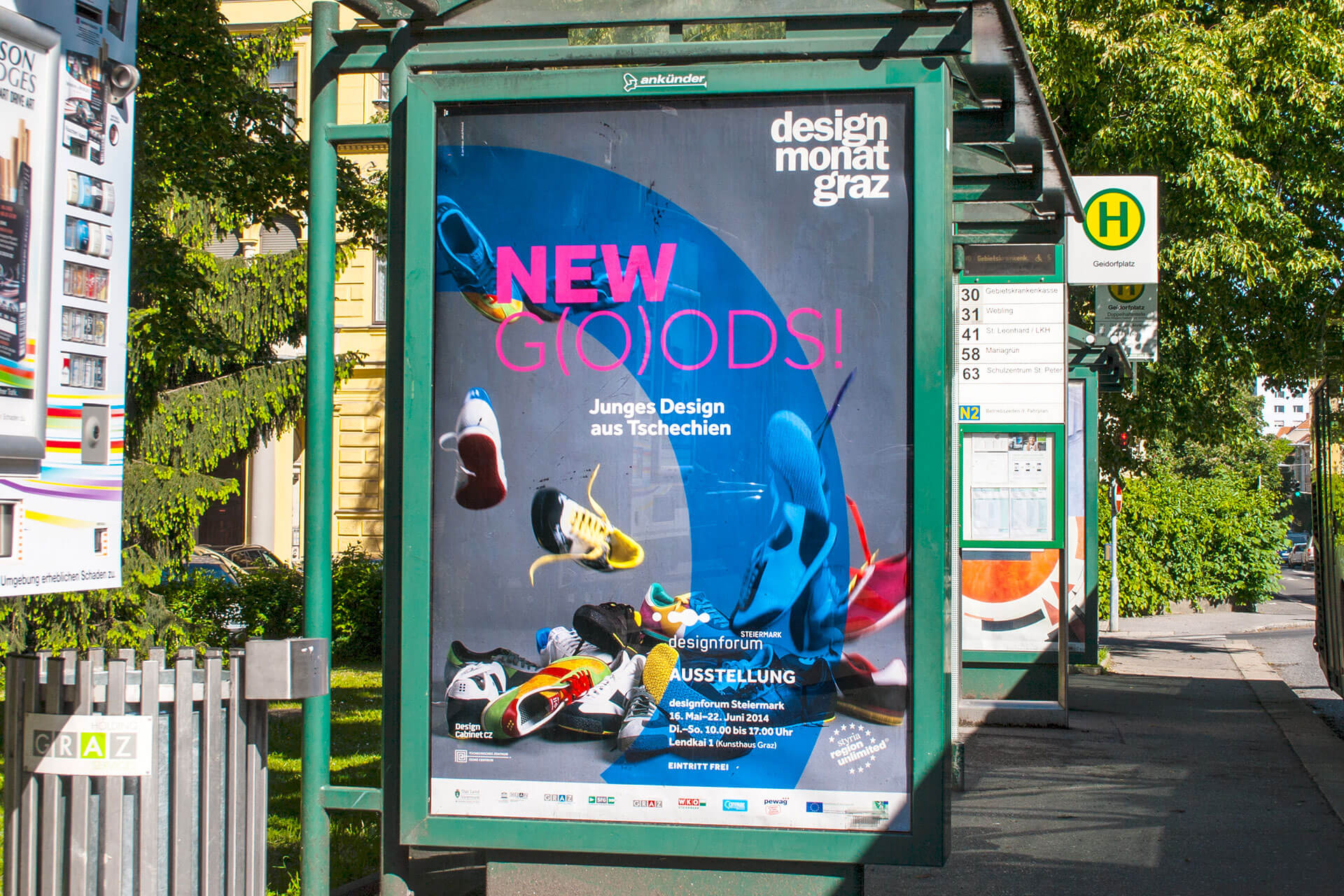
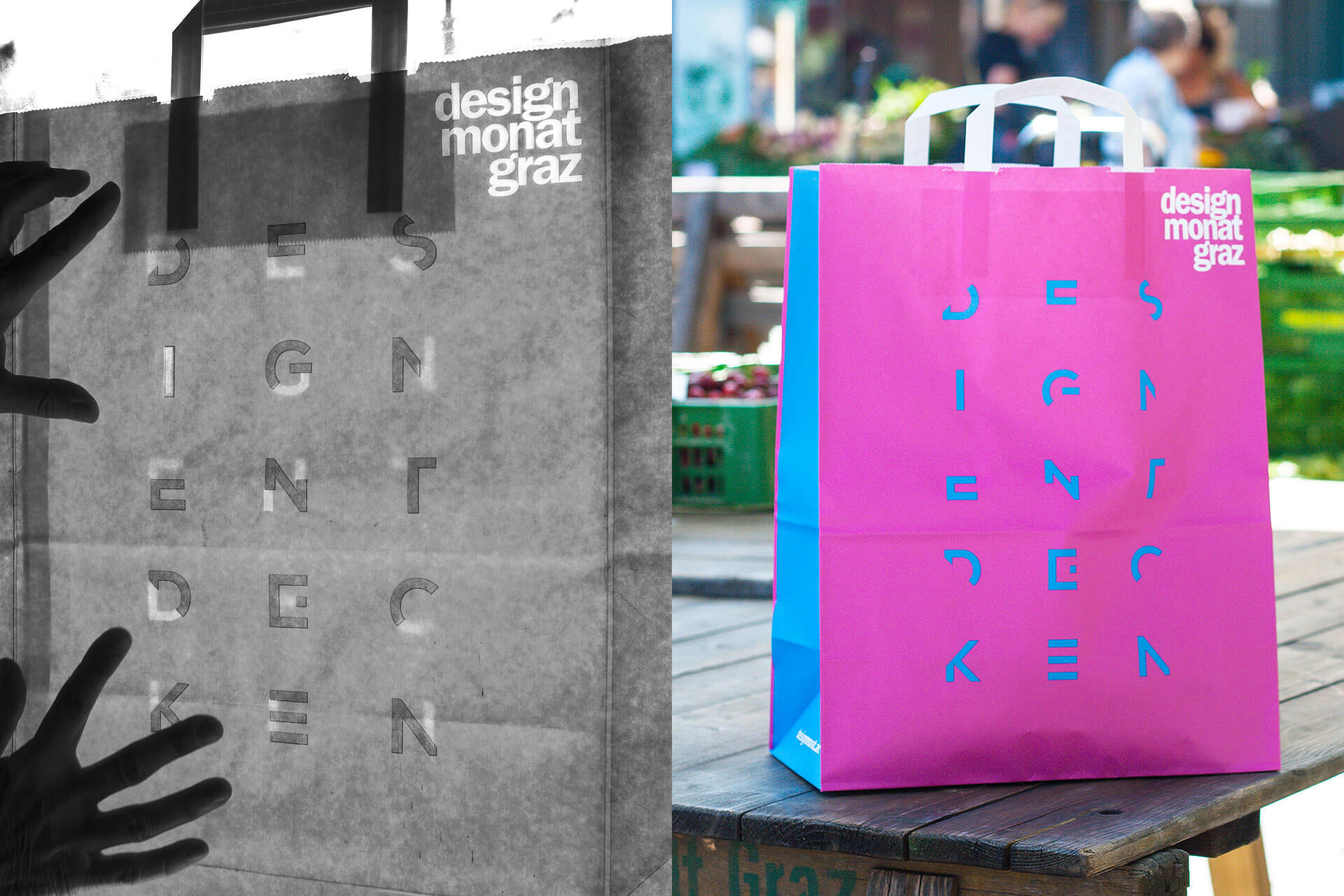
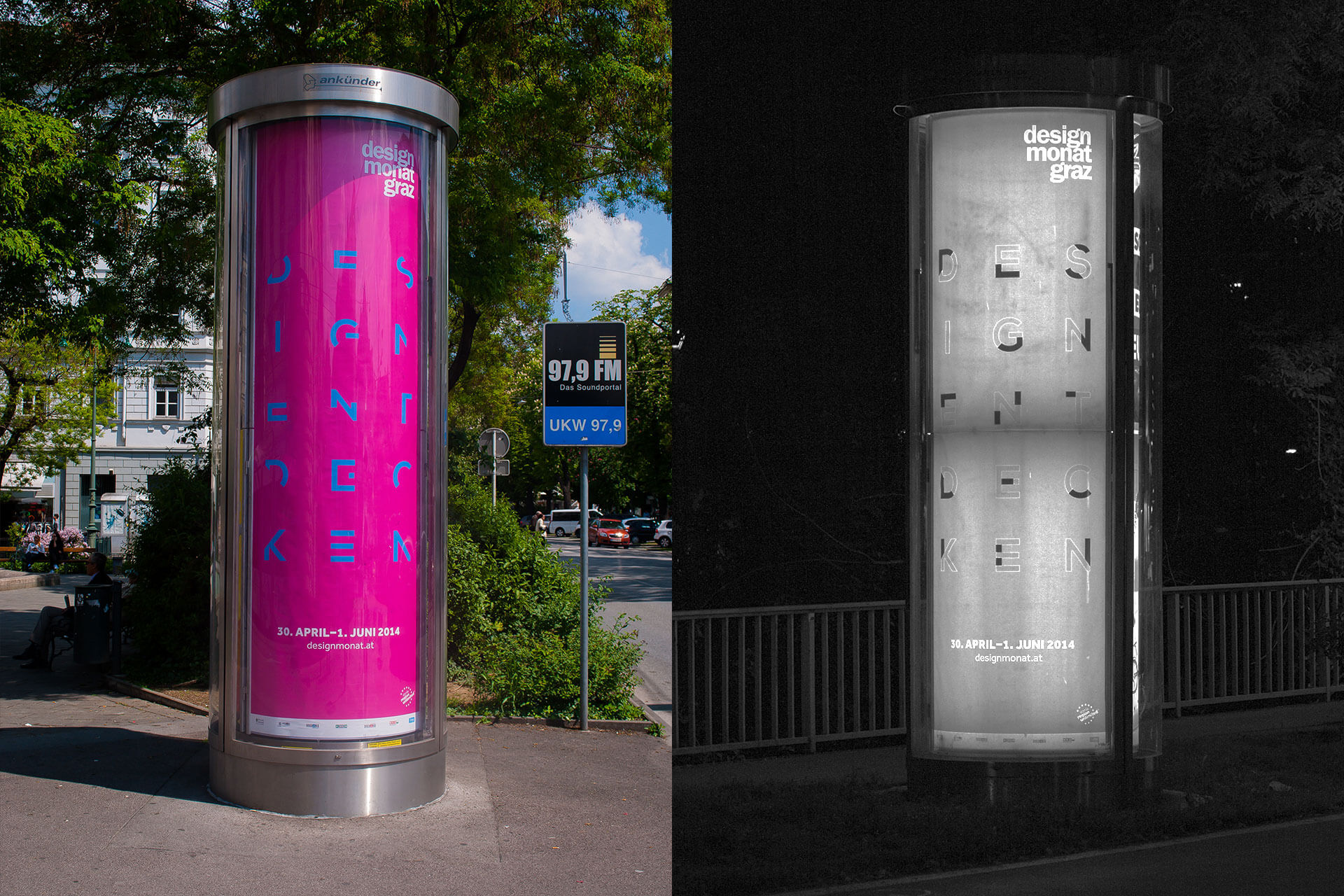
7.
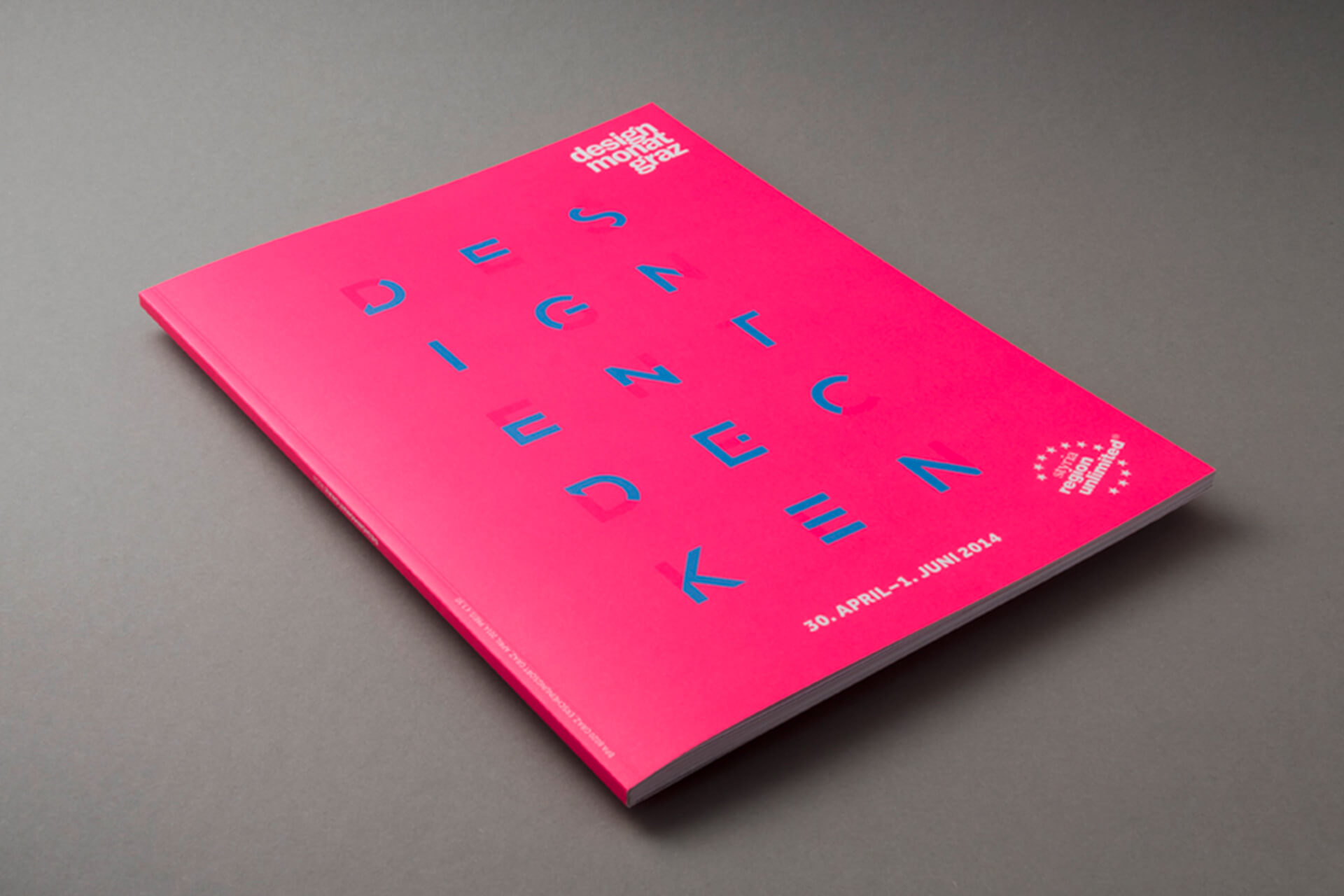
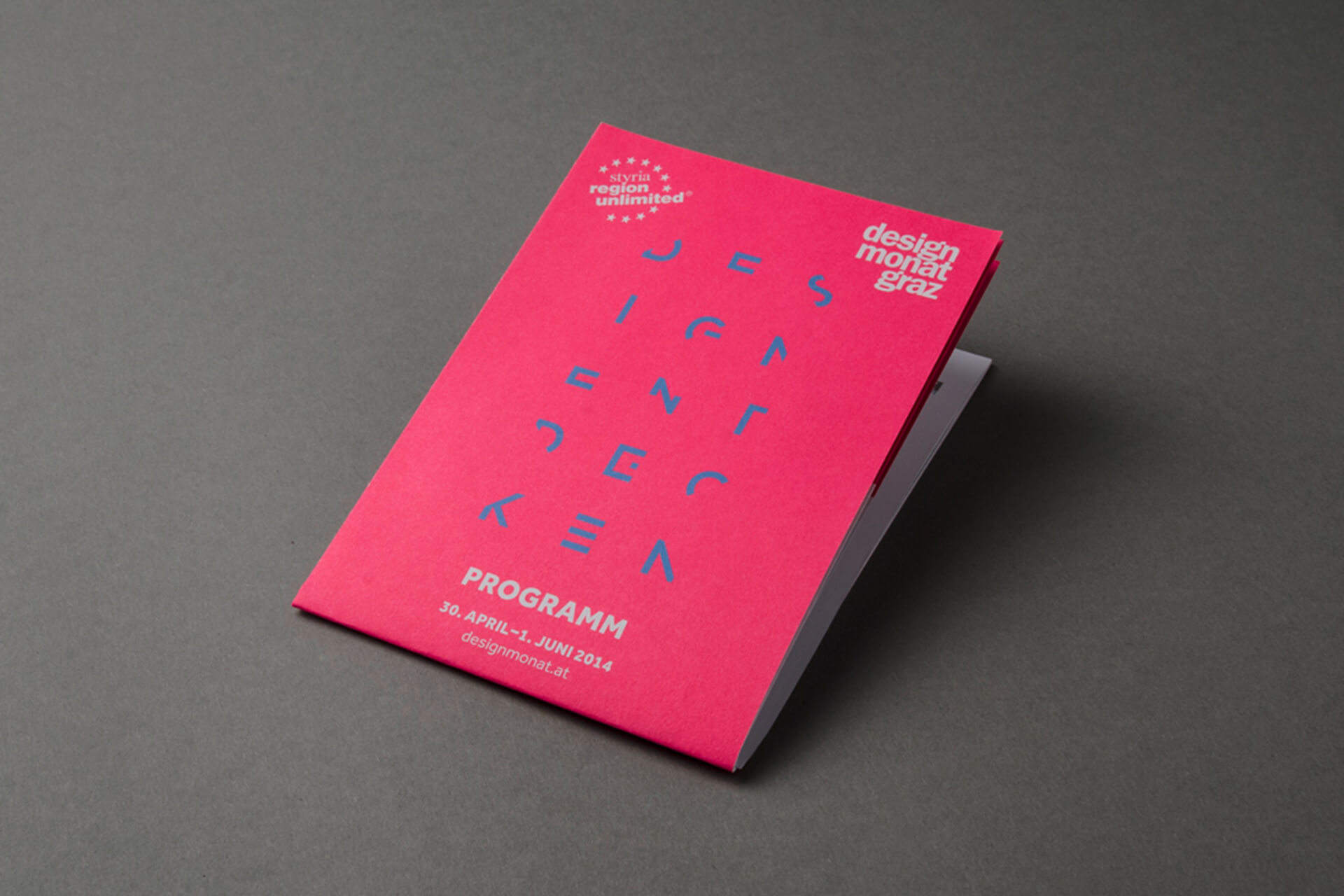
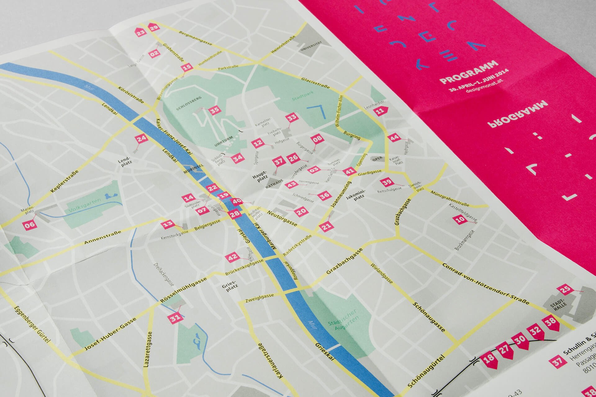
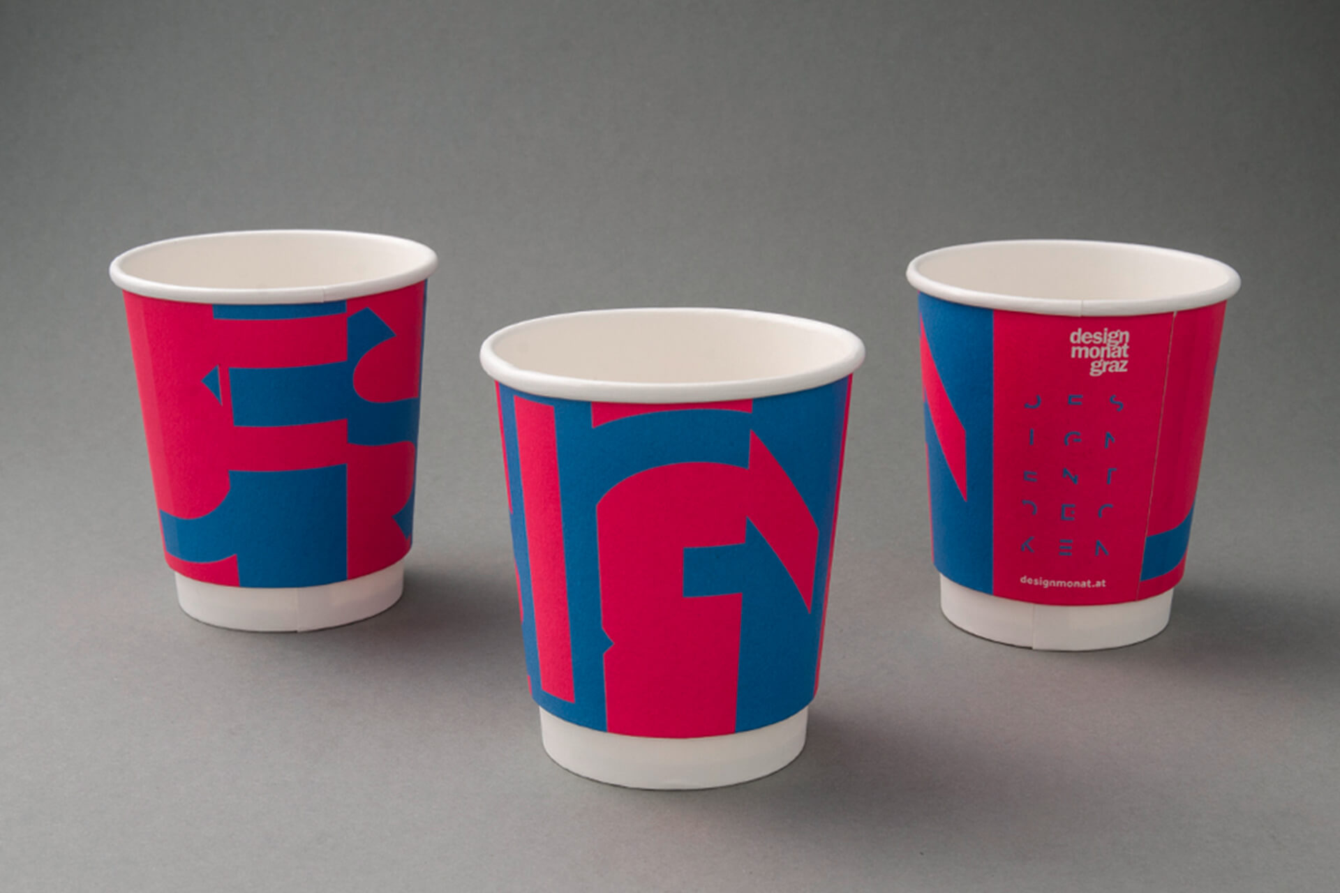
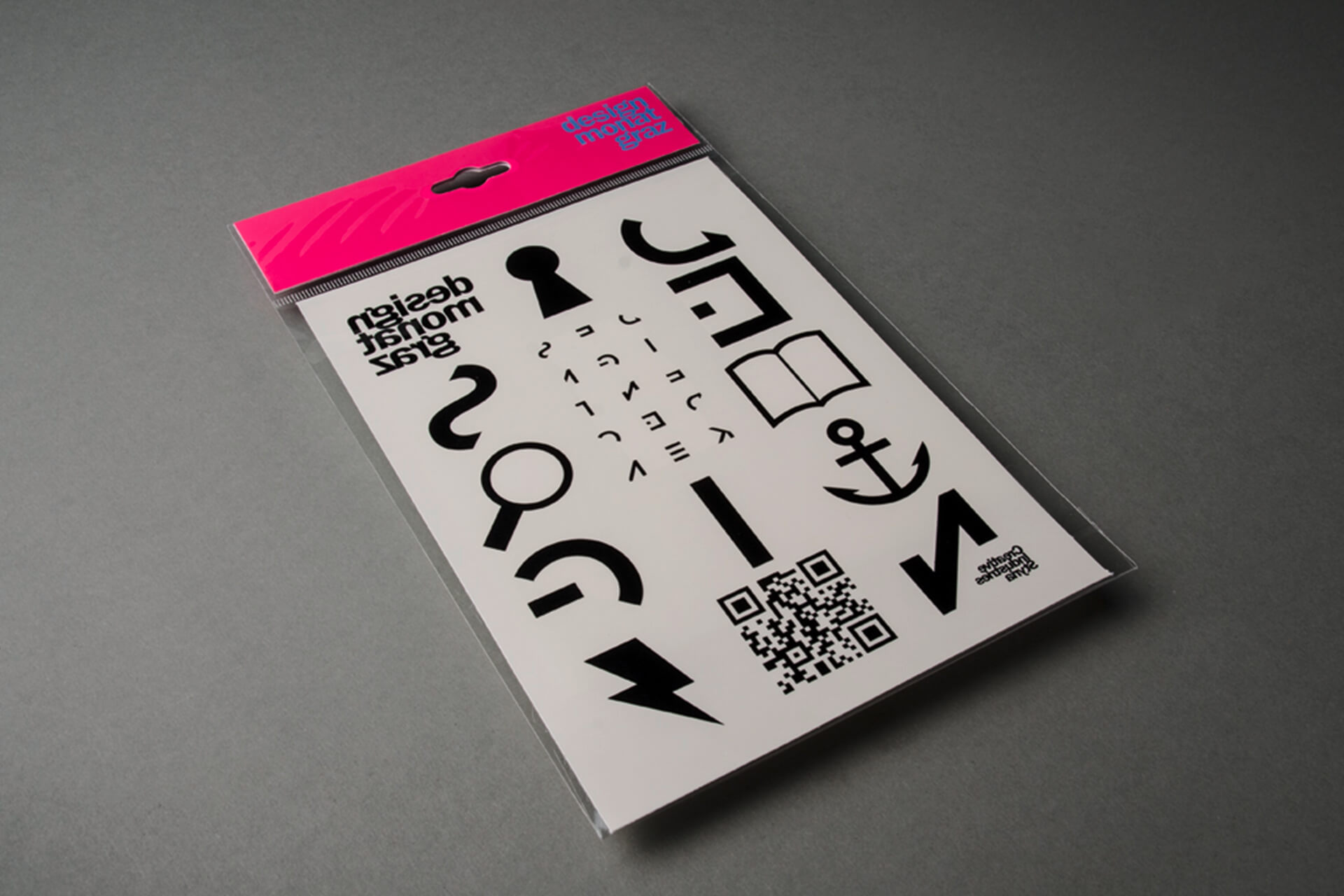
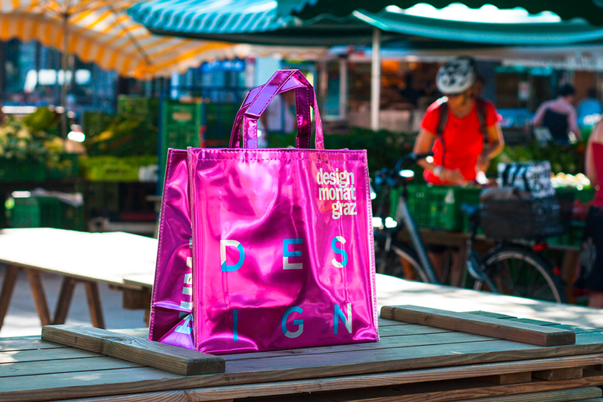
A visual identity focusing on the joy of discovery, making the abstract tangible. People shouldn't ask “What IS design?” but rather “What is design TO ME?”
5.
A visual identity focusing on the joy of discovery, making the abstract tangible: not “What IS design?”, but rather “What is design TO ME?”
4.
Visual identity and concept for an annual design festival (AUT)
6.
Visual identity and concept for an annual design festival (AUT)
Concept
Visual Identity
Editorial Design
Graphic Design
Writing
Concept; Visual Identity; Editorial Design; Graphic Design; Writing
Concept; Visual Identity; Editorial Design; Graphic Design; Writing